ReactJs - Responsive Design - Media Queries & CSS units (part-3)
Responsive web design (RWD) is a web development approach that creates dynamic changes to the appearance of a website, depending on the screen size and orientation of the device being used to view it. RWD is one approach to the problem of designing for the multitude of devices available to customers, ranging from tiny phones to huge desktop monitors.
RWD uses so-called "breakpoints" to determine how the layout of a site will appear: one design is used above a breakpoint and another design is applied below that breakpoint. The breakpoints are commonly based on the width of the browser.

The same HTML is served to all devices, using CSS (which determines the layout of webpage) to change the appearance of the page. Rather than creating a separate site and corresponding codebase for wide-screen monitors, desktops, laptops, tablets and phones of all sizes, a single codebase can support users with differently sized viewports.
In responsive design, page elements reshuffle as the viewport grows or shrinks. A three-column desktop design may reshuffle to two columns for a tablet and a single column for a smartphone. Responsive design relies on proportion-based grids to rearrange content and design elements.
Responsive Web Design Vs Adaptive Web Design
There are two approaches to ensuring a website is optimized for mobile, tablet, laptop and PC screens : responsive design and adaptive design. While both are intended to solve the same problem, they use different strategies.

A website created with responsive design serves up the same site to every device, but that site is fluid and will change its layout and appearance based on the size and orientation of the device.
Developers use CSS to ensure each page of the site can reformat based on the size of the user’s viewport and only need to create one codebase for the site. They use something called breakpoints to tell the site when to adjust to accommodate different screen sizes.
In adaptive design, a different website layout is created for each device’s screen. As it loads, the site recognizes the size of the screen and serves up the layout that was made for that viewport.
NOTE : To implement AWD in ReactJS we simply use conditional rendering, we can use the useState() to store screene sizes and then return different components based on screen sizes.
We can also use media queries for conditional rendering with react-responsive.
The pros and cons of Responsive design
- UX designer does'nt have to create multiple wireframes for different layouts,there is less work than adaptive design.
- Responsive sites also do better in search engine rankings because they’re considered mobile-friendly.
- On the other hand, responsive websites require developers to do more coding.
- Because the code for the entire website is delivered no matter what device the site is accessed on, a responsive site can be slower to load.
The pros and cons of Adaptive design
- For a UX designer, it can be easier to design the various layouts required for an adaptive design because it simply requires creating wireframes for the fixed width of each screen size.
- Using Adaptive design we can include or exclude features on our website based on device size
- Adaptive sites tend to load much faster than responsive sites.
- It’s possible to limit the work by designing for only two or three common screen sizes, that will mean if users access the site on a device that it wasn’t designed for, the site won’t format correctly.
---------------------------------------------------------------------------------------------------------------
The Viewport
A 'viewport' in web design is the user's visible area of a web page.The viewport varies with the device, and will be smaller on a mobile phone than on a computer screen.
Then, when we started surfing the internet using tablets and mobile phones, fixed size web pages were too large or too small to fit the viewport.To fix this, browsers on those devices scaled down the entire web page to fit the screen,due to which the user had to either Zoom-In or Zoom-Out to view the entire website.
NOTE : In any responsive website we want the width of the viewport and our website to be the same.
HTML5 introduced a method to let web designers take control over the viewport, through the <meta> tag. You should include the following <meta> viewport element in all your web pages,It gives the browser instructions on how to control the page's dimensions and scaling :
<meta name="viewport" content="width=device-width, initial-scale=1.0">The width=device-width part sets the width of the page to follow the screen-width of the device (which will vary depending on the device).The initial-scale=1.0 part sets the initial zoom level when the page is first loaded by the browser.

NOTE : The meta tag should be added in the head tag in HTML document.
A Responsive tags has the following attributed :
- width: Width of the virtual viewport of the device.
- height: Height of the virtual viewport of the device.
- initial-scale: Zoom level when the page is first visited.
- minimum-scale: Minimum zoom level to which a user can zoom the page.
- maximum-scale: Maximum zoom level to which a user can zoom the page.
- user-scalable: Flag which allows the device to zoom in or out.(value= yes/no).
Size Content to The Viewport
Users are used to scroll websites vertically on both desktop and mobile devices - but not horizontally! So, if the user is forced to scroll horizontally, or zoom out, to see the whole web page it results in a poor user experience.Some additional rules to follow :
- Do NOT use large fixed width elements - For example, if an image is displayed at a width wider than the viewport it can cause the viewport to scroll horizontally. Remember to adjust this content to fit within the width of the viewport.
- Do NOT let the content rely on a particular viewport width to render well - Since screen dimensions and width in CSS pixels vary widely between devices, content should not rely on a particular viewport width to render well.
- Use CSS media queries to apply different styling for small and large screens - Setting large absolute CSS widths for page elements will cause the element to be too wide for the viewport on a smaller device. Instead, consider using relative width values, such as width: 100%. Also, be careful of using large absolute positioning values. It may cause the element to fall outside the viewport on small devices
---------------------------------------------------------------------------------------------------------------
Useful : 1] Click
Media Query
Media queries is a feature of CSS3 allowing content rendering to adapt to different conditions such as screen resolution (e.g. mobile and desktop screen size). It became a W3C recommended standard in June 2012, and is a cornerstone technology of responsive web design (RWD).
Media queries can modify the appearance (and even behavior) or a website or app based on a matched set of conditions about the user’s device, browser or system settings.
NOTE : Media queries are commonly associated with CSS, but they can be used in HTML and JavaScript as well.
There is no "standard" set of screen size breakpoints to use when applying CSS media queries. The appropriate breakpoints to use will depend on the design of your website and the type of device you want to support. Here are some common screen sizes that you may want to consider using as breakpoints in your media queries:
- 320px: This is a common width for smartphones in portrait mode.
- 480px: This is a common width for smartphones in landscape mode and for small tablets.
- 768px: This is a common width for tablets in portrait mode and for small laptops.
- 1024px: This is a common width for tablets in landscape mode and for laptops.
- 1280px: This is a common width for large laptops and desktop monitors.
---------------------------------------------------------------------------------------------------------------
Media queries inside HTML
There are a few ways we can use media queries directly in HTML :
1] There’s the <link> element that goes right in the document <head>. In this example. we’re telling the browser that we want to use different stylesheets at different viewport sizes.
2] We can use media queries on <source> element, which informs the <picture> element what version of an image the browser should use from a set of image options.
3] We can also use media queries directly on the <style> element as well:
---------------------------------------------------------------------------------------------------------------
Media queries inside Javascript
Working with media queries in JavaScript is very different than working with them in CSS, even though the concepts are similar : match some conditions and apply some stuff.
Using matchMedia()
To determine if the document matches the media query string in JavaScript, we use the matchMedia() .We pass the media query string to matchMedia() and then check the ".matches" property.
The defined media query will return a "MediaQueryList" object. It is an object that stores information about the media query and the key property we need is .matches. That is a read-only Boolean property that returns true if the document matches the media query.
Index.html
Index.js
NOTE : The ".matches" is perfect for one-time instantaneous checks but is unable to continuously check for changes. This only fires once so if the alert is dismissed, it won’t fire again if we change the screen width and try again without refreshing. That’s why it’s a good idea to use a listener that checks for updates.
Using matchMedia() with listener.
The MediaQueryList object returned by matchMedia() has an addListener() (and the subsequent removeListener()) method that accepts a callback function that’s invoked when the media query status changes. In other words, we can fire additional functions when the conditions change, allowing us to “respond” to the updated conditions.
Index.js
The old way of doing things
For the sake of context I would like to cover the old, but still popular, way of doing “media queries” in JavaScript. The most common approach is binding a resize event listener that checks window.innerWidth or window.innerHeight.
Index.html
Index.js
NOTE : Since the resize event is called on each browser resize, this is an expensive operation! Even if we look past the performance issues, resize is restrictive in the sense that it doesn’t let us write advanced media queries for things like print and orientation.
---------------------------------------------------------------------------------------------------------------
Media queries with CSS
CSS is the most common place to spot a media query in the wild. They go right in the stylesheet in an @media rule that wraps elements with conditions for when and where to apply a set of styles when a browser matches those conditions.
 |
| Media Query syntax |
Aside from at-rule "@media",there are 3 main components in a media query :
- Media-Type
- Media Feature or Expression
- Operators
Anatomy of an example media query
Example]
Change text and background color if width goes above 800px
The first ingredient in a media query recipe is the @media rule itself, which is one of many CSS at-rules. Why does @media get all the attention? Because it’s geared to the "type" of media that a site is viewed with, what "media-features" that media type supports, and "operators" that can be combined to mix and match simple and complex conditions alike.
Media Types
The media-type represents what type of media are we trying to target ? In many (if not most) cases, you’ll see a screen value used here, which makes sense since many of the media types we’re trying to match are devices with screens attached to them. But screens aren’t the only type of media we can target, of course. We have a few, including:
all : Matches all devices
print : Matches documents that are viewed in a print preview or any media that breaks the content up into pages intended to print.
screen : Matches devices with a screen
speech : Matches devices that read the content audibly, such as a screenreader. This replaces the now deprecated aural type since Media Queries Level 4.
NOTE : If you dont provide any media-type then the default is "all"
Media Features
Once we define the type of media we’re trying to match, we can start defining what features we are trying to match it to. We’ve looked at a lot of examples that match screens to width, where screen is the type and both min-width and max-width are features with specific values.
But there are many, many (many!) more “features” we can match. Check them out in the official doc here , or from a blog here.
Some commonly used media-features are :
- min-width
- max-width
- color
- height
- width
- grid
- aspect ratio
Operators
Media queries support logical operators like many programming languages so that we can match media types based on certain conditions. The @media rule is itself a logical operator that is basically stating that “if” the following types and features are matches, then do some stuff.
"And" operator
We can use the "and" operator if we want to target screens within a range of widths :
"Or" operator (coma-seperated)
We can also comma-separate features as a way of using an "or" operator to match different ones :
"Not" operator
Perhaps we want to target devices by what they do "not" support or match. This declaration removes the body’s background color when the device is a printer and can only show one color.
---------------------------------------------------------------------------------------------------------------
Using "min-" and "max-" to match value ranges
Many of the media features outlined in the previous section — including width, height, color and color-index — can be prefixed with min- or max- to express minimum or maximum constraints. The point is that we can create a range of value to match instead of having to declare specific values.
Example] In the following snippet, we’re painting the body’s background purple when the viewport width is between 800-1000px. If the viewport width does not match that range of values, then it will fallback to white.
NOTE : Media Queries Level 4 specifies a new and simpler syntax using less then (<), greater than (>) and equals (=) operators. Unfortunately, at the time of writing, it’s only supported by few browsers.
---------------------------------------------------------------------------------------------------------------
CSS Units
CSS has several different units for expressing a length. There are two types of length units :
- Absolute
- Relative
NOTE : Some of the most commonly used CSS units are (px,em,rem,%,vh,vw )
1] Absolute Lengths
The absolute length units are fixed and a length expressed in any of these will appear as exactly that size.
Absolute length units are not recommended for use on screen, because screen sizes vary so much. However, they can be used if the output medium is known, such as for print layout.
| Unit | Description |
|---|---|
| cm | centimeters |
| mm | millimeters |
| in | inches (1in = 96px = 2.54cm) |
| px * | pixels (1px = 1/96th of 1in) |
| pt | points (1pt = 1/72 of 1in) |
| pc | picas (1pc = 12 pt) |
Pixels (px) are relative to the viewing device. For low-dpi devices, 1px is one device pixel (dot) of the display. For printers and high resolution screens 1px implies multiple device pixels.
2] Relative Lengths
Relative length units specify a length relative to another length property. Relative length units scale better between different rendering medium.
| Unit | Description | |
|---|---|---|
| em | Relative to the font-size of the element (2em means 2 times the size of the current font) | |
| ex | Relative to the x-height of the current font (rarely used) | |
| ch | Relative to the width of the "0" (zero) | |
| rem | Relative to font-size of the root element | |
| vw | Relative to 1% of the width of the viewport* | |
| vh | Relative to 1% of the height of the viewport* | |
| vmin | Relative to 1% of viewport's* smaller dimension | |
| vmax | Relative to 1% of viewport's* larger dimension | |
| % | Relative to the parent element |
NOTE : The em and rem units are practical in creating perfectly scalable layout!
* Viewport = the browser window size. If the viewport is 50cm wide, 1vw = 0.5cm.
Example] PIXELS (px) vs PERCENTAGE (%)
Pixel is a absolute unit while percentage is a relative unit. The px unit is fixed and keeps the element to remain of fixed size,while the % unit is relative to its parent element.

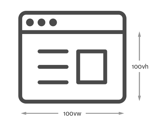
Example] Viewport-Height (vh) vs Viewport-Width (vw)
The VH and VW are relative to the width and height of the entire viewport of webpage.
REM vs EM
Both rem and em are relative units but instead of being relative of width or height , they are relative to the font size you may have defined on your system
The rem unit is relative to font-size of the html root element (which for most browsers has a default value of 16px) and the em unit is relative to the font-size of its direct or nearest parent (2em means 2 times the size of the current font).
1] EM unit
em is borrowed from the typography world, and it’s a unit that allows setting the font-size of an element relative to the font-size of its parent. Let’s take this simple example:
With that example, the child would have a font-size of 27px (1.5 * 18px = 27px).
NOTE : If the parent element doesn’t specify a value for font-size, a value will be looked for higher up in the DOM tree. If no font-size is specified all the way up to the root element (<html>), then the browser default of 16px is used.
A problem can come about from the fact that the em unit can compound from one level to the other.Let’s keep a similar basic example:

So, as you can see, the effect of em units can be compounding when multiple em-font-sized elements are within one another. This can become a problem and can lead to unintended consequences in your designs. This problem is the reason why the rem unit was created.
2] REM unit
The rem unit, short for root em is a relative unit that’ll always be based upon the font-size value of the root element, which is the <html> element. And if the <html> element doesn’t have a specified font-size, the browser default of 16px is used.
So that means that, by using the rem unit, the values of parent elements are ignored, and only the value of the root is taken into consideration.
With a similar example, but in rem :

As you can see, using rem units allow us to avoid the compounding effect of em units. With rem things are always and consistently based on the font-size or the root element, so there are no surprises.
---------------------------------------------------------------------------------------------------------------


Comments
Post a Comment