CSS NOTES - part 2 (Flexbox,Grid,Animations)
Useful : 1] Click
CSS Flexbox
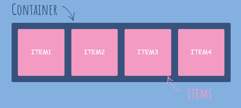
Flexbox stands for 'Flexible Box'. It’s a layout module for CSS aimed at giving you an efficient way to arrange items in row or column. Flexbox has a container (flex-container) inside which it layouts items (flex-items) along either the horizontal or the vertical axis, so you have to decide whether you want a row-based or a column-based layout.
The main idea behind the flex layout is to give the container the ability to alter its items’ width/height (and order) to best fill the available space (mostly to accommodate to all kind of display devices and screen sizes). A flex container expands items to fill available free space or shrinks them to prevent overflow.
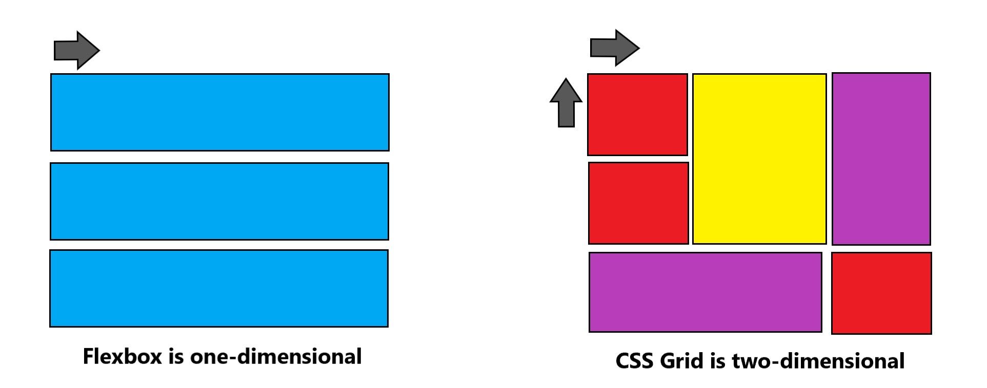
NOTE : The main difference between Flexbox and Grid layout is that Flexbox is one-dimensional layout while the Grid is a multi-dimensional layout.
Flexbox Basics

NOTE : Items will be laid out following either the main axis (from main-start to main-end) or the cross axis (from cross-start to cross-end).
- main axis – The main axis of a flex container is the primary axis along which flex items are laid out. Beware, it is not necessarily horizontal; it depends on the
flex-directionproperty.
- main-start | main-end – The flex items are placed within the container starting from main-start and going to main-end.
- main size – A flex item’s width or height, whichever is in the main dimension, is the item’s main size. The flex item’s main size property is either the ‘width’ or ‘height’ property, whichever is in the main dimension.
- cross axis – The axis perpendicular to the main axis is called the cross axis. Its direction depends on the main axis direction.
- cross-start | cross-end – Flex lines are filled with items and placed into the container starting on the cross-start side of the flex container and going toward the cross-end side.
- cross size – The width or height of a flex item, whichever is in the cross dimension, is the item’s cross size. The cross size property is whichever of ‘width’ or ‘height’ that is in the cross dimension.
Since flexbox is a whole module and not a single property, it involves a lot of things including its whole set of properties. Some of them are meant to be set on the container (parent element, known as “flex container”) whereas the others are meant to be set on the children (said “flex items”).
Display Flex
Flexbox is activated for a group of elements by applying display: flex; to the direct parent (container) of the elements to be placed in a row. Display flex is the property of flex container to use flexbox. CSS Display property can have value flex or inline-flex. By using display flex or inline-flex to parent container, the children automatically enable flex context.
NOTE : The display property can take one of 2 values for flexbox, "display : flex" which is a block level flexbox and "display:inline-flex" which gives an inline flexbox.
Example] A simple flexbox container with 3 boxes in default flex-direction of row.

Flexbox Container Properties
The following properties are applied to the parent flexbox container.
1] Flex Direction
Flex Direction property is given to flex container to change direction of flex items. By default, flex direction is row.
row(default): left to right inltr; right to left inrtlrow-reverse: right to left inltr; left to right inrtlcolumn: same asrowbut top to bottomcolumn-reverse: same asrow-reversebut bottom to top

2] Flex Wrap
By default, flex items will all try to fit onto one line. You can change that and allow the items to wrap as needed with this property.
nowrap(default): all flex items will be on one linewrap: flex items will wrap onto multiple lines, from top to bottom.wrap-reverse: flex items will wrap onto multiple lines from bottom to top.

3] Flex Flow
This is a shorthand for the flex-direction and flex-wrap properties, which together define the flex container’s main and cross axes. The default value is row nowrap.
4] Justify Content
This property arranges flex-items along the MAIN AXIS inside the flex-container.It helps distribute extra free space leftover when either all the flex items on a line are inflexible, or are flexible but have reached their maximum size.

flex-start(default): items are packed toward the start of the flex-direction.flex-end: items are packed toward the end of the flex-direction.center: items are centered along the linespace-between: items are evenly distributed in the line; first item is on the start line, last item on the end linespace-around: items are evenly distributed in the line with equal space around them. Note that visually the spaces aren’t equal, since all the items have equal space on both sides. The first item will have one unit of space against the container edge, but two units of space between the next item because that next item has its own spacing that applies.space-evenly: items are distributed so that the spacing between any two items (and the space to the edges) is equal.
5] Align Content
This property arranges flex-items along the CROSS AXIS inside the flex-container. It is similar to how justify-content aligns individual items within the main-axis.
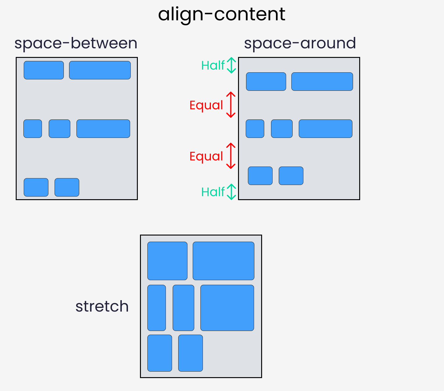

NOTE: This property only takes effect on multi-line flexible containers, where flex-wrap is set to either wrap or wrap-reverse). A single-line flexible container (i.e. where flex-wrap is set to its default value, no-wrap) will not reflect align-content.
normal(default): items are packed in their default position as if no value was set.flex-start/start: items packed to the start of the container. The (more supported)flex-starthonors theflex-directionwhilestarthonors thewriting-modedirection.flex-end/end: items packed to the end of the container. The (more support)flex-endhonors theflex-directionwhile end honors thewriting-modedirection.center: items centered in the containerspace-between: items evenly distributed; the first line is at the start of the container while the last one is at the endspace-around: items evenly distributed with equal space around each linespace-evenly: items are evenly distributed with equal space around themstretch: lines stretch to take up the remaining space.
6] Align Items
This defines the default behavior for how flex items are laid out along the CROSS AXIS on the current line. Think of it as the justify-content version for the cross-axis (perpendicular to the main-axis).

stretch(default): stretch to fill the container (still respect min-width/max-width)flex-start/start/self-start: items are placed at the start of the cross axis. The difference between these is subtle, and is about respecting theflex-directionrules or thewriting-moderules.flex-end/end/self-end: items are placed at the end of the cross axis. The difference again is subtle and is about respectingflex-directionrules vs.writing-moderules.center: items are centered in the cross-axisbaseline: items are aligned such as their baselines align
7] Gap,Row Gap & Column Gap
The gap property explicitly controls the space between flex items. It applies that spacing only between items not on the outer edges. Whereas the row-gap and column-gap properties apply gap between rows and columns of flex items,but they only work on Multiline flex-containers with multiple rows and columns.

---------------------------------------------------------------------------------------------------------------
Flexbox Items Properties
The following properties are applied to the parent flex-items inside the container.
1] Order
By default, flex items are laid out in the source order. However, the order property controls the order in which they appear in the flex container. Items with the same order revert to source order.

Example] A simple flexbox container with 3 boxes in default flex-direction of row ordered using flexbox property.

2] Flex Grow
This defines the ability for a flex item to grow if necessary. It accepts a unitless value that serves as a proportion. It dictates what amount of the available space inside the flex container the item should take up.
If all items have flex-grow set to 1, the remaining space in the container will be distributed equally to all children. If one of the children has a value of 2, that child would take up twice as much of the space either one of the others (or it will try, at least).

NOTE : Negative numbers are invalid.
Example] A simple flexbox container with 3 boxes in default flex-direction of row and first box with flex-grow of 3.

3] Flex Shrink
This property helps a flex item shrink based on the width of the flex-container. It's the opposite of flex-grow.
NOTE : Negative numbers are invalid. If you have flex-wrap property enabled,flex-shrink will not work. flex-shrink is designed to distribute negative free space in the container. In other words, it only works when flex items are big enough to overflow the container.


4] Flex
This is the shorthand for flex-grow, flex-shrink and flex-basis combined. The second and third parameters (flex-shrink and flex-basis) are optional. The default is (0 1 auto), but if you set it with a single number value, like flex: 5; then it’s like setting flex-grow: 5; flex-shrink: 1; flex-basis: 0%;.
It is recommended that you use this shorthand property rather than set the individual properties. The shorthand sets the other values intelligently.
5] Align Self
This allows the default alignment (or the one specified by align-items) to be overridden for individual flex items. It positions the selected item along the Cross Axis. See align-items to understand it better.

NOTE : The float, clear and vertical-align have no effect on a flex item.
Example] A simple flexbox container with 3 boxes inside it and the second box being aligned to cross axis start.

---------------------------------------------------------------------------------------------------------------
Useful : 1] Click 2] Grid Layouts
CSS Grid
The CSS Grid Layout is a two-dimensional grid-based layout system with rows and columns. It is useful in creating more complex and organized layouts. Flexbox is made for one-dimensional layouts, and the Grid is made for two-dimensional layouts. It means Flexbox can work on either rows or columns at a time, but Grids can work on both simultaneously.
Grid Basics
1] Grid Line
2] Grid Track
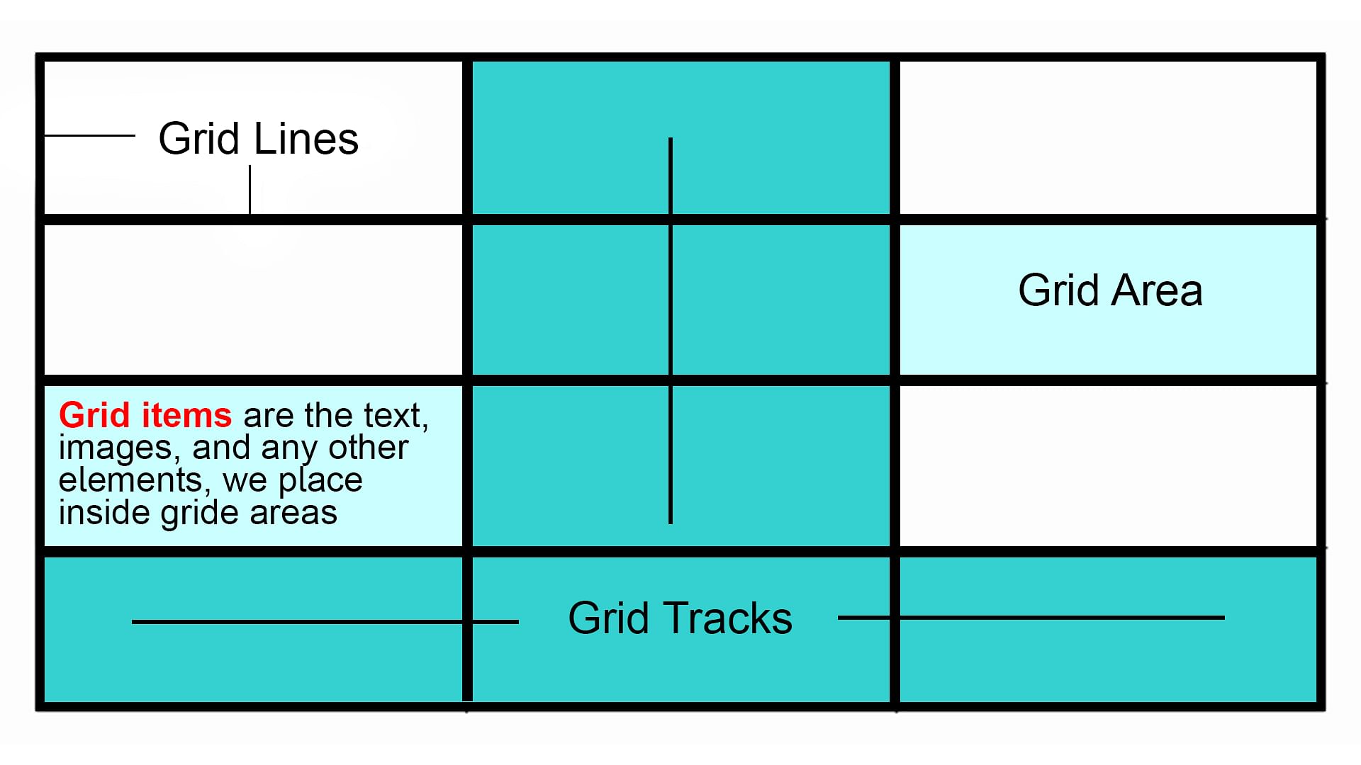
3] Grid Cell
The space between two adjacent row and two adjacent column grid lines. It’s a single “unit” of the grid. Here’s the grid cell between row grid lines 1 and 2, and column grid lines 2 and 3.

4] Grid Area
The total space surrounded by four grid lines. A grid area may be composed of any number of grid cells. Here’s the grid area between row grid lines 1 and 3, and column grid lines 1 and 3.

Just like flexbox, the CSS Grid has a container of items. The Grid provides a set of properties for both the grid container and the children inside it. Below we discuss the properties for container and the items inside it.
Display Property
Defines the element as a grid container and establishes a new grid formatting context for its contents. An HTML element becomes a grid container when its display property is set to grid or inline-grid.
grid– generates a block-level gridinline-grid– generates an inline-level grid
---------------------------------------------------------------------------------------------------------------
Grid Container Properties
The following properties are applied to the parent Grid container.
1] Grid Template Column
The grid-template-columns property defines the number of columns in your grid layout, and it defines the width of each column.
The value is a 'space-separated-list', where each value defines the width of the respective column. For Example,If you want your grid layout to contain 4 columns, specify the width of the 4 columns, or "auto" if all columns should have the same width.
Example] A simple grid with 3 columns with width 200px,250px and 275px.

Example] A simple grid with 4 columns with width 200px,250px,275px and Auto.

2] Grid Template Row
The grid-template-rows property defines the height of each row.The value is a space-separated-list, where each value defines the height of the respective row.
Example] A simple grid with 2 rows and 3 columns where each row has different height.

3] Grid Column & Row Gap
The spaces between each column/row are called gaps. These specify the size of the grid lines. You can think of it like setting the width of the gutters between the columns/rows.
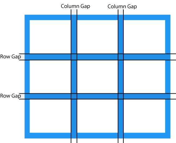
NOTE : The gutters are only created between the columns/rows, not on the outer edges.
Example] A simple 3x3 grid with gap between rows and columns.

Gap Shorthand
The gap property is a shorthand property for the row-gap and the column-gap properties
Example]
NOTE : If no row-gap is specified, it’s set to the same value as column-gap
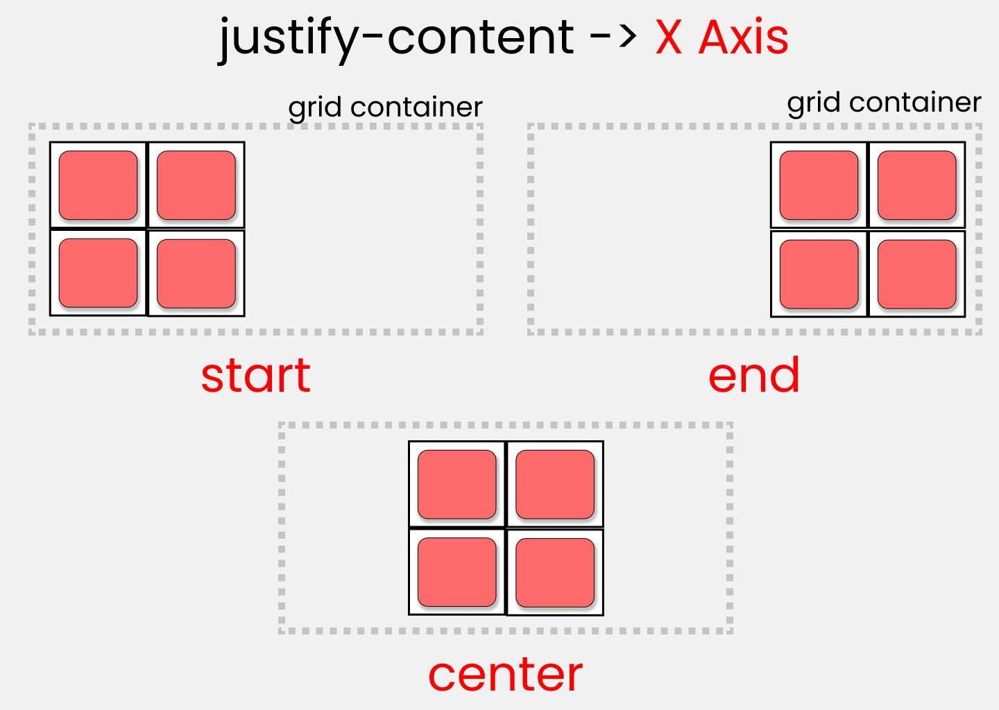
4] Justify Content
The justify-content property is used to align the whole grid inside the container. This property aligns the grid along the inline (row) axis (as opposed to align-content which aligns the grid along the block (column) axis).
NOTE : The grid's total width has to be less than the container's width for the justify-content property to have any effect.
5] Align Content
The align-content property is used to vertically align the whole grid inside the container. This property aligns the grid along the block (column) axis (as opposed to justify-content which aligns the grid along the inline (row) axis).
align-content property to have any effect.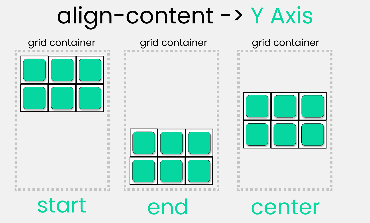
6] Justify Items
Aligns grid items along the inline (row) x-axis (as opposed to align-items which aligns along the block (column) axis). This value applies to all grid items inside the container.
Examples]


7] Align Items
Aligns grid items along the block (column) y-axis (as opposed to justify-items which aligns along the inline (row) axis). This value applies to all grid items inside the container.
Examples]


---------------------------------------------------------------------------------------------------------------
Grid Items Properties
The following properties are applied to the child Grid Items inside the container.
1] Grid Column & Row Properties
By default, a container has one grid item for each column, in each row, but you can style the grid items so that they will span multiple columns and/or rows. These are set of properties which help us position and span grid items inside the grid. Below are the following properties :
These determines a grid item’s location within the grid by referring to specific grid lines. grid-column-start/grid-row-start is the line where the item begins at the column/row axis, and grid-column-end/grid-row-end is the line where the item ends at column/row axis.
NOTE : The value of each property is either a 'grid line number' or 'span value' which defines the number of rows/columns to span.
Examples]


Examples] In the below example we span the first grid-item to take space of 2 columns.

Grid-Column & Grid-Row
The grid-column property is a shorthand property for the grid-column-start and the grid-column-end properties. The grid-row property is a shorthand property for the grid-row-start and the grid-row-end properties.
<start-line>/<end-line>– each one accepts a grid line number or a span value.
Example]

Examples] In the below example we span the first grid-item to take space of 2 columns.
2] Justify Self
Aligns a grid item inside a cell along the inline (row) x-axis (as opposed to align-self which aligns along the block (column) axis). This value applies to a grid item inside a single cell.
Examples]


3] Align Self
Aligns a grid item inside a cell along the block (column) y-axis (as opposed to justify-self which aligns along the inline (row) axis). This value applies to the content inside a single grid item.
Examples]


4] Order
The order CSS property sets the order to lay out an item in a flex or grid container. Items in a container are sorted by ascending order value and then by their source code order.
Examples] We change the order of the grid items.

---------------------------------------------------------------------------------------------------------------
Scroll Based Animations : 1] Click
CSS Animations
In this part we'll learn about CSS animations.
2D Transforms
CSS transforms allow you to move, rotate, scale, and skew elements,which come very handy in order to make animations. With the CSS transform property you can use the following 2D transformation methods:
translate()rotate()scaleX()scaleY()scale()skewX()skewY()skew()matrix()
1] Translate()
The translate() method moves an element from its current position (according to the parameters given for the X-axis and the Y-axis). The following example moves the <div> element 50 pixels to the right, and 100 pixels down from its current position:
Example]
div {
transform: translate(50px, 100px); /* 50px right and 100px down */
}
div {
transform: translate(50px, 100px); /* 50px right and 100px down */
}2] Rotate()
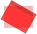
The rotate() method rotates an element clockwise or counter-clockwise according to a given degree. Using negative values will rotate the element counter-clockwise.
Example]
div {
transform: rotate(20deg);
}
div {
transform: rotate(20deg);
}3] Scale()
The scale() method increases or decreases the size of an element (according to the parameters given for the width and height).
The following example increases the <div> element to be two times of its original width, and three times of its original height:
Example]
div {
transform: scale(2, 3); /* 2x width , 3x height */
}The scaleX() method increases or decreases the width of an element and the scaleY() method increases or decreases the height of an element.
div {
transform: scale(2, 3); /* 2x width , 3x height */
}scaleX() method increases or decreases the width of an element and the scaleY() method increases or decreases the height of an element.4] Skew()
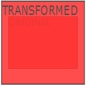
The skew() method skews an element along the X and Y-axis by the given angles.
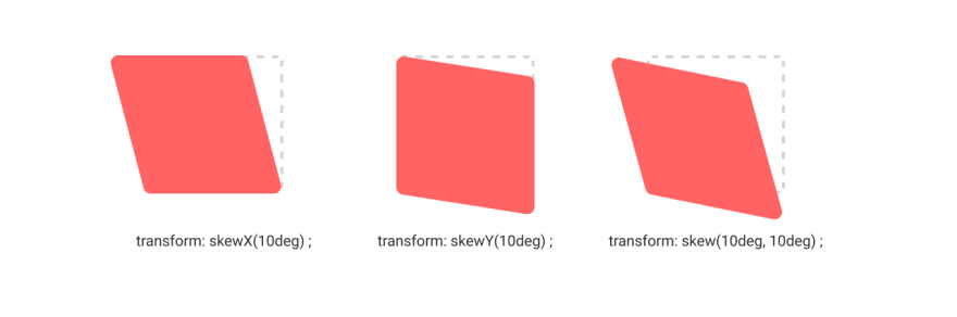
The following example skews the <div> element 20 degrees along the X-axis, and 10 degrees along the Y-axis:
Example]
div {
transform: skew(20deg, 10deg);
}The skewX() method skews an element along the X-axis by the given angle and the skewY() method skews an element along the Y-axis by the given angle.
div {
transform: skew(20deg, 10deg);
}skewX() method skews an element along the X-axis by the given angle and the skewY() method skews an element along the Y-axis by the given angle.5] Matrix()
The matrix() method combines all the 2D transform methods into one. The matrix() method take six parameters, containing mathematic functions, which allows you to rotate, scale, move (translate), and skew elements.
Syntax : matrix(scaleX(),skewY(),skewX(),scaleY(),translateX(),translateY())
Example]
div {
transform: matrix(1, -0.3, 0, 1, 0, 0);
}
div {
transform: matrix(1, -0.3, 0, 1, 0, 0);
}3D Transforms
The CSS 3D transforms facilitates you to move an element to X-axis, Y-axis and Z-axis. Following is a list of 3D transforms methods:
| Function | Description |
|---|---|
| matrix3D(n,n,n,n,n,n,n,n,n,n,n,n,n,n,n,n) | It specifies a 3D transformation, using a 4x4 matrix of 16 values. |
| translate3D(x,y,z) | It specifies a 3D translation. |
| translateX(x) | It specifies 3D translation, using only the value for the X-axis. |
| translateY(y) | It specifies 3D translation, using only the value for the Y-axis. |
| translateZ(z) | It specifies 3D translation, using only the value for the Z-axis. |
| scale3D(x,y,z) | It specifies 3D scale transformation |
| scaleX(x) | It specifies 3D scale transformation by giving a value for the X-axis. |
| scaley(y) | It specifies 3D scale transformation by giving a value for the Y-axis. |
| scaleZ(z) | It specifies 3D scale transformation by giving a value for the Z-axis. |
| rotate3D(X,Y,Z,angle) | It specifies 3D rotation along with X-axis, Y-axis and Z-axis. |
| rotateX(angle) | It specifies 3D rotation along with X-axis. |
| rotateY(angle) | It specifies 3D rotation along with Y-axis. |
| rotateZ(angle) | It specifies 3D rotation along with Z-axis. |
| perspective(n) | It specifies a perspective view for a 3D transformed element. |
Rotate3D
The rotate3d() CSS function defines a transformation that rotates an element around a fixed axis in 3D space, without deforming it.
The amount of rotation created by rotate3d() is specified by three numbers and one <angle>. The numbers represent the x-, y-, and z-coordinates of the vector denoting the axis of rotation. The <angle> represents the angle of rotation; if positive, the movement will be clockwise; if negative, it will be counter-clockwise.
This function accepts four parameters as mentioned above and described below:
- x: It holds a number denoting the x-coordinate. Its value lies between 0 to 1.
- y: It holds a number denoting the y-coordinate. Its value lies between 0 to 1.
- z: It holds a number denoting the z-coordinate. Its value lies between 0 to 1.
- angle: It holds the angle of rotation. The positive angle represents a clockwise rotation and a negative angle represents a counter-clockwise rotation.
NOTE : The rotate3D() function is often combined with transform or keyframe properties to create 3D transitions and animations.
---------------------------------------------------------------------------------------------------------------
CSS Transitions
CSS transitions allows you to change property values smoothly, over a given duration.
1] Transition Property
To create a transition effect, you must specify two things:
- the CSS property (eg- width) you want to add an effect to
- the duration of the effect
NOTE: If the duration part is not specified, the transition will have no effect, because the default value is 0.
The following example shows a 100px * 100px red <div> element. The <div> element has also specified a transition effect for the width property, with a duration of 2 seconds:
Example
div {
width: 100px;
height: 100px;
background: red;
transition: width 2s;
}
div {
width: 100px;
height: 100px;
background: red;
transition: width 2s;
}NOTE: The transition effect will start when the specified CSS property (eg-width) changes value.
NOTE: The transition property is shorthand for transition-property and transition-duration
Now, let us specify a new value for the width property when a user mouses over the <div> element:
Example]
div:hover {
width: 300px;
}Examples] The width and height changes with transition as we hover over the div.
<!DOCTYPE html><html lang="en"> <head> <title>Document</title> <style> .div1 { display: inline-block; background: rgb(92, 209, 255); height: 150px; width: 150px;
font-size: 15px; font-family: Arial, Helvetica, sans-serif; color: aliceblue; display: flex; align-items: center; justify-content: center;
/* Specify transition properties & duration */ /* Transition triggers when width or height changes */ transition: width 2s, height 4s; }
.div1:hover { height: 250px; width: 250px; background: rgb(255, 92, 92); } </style> <script></script> </head> <body> <div class="div1">BOX</div> </body></html>
div:hover {
width: 300px;
}2] Transition Timing
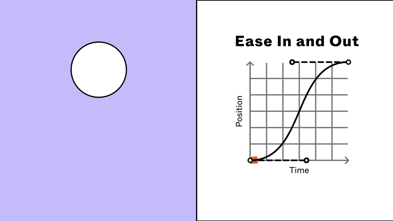
The transition-timing-function property specifies the speed curve of the transition effect. The transition-timing-function property can have the following values:
ease- specifies transition effect with slow start, then fast, then end slowly ( default)linear- specifies a transition effect with the same speed from start to endease-in- specifies a transition effect with a slow startease-out- specifies a transition effect with a slow endease-in-out- specifies a transition effect with a slow start and endcubic-bezier(n,n,n,n)- lets you define your own values in a cubic-bezier function
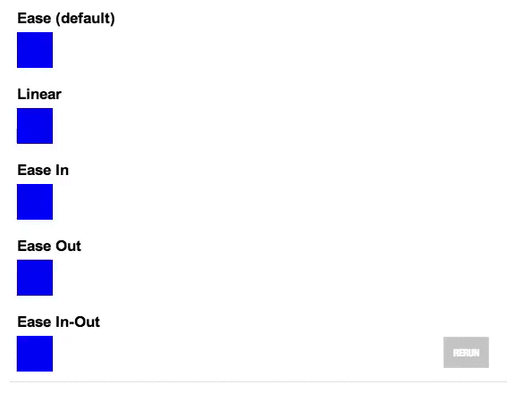
The following example shows some of the different speed curves that can be used:
Example]
#div1 {transition-timing-function: linear;}
#div2 {transition-timing-function: ease;}
#div3 {transition-timing-function: ease-in;}
#div4 {transition-timing-function: ease-out;}
#div5 {transition-timing-function: ease-in-out;}
#div1 {transition-timing-function: linear;}
#div2 {transition-timing-function: ease;}
#div3 {transition-timing-function: ease-in;}
#div4 {transition-timing-function: ease-out;}
#div5 {transition-timing-function: ease-in-out;}3] Transition Delay
The transition-delay property specifies a delay (in seconds) for the transition effect to start. The following example has a 2 second delay before starting:
Example]
div {
transition-delay: 2s;
}
div {
transition-delay: 2s;
}4] Transformation with Transition
You can also add transition effect to the transform methods. Whenever the transform property is triggered,it also triggers the effect here.
Examples] The box rotates 360 degree with spinning effect.
---------------------------------------------------------------------------------------------------------------
Useful : 1] Click
CSS Animations
CSS allows animation of HTML elements without using JavaScript. An animation lets an element gradually change from one style to another.You can change as many CSS properties you want, as many times as you want.
1] Keyframes
To use CSS animation, you must first specify some keyframes for the animation. Keyframes hold what styles the element will have at certain times.
When you specify CSS styles inside the @keyframes rule, the animation will gradually change from the current style to the new style at certain times. We specify when the style change will happen in percent or keywords "from" and "to", which is the same as 0% and 100%. 0% is the beginning of the animation, 100% is when the animation is complete.
Examples] The following example binds the "example" animation to the <div> element. The animation will last for 4 seconds, and it will gradually change the background-color of the <div> element from "red" to "yellow":
Example]
/* The animation code */
@keyframes example {
from {background-color: red;}
to {background-color: yellow;}
}
/* The element to apply the animation to */
div {
width: 100px;
height: 100px;
background-color: red;
animation-name: example;
animation-duration: 4s;
}
/* The animation code */
@keyframes example {
from {background-color: red;}
to {background-color: yellow;}
}
/* The element to apply the animation to */
div {
width: 100px;
height: 100px;
background-color: red;
animation-name: example;
animation-duration: 4s;
}NOTE: The animation-duration property defines how long an animation should take to complete. If the animation-duration property is not specified, no animation will occur, because the default value is 0s (0 seconds).
In the example above we have specified when the style will change by using the keywords "from" and "to" (which represents 0% (start) and 100% (complete)).
It is also possible to use percent. By using percent, you can add as many style changes as you like. The following example will change the background-color of the <div> element when the animation is 25% complete, 50% complete, and again when the animation is 100% complete:
Example]
/* The animation code */
@keyframes example {
0% {background-color: red;}
25% {background-color: yellow;}
50% {background-color: blue;}
100% {background-color: green;}
}
/* The element to apply the animation to */
div {
width: 100px;
height: 100px;
background-color: red;
animation-name: example;
animation-duration: 4s;
}Examples] The below animation moves the box forward in right direction with 3D rotation along the Y-axis and changing color at different points.
<!DOCTYPE html><html lang="en"> <head> <title>Document</title> <style> .div1 { display: inline-block; background: rgb(92, 209, 255); height: 150px; width: 150px;
font-size: 15px; font-family: Arial, Helvetica, sans-serif; color: aliceblue; display: flex; align-items: center; justify-content: center; border-radius: 10px;
/* Specify animation & duration */ animation-name: div-Animation; animation-duration: 3s; }
@keyframes div-Animation { from { margin-left: 0px;
/* Rotating 3D on the Y-axis */ transform: rotate3d(0, 1, 0, 360deg); }
20% { background: rgb(88, 76, 255); }
40% { background: rgb(255, 76, 76); }
60% { background: rgb(92, 255, 228); }
80% { background: rgb(234, 255, 113); }
to { margin-left: 60%; } } </style> <script></script> </head> <body> <div class="div1">BOX</div> </body></html>
/* The animation code */
@keyframes example {
0% {background-color: red;}
25% {background-color: yellow;}
50% {background-color: blue;}
100% {background-color: green;}
}
/* The element to apply the animation to */
div {
width: 100px;
height: 100px;
background-color: red;
animation-name: example;
animation-duration: 4s;
}2] Animation Delay
The animation-delay property specifies a delay for the start of an animation.
The following example has a 2 seconds delay before starting the animation:
Example]
div {
width: 100px;
height: 100px;
position: relative;
background-color: red;
animation-name: example;
animation-duration: 4s;
animation-delay: 2s;
}
div {
width: 100px;
height: 100px;
position: relative;
background-color: red;
animation-name: example;
animation-duration: 4s;
animation-delay: 2s;
}NOTE : Negative values are also allowed. If using negative values, the animation will start as if it had already been playing for N seconds.
In the following example, the animation will start as if it had already been playing for 2 seconds:
Example]
div {
width: 100px;
height: 100px;
position: relative;
background-color: red;
animation-name: example;
animation-duration: 4s;
animation-delay: -2s;
}
div {
width: 100px;
height: 100px;
position: relative;
background-color: red;
animation-name: example;
animation-duration: 4s;
animation-delay: -2s;
}3] Animation Iteration Count
The animation-iteration-count property specifies the number of times an animation should run.
The following example will run the animation 3 times before it stops:
Example]
div {
width: 100px;
height: 100px;
position: relative;
background-color: red;
animation-name: example;
animation-duration: 4s;
animation-iteration-count: 3;
}
div {
width: 100px;
height: 100px;
position: relative;
background-color: red;
animation-name: example;
animation-duration: 4s;
animation-iteration-count: 3;
}4] Animation direction
The animation-direction property specifies whether an animation should be played forwards, backwards or in alternate cycles. The animation-direction property can have the following values:
normal- The animation is played as normal (forwards). This is defaultreverse- The animation is played in reverse direction (backwards)alternate- The animation is played forwards first, then backwardsalternate-reverse- The animation is played backwards first, then forwards
NOTE : In order to run the animation in alternate or reverse-alternate direction, the iteration count should be atleast 2.
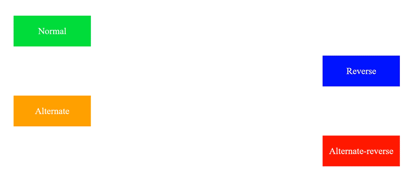
The following example uses the value "alternate" to make the animation run forwards first, then backwards:
Example]
div {
width: 100px;
height: 100px;
position: relative;
background-color: red;
animation-name: example;
animation-duration: 4s;
animation-iteration-count: 2;
animation-direction: alternate;
}
div {
width: 100px;
height: 100px;
position: relative;
background-color: red;
animation-name: example;
animation-duration: 4s;
animation-iteration-count: 2;
animation-direction: alternate;
}5] Animation timing
The animation-timing-function property specifies the speed curve of the animation.The animation-timing-function property can have the following values:
ease- Specifies an animation with a slow start, then fast, then end slowly (this is default)linear- Specifies an animation with the same speed from start to endease-in- Specifies an animation with a slow startease-out- Specifies an animation with a slow endease-in-out- Specifies an animation with a slow start and endcubic-bezier(n,n,n,n)- Lets you define your own values in a cubic-bezier function
The following example shows some of the different speed curves that can be used:
Example]
#div1 {animation-timing-function: linear;}
#div2 {animation-timing-function: ease;}
#div3 {animation-timing-function: ease-in;}
#div4 {animation-timing-function: ease-out;}
#div5 {animation-timing-function: ease-in-out;}
#div1 {animation-timing-function: linear;}
#div2 {animation-timing-function: ease;}
#div3 {animation-timing-function: ease-in;}
#div4 {animation-timing-function: ease-out;}
#div5 {animation-timing-function: ease-in-out;}6] Animation Shorthand
The animation property is a shorthand property for:
- animation-name
- animation-duration
- animation-timing-function
- animation-delay
- animation-iteration-count
- animation-direction
- animation-fill-mode
- animation-play-state
Syntax :
animation: name duration timing-function delay iteration-count direction fill-mode play-state;
NOTE: Always specify the animation-duration property, otherwise the duration is 0, and will never be played.
The example below uses six of the animation properties:
Example]
div {
animation-name: example;
animation-duration: 5s;
animation-timing-function: linear;
animation-delay: 2s;
animation-iteration-count: infinite;
animation-direction: alternate;
}
div {
animation-name: example;
animation-duration: 5s;
animation-timing-function: linear;
animation-delay: 2s;
animation-iteration-count: infinite;
animation-direction: alternate;
}The same animation effect as above can be achieved by using the shorthand animation property:
Example]
div {
animation: example 5s linear 2s infinite alternate;
}
div {
animation: example 5s linear 2s infinite alternate;
}7] Trigger Animation on Interaction
By default all animations trigger on page load,but we can control that by using classes. We can control when the animation is played by adding the animation properties to a separate class than the class used to style the element. We then add the animation class to the element dynamically using javascript.
NOTE : The only time the CSS animation will trigger is when theanimation class is added, not removed.Examples] The box moves when the class is added.

<!DOCTYPE html><html lang="en"> <head> <title>CSS Animations</title> <style> #div1 { display: inline-block; background: rgb(92, 209, 255); height: 150px; width: 150px;
font-size: 15px; font-family: Arial, Helvetica, sans-serif; color: aliceblue; display: flex; align-items: center; justify-content: center; border-radius: 10px; }
@keyframes div-Animation { from {margin-left: 0px; /* Rotating 3D on the Y-axis */ transform: rotate3d(0, 1, 0, 360deg);} 20% {background: rgb(88, 76, 255);} 40% {background: rgb(255, 76, 76); } 60% {background: rgb(92, 255, 228);} 80% {background: rgb(234, 255, 113);} to {margin-left: 50%;} }
.box-animation { /* Specify animation & duration */ animation-name: div-Animation; animation-duration: 3s; }
</style> <script>
function addClass(){ var element = document.getElementById("div1"); element.classList.add("box-animation"); console.log("Classes : ",element.classList) }
function removeClass(){ var element = document.getElementById("div1"); element.classList.remove("box-animation"); console.log("Classes : ",element.classList) }
</script> </head> <body> <div id="div1">BOX</div> <button style="padding: 10px;margin-top: 20px;" onclick="addClass()"> ADD CLASS </button> <button style="padding: 10px; margin-left: 10px;" onclick="removeClass()"> REMOVE CLASS </button> </body></html>
animation class is added, not removed.Examples] The box moves when the class is added.
8] Trigger Animation on Scroll View (Useful : 1] Click)
We've created a CSS animation and can trigger it by adding the class to our element. Instead of adding and removing the class when a button is clicked, we can add it when the element is scrolled into view.
There are 3 ways to determine when the element is scrolled into view:
- Use the Intersection Observer API
- Measure the element's offset when the user scrolls
- Use a third-party JavaScript library that implements #1 or #2
The Intersection Observer API lets you keep track of when one element intersects with an another and tells you when that happens. That's perfect for triggering a CSS animation on scroll. We want to know when our square/element intersects with the viewport. If it is intersecting, that means the square is in view and we should trigger our animation.
If you're familiar with event listeners in JavaScript, you can think of Intersection Observer as a fancy event listener with some extra options. Instead of attaching an event listener to an element, we tell the observer to keep track of the element and where it is on the page.Let's start by creating an observer and have it keep track of our square :
// Create the observer
const observer = new IntersectionObserver(entries => {
  // We will fill in the callback later...
});

// Tell the observer which elements to track
observer.observe(document.querySelector('.square'));
By default, the root element that will be checked for intersection is the browser viewport, so we only need to tell the observer about our square.
When the callback function runs, it gives us an entries array of the target elements we asked it to watch, plus some additional information about them. It will always hand back an array, even if you only observe one element like we are here.
In the callback, we can loop over the array of entries to specify what we want to do. Each entry has an isIntersecting property that will be true or false. If it's true, that means the element is visible within the viewport.
entries.forEach(entry => {
  if (entry.isIntersecting) {
    // It's visible. Add the animation class here!
  }
});
Let's put it all together. Note that entry is the object given to us by the observer and entry.target is the actual element that we are observing, so that's where we should apply the class.
const observer = new IntersectionObserver(entries => {
  // Loop over the entries
  entries.forEach(entry => {
    // If the element is visible
    if (entry.isIntersecting) {
      // Add the animation class
      entry.target.classList.add('square-animation');
    }
  });
});

observer.observe(document.querySelector('.square'));
Now when the square is intersecting with the viewport, the animation class will be added, which will play the animation.
NOTE : If the element you are animating changes size or position, it can be tricky for the browser to decide if the element is currently in or out of the viewport. It's best to wrap the element you want to animate in an element that won't change size or position and use that one for your observer instead of the element you are animating.
<div class="square-wrapper">
  <div class="square"></div>
</div>
NOTE : The animation above triggers only once when the element becomes visible .If you want the animation to play every time the element enters the viewport, you need to remove the animation class when the element is no longer intersecting.
We can remove the class from the square so that the animation will restart next time it is scrolled into view.
const observer = new IntersectionObserver(entries => {
  entries.forEach(entry => {
    const square = entry.target.querySelector('.square');

    if (entry.isIntersecting) {
      square.classList.add('square-animation');
	  return; // if we added the class, exit the function
    }

    // We're not intersecting, so remove the class!
    square.classList.remove('square-animation');
  });
});

observer.observe(document.querySelector('.square-wrapper'));
Now the square will animate every time the wrapper element enters the viewport.
Example] The box-animation class is added when the element is inside the viewport and removed when it is out of the visible screen.
main.html
<!DOCTYPE html><html lang="en"> <head> <title>CSS Animations</title> <style> .square { /* Increase height of document */ margin-top: 1000px;
display: inline-block; background: rgb(92, 209, 255); height: 150px; width: 150px;
font-size: 15px; font-family: Arial, Helvetica, sans-serif; color: aliceblue; display: flex; align-items: center; justify-content: center; border-radius: 10px; }
@keyframes div-Animation { from { margin-left: 0px; /* Rotating 3D on the Y-axis */ transform: rotate3d(0, 1, 0, 360deg); } 20% { background: rgb(88, 76, 255); } 40% { background: rgb(255, 76, 76); } 60% { background: rgb(92, 255, 228); } 80% { background: rgb(234, 255, 113); } to { margin-left: 50%; } }
.square-animation { /* Specify animation & duration */ animation-name: div-Animation; animation-duration: 3s; animation-iteration-count: 2; animation-direction: alternate; } </style>
<!-- The 'async' is important --> <script src="main.js" async></script> </head> <body> <div class="square-container"> <div class="square">BOX</div> </div> </body></html>
main.js
// Reference the element to add animation and its containerconst square = document.querySelector(".square");const square_container = document.querySelector(".square-container");
const observer = new IntersectionObserver((entries) => { entries.forEach((entry) => { // If the Intersecting element is same as // observing element,add animation class if (entry.isIntersecting) { if (entry.target.className == "square-container") { // Add the animation class to element square.classList.add("square-animation"); return; } }
// We're not intersecting, so remove the class! square.classList.remove("square-animation"); });});
// Add the element to observe for scroll viewobserver.observe(square_container);
We've created a CSS animation and can trigger it by adding the class to our element. Instead of adding and removing the class when a button is clicked, we can add it when the element is scrolled into view.
There are 3 ways to determine when the element is scrolled into view:
- Use the Intersection Observer API
- Measure the element's offset when the user scrolls
- Use a third-party JavaScript library that implements #1 or #2
Let's start by creating an observer and have it keep track of our square :
// Create the observer
const observer = new IntersectionObserver(entries => {
// We will fill in the callback later...
});
// Tell the observer which elements to track
observer.observe(document.querySelector('.square'));By default, the root element that will be checked for intersection is the browser viewport, so we only need to tell the observer about our square.
When the callback function runs, it gives us an entries array of the target elements we asked it to watch, plus some additional information about them. It will always hand back an array, even if you only observe one element like we are here.
In the callback, we can loop over the array of entries to specify what we want to do. Each entry has an isIntersecting property that will be true or false. If it's true, that means the element is visible within the viewport.
entries.forEach(entry => {
if (entry.isIntersecting) {
// It's visible. Add the animation class here!
}
});Let's put it all together. Note that entry is the object given to us by the observer and entry.target is the actual element that we are observing, so that's where we should apply the class.
const observer = new IntersectionObserver(entries => {
// Loop over the entries
entries.forEach(entry => {
// If the element is visible
if (entry.isIntersecting) {
// Add the animation class
entry.target.classList.add('square-animation');
}
});
});
observer.observe(document.querySelector('.square'));Now when the square is intersecting with the viewport, the animation class will be added, which will play the animation.
NOTE : If the element you are animating changes size or position, it can be tricky for the browser to decide if the element is currently in or out of the viewport. It's best to wrap the element you want to animate in an element that won't change size or position and use that one for your observer instead of the element you are animating.
<div class="square-wrapper">
<div class="square"></div>
</div>NOTE : The animation above triggers only once when the element becomes visible .If you want the animation to play every time the element enters the viewport, you need to remove the animation class when the element is no longer intersecting.
We can remove the class from the square so that the animation will restart next time it is scrolled into view.
const observer = new IntersectionObserver(entries => {
entries.forEach(entry => {
const square = entry.target.querySelector('.square');
if (entry.isIntersecting) {
square.classList.add('square-animation');
return; // if we added the class, exit the function
}
// We're not intersecting, so remove the class!
square.classList.remove('square-animation');
});
});
observer.observe(document.querySelector('.square-wrapper'));Now the square will animate every time the wrapper element enters the viewport.
Example] The box-animation class is added when the element is inside the viewport and removed when it is out of the visible screen.
main.html
main.js
---------------------------------------------------------------------------------------------------------------
Bezier Curve (Useful : 1] Click)
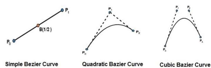
A Bezier curve is a mathematically defined curve used in two-dimensional graphic applications. The curve is defined by 4 points: the initial position and the terminating position (which are called "anchors") and two separate middle points (which are called "handles").Bézier curves are widely used in computer graphics to model smooth curves.
There are different types of bezier curves,some fundamental curves are below :
- Linear Bezier Curve (2 points)
- Quadratic Bezier Curve (3 points)
- Cubic Bezier Curve (4 points)
We use bezier curves in CSS to create custom time functions for animations and also to move objects in curved paths.
1] Cubic-Bezier()
The cubic-bezier() function defines a Cubic Bezier curve. A cubic Bézier function defined by four real numbers that specify the two control points, P1 and P2, of a cubic Bézier curve whose end points P0 and P3 are fixed at (0, 0) and (1, 1) respectively. The x coordinates of P1 and P2 are restricted to the range [0, 1].
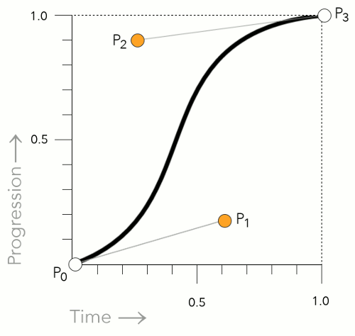
The cubic-bezier() function can be used with the animation-timing-function property and the transition-timing-function property.
NOTE : You can create your own cubic bezier curve to define in your transitions at https://www.cssportal.com/css-cubic-bezier-generator/
Examples] The below animation moves the box with custom timing function made with cubic bezier function.
---------------------------------------------------------------------------------------------------------------


Comments
Post a Comment