Useful : 1] Click
NOTE : Material UI is heavily based on styled-components,so you must know about the styled-components react library before you move forward.
Material-UI is simply a library that allows us to import and use different components to create a user interface in our React applications. This saves a significant amount of time since the developers do not need to write everything from scratch. Material-UI widgets are heavily inspired by Google’s principles on building user interfaces. It is, therefore, easy for developers to build visually-appealing applications.
In 2021 the Mui team released version 5 of Material-ui . they made some changes in this version,some major ones are below :
They renamed @material-ui/core to @mui/materialThey renamed @material-ui/lab to @mui/labThey renamed @material-ui/icons to @mui/icons-material- Now we also need to install the
@emotion for the style as they deprecated their styles APIS like makeStyle and move to @mui/system lib.
$ yarn add @mui/system @emotion/react @emotion/styled
# NPM
$ npm i @mui/system @emotion/react @emotion/styled
NOTE : Whenever using MUI components,try to read their API documentation.
NOTE : Some note worthy components in MUI are listed below :
- Tooltip
- Drawer
- Backdrop
- "Skeleton"
- Snackbar
- ImageList
- Mansory
---------------------------------------------------------------------------------------------------------------
MUI Buttons
import "./App.css";
import SaveIcon from '@mui/icons-material/Save';
import Stack from '@mui/material/Stack';
import Button from '@mui/material/Button';
function App() {
return (
<Stack spacing={2} direction="row" id="stack">
<Button variant="text">Text Button</Button>
<Button variant="contained">Contained Button</Button>
<Button variant="outlined">Outlined Button</Button>
<Button variant="contained"
endIcon={<SaveIcon/>}> Icon Button </Button>
<Button variant="contained"
style={{backgroundColor:"#54BAB9"}}>Colored Button</Button>
</Stack>
);
}
export default App;
Floating Action Buttons
import "./App.css";
import Stack from '@mui/material/Stack';
import Fab from '@mui/material/Fab';
import AddIcon from '@mui/icons-material/Add';
import EditIcon from '@mui/icons-material/Edit';
function App() {
return (
<Stack spacing={2} direction="row" id="stack">
<Fab color="primary" variant="circular">
<AddIcon />
</Fab>
<Fab color="secondary" variant="extended" onClick={()=>{alert("Hello !")}}>
<EditIcon />
<p> Edit Icon</p>
</Fab>
</Stack>
);
}
export default App;
Select Widget
import "./App.css";
import * as React from 'react';
import InputLabel from '@mui/material/InputLabel';
import MenuItem from '@mui/material/MenuItem';
import FormControl from '@mui/material/FormControl';
import Select from '@mui/material/Select';
function App() {
const [age, setAge] = React.useState('');
return (
<div className="container">
<FormControl minWidth="200">
<InputLabel id="simple-select-label">Select Age</InputLabel>
<Select
labelId="simple-select-label"
id="simple-select"
value={age}
label="Select Your Age"
onChange={(event)=>{setAge(event.target.value);}}>
<MenuItem value={10}>Ten</MenuItem>
<MenuItem value={20}>Twenty</MenuItem>
<MenuItem value={30}>Thirty</MenuItem>
<MenuItem value={40}>Fourty</MenuItem>
<MenuItem value={50}>Fifty</MenuItem>
</Select>
<p> SELECTED VALUE : {age}</p>
</FormControl>
</div>
);
}
export default App;
Slider
import "./App.css";
import * as React from 'react';
import Box from '@mui/material/Box';
import Stack from '@mui/material/Stack';
import Slider from '@mui/material/Slider';
import VolumeDown from '@mui/icons-material/VolumeDown';
import VolumeUp from '@mui/icons-material/VolumeUp';
function App() {
const [value, setValue] = React.useState(100);
return (
<div className="container">
<Box sx={{ width: 400 }}>
<Stack spacing={2} direction="row" alignItems="center">
<VolumeDown />
<Slider value={value} min={0} max={1000}
onChange={(event,newValue)=>{setValue(newValue);}} />
<VolumeUp />
</Stack>
<p> Slider Value : {value} </p>
</Box>
</div>
);
}
export default App;
Toggle Button
import "./App.css";
import * as React from 'react';
import FormatBoldIcon from '@mui/icons-material/FormatBold';
import FormatItalicIcon from '@mui/icons-material/FormatItalic';
import StrikethroughSIcon from '@mui/icons-material/StrikethroughS';
import ToggleButton from '@mui/material/ToggleButton';
import ToggleButtonGroup from '@mui/material/ToggleButtonGroup';
function App() {
const [alignment, setAlignment] = React.useState('strike');
return (
<div className="container">
<ToggleButtonGroup
color="primary"
value={alignment}
onChange={(event,newAlignment)=>{setAlignment(newAlignment);}}
aria-label="text alignment"
>
<ToggleButton value="bold" aria-label="left aligned">
<FormatBoldIcon />
</ToggleButton>
<ToggleButton value="italic" aria-label="centered">
<FormatItalicIcon />
</ToggleButton>
<ToggleButton value="strike" aria-label="right aligned">
<StrikethroughSIcon />
</ToggleButton>
</ToggleButtonGroup>
</div>
);
}
export default App;
ImageList

import "./App.css";
import * as React from "react";
import ImageList from "@mui/material/ImageList";
import ImageListItem from "@mui/material/ImageListItem";
function App() {
return (
<div className="container">
<ImageList sx={{ width: 500, height: 500 }} cols={4} rowHeight={164}>
{itemData.map((item) => (
<ImageListItem key={item.img}>
<img
src={`${item.img}?w=164&h=164&fit=crop&auto=format`}
srcSet={`${item.img}?w=164&h=164&fit=crop&auto=format&dpr=2 2x`}
alt={item.title}
loading="lazy"
/>
</ImageListItem>
))}
</ImageList>
</div>
);
}
const itemData = [
{
img: "https://images.unsplash.com/photo-1551963831-b3b1ca40c98e",
title: "Breakfast",
},
{
img: "https://images.unsplash.com/photo-1551782450-a2132b4ba21d",
title: "Burger",
},
{
img: "https://images.unsplash.com/photo-1522770179533-24471fcdba45",
title: "Camera",
},
{
img: "https://images.unsplash.com/photo-1444418776041-9c7e33cc5a9c",
title: "Coffee",
},
{
img: "https://images.unsplash.com/photo-1533827432537-70133748f5c8",
title: "Hats",
},
{
img: "https://images.unsplash.com/photo-1558642452-9d2a7deb7f62",
title: "Honey",
},
{
img: "https://images.unsplash.com/photo-1516802273409-68526ee1bdd6",
title: "Basketball",
},
{
img: "https://images.unsplash.com/photo-1518756131217-31eb79b20e8f",
title: "Fern",
},
{
img: "https://images.unsplash.com/photo-1597645587822-e99fa5d45d25",
title: "Mushrooms",
},
{
img: "https://images.unsplash.com/photo-1567306301408-9b74779a11af",
title: "Tomato basil",
},
{
img: "https://images.unsplash.com/photo-1471357674240-e1a485acb3e1",
title: "Sea star",
},
{
img: "https://images.unsplash.com/photo-1589118949245-7d38baf380d6",
title: "Bike",
},
];
export default App;
Date Picker
Read the MUI Documentation for proper setup instructions.
import "./App.css";
import * as React from "react";
import DateAdapter from '@mui/lab/AdapterDateFns';
import LocalizationProvider from '@mui/lab/LocalizationProvider';
import DatePicker from '@mui/lab/DatePicker';
import TextField from '@mui/material/TextField';
function App() {
const [value, setValue] = React.useState(null);
return (
<div className="container">
<LocalizationProvider dateAdapter={DateAdapter}>
<DatePicker
label="Select Date"
value={value}
onChange={(newValue) => {
setValue(newValue);
}}
renderInput={(params) => <TextField {...params} />}
/>
</LocalizationProvider>
</div>
);
}
export default App;
---------------------------------------------------------------------------------------------------------------
Useful : 1] Click
MUI Component Styling
Material-UI v4 relied on JSS and the makeStyles hook for styling its components. MUI v5 now has migrated to 2 options for styling its components :
The styled API creates a new component that can easily be exported, and usage of the component is very clean with less inline prop code. The sx prop is a superset of CSS that include built-in shorthands (i.e. mt={2} sets margin-top) The SX and Styled API both offer unique abstractions that simplify your code. sx requires less code to do more styling, while styled offers simplified reusability.
NOTE : One advantage of Styled API over SX prop is that, we can write regular CSS inside Javascript whereas in SX prop we have to follow the system properties to style the component.
Styled API
There are many CSS-in-JSS style libraries like Emotion and Styled-components library. All MUI components are built using such libraries. By default MUI components comes with Emotion as their style engine,but you can also configure your app to use styled-components library instead.
Most developers should use the MUI-recommended approach, which is the styled() API that wraps emotion.
- This avoids having to configure
package.json dependencies and tsconfig.json. - The styling syntax is identical and the MUI documentation directs users to the same guide for both emotion and styled-components.
The simplest import for the styled() emotion wrapper :
import { styled } from "@mui/system"
NOTE : The Styled API is also passed the Theme object in the current React context,this is particulary useful when using MUI breakpoints.
Example] Below we create a new stylized button using Styled API. See that we can use Style API and SX prop at the same time.
import "./App.css";
import * as React from "react";
import Button from "@mui/material/Button"
import { styled } from "@mui/system"
// Styling default MUI button
const FancyButton = styled(Button)(({ theme }) => ({
backgroundColor: "#ff0000",
fontSize: 30,
fontWeight: "bolder"
}));
export default function App() {
return(
<>
<FancyButton variant="contained" sx={{mx:10,my:10}}>
Styled Button
</FancyButton>
<Button variant="contained"> Standard Button</Button>
</>
)
}
We can also rather than getting a theme, get the component props. In below example we change button color by passed prop.
import "./App.css";
import * as React from "react";
import Button from "@mui/material/Button"
import { styled } from "@mui/system"
// Styling default MUI button
const FancyButton = styled(Button)((props) => ({
fontSize: 30,
fontWeight: "bolder",
backgroundColor: props.myColor
}));
export default function App() {
return(
<>
<FancyButton variant="contained" sx={{mx:10,my:10}} myColor="#00ff00">
Styled Button
</FancyButton>
<Button variant="contained"> Standard Button</Button>
</>
)
}
SX prop API
The sx prop is a shortcut for defining a custom style that has access to the theme. It is a simple solution to add style to components without having to name them like you would using styled components,its kind of like writing inline css.
NOTE : The sx prop is available on all MUI components.
To add styles to any MUI component, pass the sx prop an object of CSS properties you want to apply to that component. The main thing to remember is that we cannot pass plain CSS directly to sx prop. The way we pass CSS to sx prop is by passing it an object of JSS values which are linked to actual CSS values. For example,we'll not pass sx prop "margin : 10px" but rather pass "m : 10".
NOTE : See which CSS values are linked to which JSS values here.
Example] Below we style the button using sx prop. See how we achieved the same result as above example in styled API.
import "./App.css";
import * as React from "react";
import Button from "@mui/material/Button";
import { styled } from "@mui/system";
export default function App() {
return (
<>
<Button
variant="contained"
sx={{
mx: 10,
my: 10,
fontWeight: "bolder",
fontSize: 30,
backgroundColor: "#ff0000",
}}
myColor="#00ff00">
Styled Button
</Button>
<Button variant="contained"> Standard Button</Button>
</>
);
}
---------------------------------------------------------------------------------------------------------------
MUI System Properties
MUI comes with dozens of ready-to-use components in the core. These components are an incredible starting point but when it comes to making your site stand out with a custom design, it can be simpler to start from an unstyled state. The MUI system properties are basically linked to all the CSS properties,so its similar to writing CSS properties but with different names,you can see here which system properties are linked to which CSS property.
NOTE : These System properties are most commonly used with the SX prop. The SX property is a superset of CSS that packages all the style functions that are exposed in @mui/system. You can specify any valid CSS using this prop.
BOX Component
The Box component provides a wrapper around other MUI components,we can add CSS to this Box wrapper. With BOX you can write CSS more declarative instead of adding className and CSS like the traditional way.
The Box component wraps your component. It creates a new DOM element, a <div> that by default can be changed with the component prop. Let's say you want to use a <span> instead:
import * as React from 'react';
import Box from '@mui/material/Box';
import Button from '@mui/material/Button';

export default function BoxComponent() {
  return (
    <Box component="span" sx={{ p: 2, border: '1px dashed grey' }}>
      <Button>Save</Button>
    </Box>
  );
}
There are 2 ways to add CSS to Box component :
- 1] Using the "SX" prop
- 2] Using system properties directly as Box prop
As a CSS utility component, the Box also supports all system properties. You can use them as prop directly on the component. For instance, a margin-top:
import * as React from 'react';
import Box from '@mui/material/Box';
import Button from '@mui/material/Button';

export default function BoxComponent() {
  return (
    <Box component="span" mt={10} sx={{ p: 2, border: '1px dashed grey' }}>
      <Button>Save</Button>
    </Box>
  );
}
NOTE : Always read the documentation for each CSS system property you are applying because different Property values may depend on other metrics too,for example the set margin & padding values get automatically multiplied with the theme spacing value.
---------------------------------------------------------------------------------------------------------------
Stack Component
The Stack component manages layout of immediate children along the vertical or horizontal axis with optional spacing and/or dividers between each child.
NOTE : The Stack is concerned with one-dimensional layouts, while Grid handles two-dimensional layouts.
import "./App.css";
import * as React from "react";
import Stack from "@mui/material/Stack";
import Button from "@mui/material/Button";
const ColumnStack = () => {
return (
<Stack spacing={2}>
<p> Item 1 </p>
<p> Item 2 </p>
<p> Item 3 </p>
</Stack>
);
};
const RowStack = () => {
return (
<Stack spacing={2} direction="row">
<Button variant="text">Text</Button>
<Button variant="contained">Contained</Button>
<Button variant="outlined">Outlined</Button>
</Stack>
);
};
function App() {
return (
<div className="container">
<RowStack />
<ColumnStack />
</div>
);
}
export default App;
---------------------------------------------------------------------------------------------------------------
Useful : 1] Click 2] Click
Grid Component
Material Design’s grid system is implemented in MUI using the <Grid /> component. Under the hood, the <Grid /> component uses Flexbox properties for greater flexibility.There are two types of grid components: containers and items. To make the layout fluid and adaptive to screen sizes, the item widths are set in percentages.
NOTE : Material UI's grid system follows 12 column grid layout.
There are five types of grid breakpoints: xs, sm, md, lg, and xl which define how many units of column space should each grid item use at different breakpoints, Integer values can be given to each breakpoint, indicating how many of the 12 available columns are occupied by the component when the viewport width satisfies the breakpoint constraints.
Example] In the below example we show how to use MUI's grid component.
import "./App.css";
import * as React from "react";
import Button from "@mui/material/Button";
import Grid from '@mui/material/Grid';
export default function MediaQuery() {
return (
<div>
<Grid container spacing={1}>
<Grid item>
<Button sx={{backgroundColor: "primary.main",
color:"#ffffff"}}> Click </Button>
</Grid>
<Grid item>
<Button sx={{backgroundColor: "primary.main",
color:"#ffffff"}}> Click </Button>
</Grid>
<Grid item>
<Button sx={{backgroundColor: "primary.main",
color:"#ffffff"}}> Click </Button>
</Grid>
<Grid item>
<Button sx={{backgroundColor: "primary.main",
color:"#ffffff"}}> Click </Button>
</Grid>
</Grid>
</div>
);
}
Example] In the below example we specify different breakpoint values to grid items,to define how many unit columns should each item occupy at certain breakpoint constraints. As the screen size grows the number of grid items in each row increases.
import "./App.css";
import * as React from "react";
import Button from "@mui/material/Button";
import Grid from '@mui/material/Grid';
/*
xs={12} - Each grid item occupies the pace of all 12 columns (1 item each row)
sm={6} - Each grid item occupies the pace of 6 columns (2 items each row)
md={3} - Each grid item occupies the pace of 3 columns (4 items each row)
*/
export default function MediaQuery() {
return (
<div>
<Grid container spacing={1}>
<Grid item xs={12} sm={6} md={3}>
<Button sx={{backgroundColor: "primary.main",
color:"#ffffff"}}> Click </Button>
</Grid>
<Grid item xs={12} sm={6} md={3}>
<Button sx={{backgroundColor: "primary.main",
color:"#ffffff"}}> Click </Button>
</Grid>
<Grid item xs={12} sm={6} md={3}>
<Button sx={{backgroundColor: "primary.main",
color:"#ffffff"}}> Click </Button>
</Grid>
<Grid item xs={12} sm={6} md={3}>
<Button sx={{backgroundColor: "primary.main",
color:"#ffffff"}}> Click </Button>
</Grid>
<Grid item xs={12} sm={6} md={3}>
<Button sx={{backgroundColor: "primary.main",
color:"#ffffff"}}> Click </Button>
</Grid>
<Grid item xs={12} sm={6} md={3}>
<Button sx={{backgroundColor: "primary.main",
color:"#ffffff"}}> Click </Button>
</Grid>
<Grid item xs={12} sm={6} md={3}>
<Button sx={{backgroundColor: "primary.main",
color:"#ffffff"}}> Click </Button>
</Grid>
<Grid item xs={12} sm={6} md={3}>
<Button sx={{backgroundColor: "primary.main",
color:"#ffffff"}}> Click </Button>
</Grid>
</Grid>
</div>
);
}
---------------------------------------------------------------------------------------------------------------
Useful : 1] Click
MUI Theming
When we use MUI components,we can see that by default some base styles are already applied to them,these base styles come from the default 'theme' applied to all the components. A theme in MUI is an 'object' with various properties and values like primary & secondary colors,fonts,margins etc.
We can customize the default theme properties and create a new theme using the 'createTheme()' and the 'ThemeProvider' component. We basically rewrite the properties we want using createTheme() and apply that theme using ThemeProvider.
NOTE : See the default theme object applied to all components by default here
Changing the theme variables is the most effective way to match MUI to your needs. Some of the important sections inside theme object are the following:
.palette (modify colors of components).typography (modify fonts of components).spacing (modify space scaling factor for margin,padding etc).breakpoints (modify responsive units of components).components (modify default props of components).zIndex.transitions
Example] We know that all MUI buttons have a primary color of blue,here we change the default theme value for primary color to red.
import "./App.css";
import * as React from "react";
import Button from "@mui/material/Button";
import { createTheme, ThemeProvider } from "@mui/material/styles";
function App() {
const theme = createTheme({
palette: {
primary: {
main: "#ff0000", // changing primary.main from "blue" to "red"
},
},
});
return (
<div className="container">
<Button variant="contained" sx={{m:5}}> Default Button </Button>
<ThemeProvider theme={theme}>
<Button variant="contained"> Custom Button </Button>
</ThemeProvider>
</div>
);
}
export default App;
NOTE : You can also nest the themes. The 'ThemeProvider' component takes a theme prop and applies it to the entire React tree that it is wrapping around.
import "./App.css";
import * as React from "react";
import Button from "@mui/material/Button";
import { createTheme, ThemeProvider } from "@mui/material/styles";
function App() {
const theme_1 = createTheme({
palette: {
primary: {
main: "#ff0000", // changing primary.main from "blue" to "red"
},
},
});
const theme_2 = createTheme({
palette: {
primary: {
main: "#00ff00", // changing primary.main from "blue" to "green"
},
},
});
return (
<div className="container">
<ThemeProvider theme={theme_1}>
<Button variant="contained" sx={{m:5}}> Custom Button 1</Button>
<ThemeProvider theme={theme_2}>
<Button variant="contained"> Custom Button 2</Button>
</ThemeProvider>
</ThemeProvider>
</div>
);
}
export default App;
---------------------------------------------------------------------------------------------------------------
MUI Theme.Palette
The palette enables you to modify the color of the components to suit your brand. The theme exposes the following default palette colors/color-objects (accessible under theme.palette) :
- primary - used to represent primary interface elements for a user. It's the color displayed most frequently across your app's screens and components.
- secondary - used to represent secondary interface elements for a user. It provides more ways to accent and distinguish your product. Having it is optional.
- error - used to represent interface elements that the user should be made aware of.
- warning - used to represent potentially dangerous actions or important messages.
- info - used to present information to the user that is neutral and not necessarily important.
- success - used to indicate the successful completion of an action that user triggered.
NOTE : Each color object inside Palette has 4 common properties (main, light,dark,contrasText). You can customise the palette colors as per your need by including/overidding one or more of these properties in your theme.
import "./App.css";
import * as React from "react";
import Button from "@mui/material/Button";
import { createTheme, ThemeProvider } from "@mui/material/styles";
import blue from "@mui/material/colors/blue";
function App() {
// 1] Override default palette values
const theme_1 = createTheme({
palette: {
primary: {
main: "#ff0000", // override primary.main
},
},
});
// 2] Replace palette value with color object
const theme_2 = createTheme({
palette: {
primary: blue,
},
});
// 3] Add new colors to palette
const theme_3 = createTheme({
palette: {
primary: {
main: "#0971f1",
darker: "#053e85",
},
my_new_color: {
main: "#64748B",
contrastText: "#fff",
},
},
});
return (
<div className="container">
<ThemeProvider theme={theme_1}>
<Button variant="contained" color="primary" sx={{ m: 3 }}>
{" "}
Custom Button{" "}
</Button>
</ThemeProvider>
<ThemeProvider theme={theme_2}>
<Button variant="contained" color="primary" sx={{ m: 3 }}>
{" "}
Custom Button{" "}
</Button>
</ThemeProvider>
<ThemeProvider theme={theme_3}>
<Button variant="contained" color="my_new_color" sx={{ m: 3 }}>
{" "}
Custom Button{" "}
</Button>
</ThemeProvider>
</div>
);
}
export default App;
Dark Mode
NOTE : MUI comes with two palette modes: light (the default) and dark. Different colors are used based on whether the mode is light or dark. Depending on the mode several palette values change. The colors are modified only if you use the default palette. If you have a custom palette, you need to make sure that you have the correct values based on the mode.
import "./App.css";
import * as React from "react";
import Button from "@mui/material/Button";
import { createTheme, ThemeProvider } from "@mui/material/styles";
function App() {
const theme_1 = createTheme({
palette: {
mode: 'dark'
},
});
const theme_2 = createTheme({
palette: {
mode: 'light'
},
});
return (
<div className="container">
<ThemeProvider theme={theme_1}>
<Button variant="contained" color="primary"> Dark Mode Button </Button>
</ThemeProvider>
<ThemeProvider theme={theme_2}>
<Button variant="contained" color="primary" sx={{m:3}}>
Light Mode Button </Button>
</ThemeProvider>
</div>
);
}
export default App;
The easiest way to implement your custom palette that depends on mode is to have a dedicated function that will return the palette based on the mode.
import "./App.css";
import * as React from "react";
import Button from "@mui/material/Button";
import { createTheme, ThemeProvider } from "@mui/material/styles";
function App() {
const [mode,setMode] = React.useState("light")
const getModeTheme= (mode)=>{
if(mode=="dark"){
return{
palette: {
primary: {
main: "#ff0000"
},
},
}
}
if(mode=="light"){
return{
palette: {
primary: {
main: "#00ff00"
},
},
}
}
}
const theme = createTheme(getModeTheme(mode))
const changeMode = ()=>{ setMode(mode=="light"?"dark":"light")}
return (
<div className="container">
<ThemeProvider theme={theme}>
<Button variant="contained" color="primary" onClick={changeMode}>
Change Mode </Button>
</ThemeProvider>
</div>
);
}
export default App;
Users might have specified a preference for a light or dark theme on their system. The method by which the user expresses their preference can vary. It might be a system-wide setting exposed by the Operating System, or a setting controlled by the User Agent.
You can leverage this preference dynamically with the 'useMediaQuery' hook and the 'prefers-color-scheme' media query. By knowing the user preference,we can automatically then apply that theme beforehand.
import "./App.css";
import * as React from "react";
import Button from "@mui/material/Button";
import useMediaQuery from '@mui/material/useMediaQuery';
import { createTheme, ThemeProvider } from "@mui/material/styles";
function App() {
// Set the default theme as per user preference
const prefersDarkMode = useMediaQuery('(prefers-color-scheme: dark)');
const preference_mode = prefersDarkMode ? "dark" : "light"
const [mode,setMode] = React.useState(preference_mode)
const getModeTheme= (mode)=>{
if(mode=="dark"){
return{
palette: {
primary: {
main: "#ff0000"
},
},
}
}
if(mode=="light"){
return{
palette: {
primary: {
main: "#00ff00"
},
},
}
}
}
const theme = createTheme(getModeTheme(mode))
const changeMode = ()=>{ setMode(mode=="light"?"dark":"light")}
return (
<div className="container">
<ThemeProvider theme={theme}>
<h2> User Prefers {preference_mode} mode </h2>
<Button variant="contained" color="primary"
onClick={changeMode}> Change Mode </Button>
</ThemeProvider>
</div>
);
}
export default App;
---------------------------------------------------------------------------------------------------------------
MUI Spacing (Padding & Margin)
The space utility converts shorthand margin and padding props to margin and padding CSS declarations. The spacing variable in the theme acts as a common scale factor,when using space utilities like margin or padding their values get multiplied with the spacing value.
const theme = {
spacing: 8,
}
<Box sx={{ m: -2 }} />
<Box sx={{ m: 0 }} />
<Box sx={{ m: 0.5 }} />
<Box sx={{ m: 2 }} />
Example] In the below example you can see , we apply same padding to both button but they give different results since their scale factors are different.
import "./App.css";
import * as React from "react";
import Button from "@mui/material/Button";
import { createTheme, ThemeProvider } from "@mui/material/styles";
import Box from '@mui/material/Box';
function App() {
const theme_1 = createTheme({
spacing: 4, // padding : 2 (2x4 = 8)
});
const theme_2 = createTheme({
spacing: 8, // padding : 2 (2x8 = 16)
});
return (
<div className="container">
<ThemeProvider theme={theme_1}>
<Box component="span" sx={{ p: 2 , backgroundColor:'#ff0000'}}>
<Button variant="contained" color="primary"> Button </Button>
</Box>
</ThemeProvider>
<ThemeProvider theme={theme_2}>
<Box component="span" sx={{ p: 2 , backgroundColor:'#00ff00'}}>
<Button variant="contained" color="primary"> Button </Button>
</Box>
</ThemeProvider>
</div>
);
}
export default App;
---------------------------------------------------------------------------------------------------------------
Useful : 1] Click
Material UI Responsive
In order to make MUI components responsive we make use of 2 main things :
- MUI Breakpoints
- Styled-components
We'll start with MUI breakpoints and then see how we can make MUI components responsive using styled-component's styled() function.
MUI Breakpoints
Breakpoints are pixel values for a specific webpage. Used in software development, they help us create more responsive webpages and apply CSS conditionally. MUI set ups default breakpoint values as part of their default theme. These values, being extra small (xs), small (sm), medium (md), large (lg), and extra large (xl), all hold a unique pixel value that corresponds to a specific window size.
In order to apply CSS conditionally,along with the default breakpoint values MUI also provides with the following helper functions to apply media queries :
1] Theme.breakpoints.up( ) : It targets a screen size greater than and equal to a given variable. So theme.breakpoints.up('md') targets the screen size from when it is 900px or more.
2] Theme.breakpoints.down( ) : It targets a screen size less than and equal to a given variable. So theme.breakpoints.down('md') targets the screen size from when it is 900px or more.
3] Theme.breakpoints.between( ) : It takes in two variables and targets the screen starting at the first variable and up to, and including, the second variable. So theme.breakpoints.between('sm', 'md') is going to target the screen from 600px to 900px.
4] Theme.breakpoints.only( ) : It only targets the screen when it is within the boundaries of a given variable. So theme.breakpoints.only('sm') only targets the screen when it is greater than 600px and less than 900px (which is the threshold for 'md').
NOTE : The default unit for breakpoints is "Px",you can change that by overriding the value for "theme.breakpoints.unit" in theme object.
Example] In the below example we change the CSS conditionally by using the default breakpoint values.
import * as React from 'react';
import { styled } from "@mui/system"
import { red, green, blue } from '@mui/material/colors';
const MyBreakpoints = styled('div')(({ theme }) => ({
[theme.breakpoints.down('md')]: {
backgroundColor: red[500],
fontSize: 40,
fontWeight: 'bold'
},
[theme.breakpoints.up('md')]: {
backgroundColor: blue[500],
fontSize: 60
},
[theme.breakpoints.up('lg')]: {
backgroundColor: green[500],
fontSize: 80,
fontWeight: 'bold',
fontStyle: 'italic'
},
}));
export default function MediaQuery() {
return (
<MyBreakpoints>
<p> Hello World !</p>
</MyBreakpoints>
);
}
Custom Breakpoints
NOTE : You can create new breakpoint values or override the existing values. If you change the default breakpoints's values, you need to provide them all.
Example] In the below example we change the default value for "md" and also create a new breakpoint.
import * as React from 'react';
import { styled } from '@mui/material/styles';
import { createTheme, ThemeProvider } from "@mui/material/styles";
import { red, green, blue } from '@mui/material/colors';
export default function MediaQuery() {
const theme = createTheme({
breakpoints: {
values: {
xs: 0,
sm: 600,
md: 800, // change from 900 to 800
lg: 1200,
xl: 1536,
mybreak : 1000 // new breakpoint
},
},
});
const MyBreakpoints = styled('div')(({ theme }) => ({
[theme.breakpoints.down('md')]: {
backgroundColor: red[500],
fontSize: 40,
fontWeight: 'bold'
},
[theme.breakpoints.up('mybreak')]: {
backgroundColor: blue[500],
fontSize: 60
},
[theme.breakpoints.up('lg')]: {
backgroundColor: green[500],
fontSize: 80,
fontWeight: 'bold',
fontStyle: 'italic'
},
}));
return (
<ThemeProvider theme={theme}>
<MyBreakpoints>
<p> Hello World !</p>
</MyBreakpoints>
</ThemeProvider>
);
}
SX prop breakpoints
All properties as part of the sx prop also have a support for defining different values for specific breakpoints. In below example the button changes its background color as per the breakpoints.
import * as React from "react";
import Button from "@mui/material/Button";
import "./App.css";
export default function MediaQuery() {
return (
<div className="container">
<Button variant="contained"
sx={{ backgroundColor: {xs: "#ff0000",sm: "#00ff00",
md: "#0000ff",lg: "#F50FE0",xl: "#F5E30F"}}}>
Click here
</Button>
</div>
);
}
useMediaQuery Hook
Sometimes, using CSS isn't enough. You might want to change the React rendering tree based on the breakpoint value, in JavaScript. You can use the useMediaQuery() Hook for that. It basically takes a CSS media query as input and returns a boolean value if it matches the window.
NOTE : Since the breakpoint helper functions mentioned above also returns a media query,we can pass them too.
import * as React from 'react';
import "./App.css";
import { useTheme } from '@mui/material/styles';
import useMediaQuery from '@mui/material/useMediaQuery';
export default function MediaQuery() {
// True if Width >= 600px
const query1 = useMediaQuery('(min-width:900px)');
// True if Width >= 600px
const theme = useTheme();
const query2 = useMediaQuery(theme.breakpoints.up('md'));
return (
<div className='container'>
<h2> {`(min-width:900px) matches: ${query1}`} </h2>
<h2> {`theme.breakpoints.up('md') matches: ${query2}`} </h2>
</div>
);
}
Responsive MUI Components
Now that we know what breakpoints are,we can see how to make MUI components responsive. MUI components are built using styled-components,so we can make use of the styled() to extend these components and add breakpoints.
NOTE : MUI's styled() function is based on styled-component library's styled() function.
Example] In the below example we make MUI's default button responsive. We basically extend its functionality by using styled-component's styled() function. We set the breakpoints starting from "sm" i.e 600px,so below 600px the button goes back to its default MUI appearance.
NOTE : Since we extended an MUI component,we can still use MUI component's internal props like "variant" and "SX".
import "./App.css";
import * as React from "react";
import Button from "@mui/material/Button"
import { styled } from '@mui/material/styles';
// Extending MUI Button
const ResponsiveButton = styled(Button)(({ theme }) => ({
[theme.breakpoints.up('sm')]: {
backgroundColor: "#ff0000",
fontSize: 30,
fontWeight: 'bold'
},
[theme.breakpoints.up('md')]: {
backgroundColor: "#00ff00",
fontSize: 50
},
[theme.breakpoints.up('lg')]: {
backgroundColor: "#0000ff",
fontSize: 80,
fontWeight: 'bold',
fontStyle: 'italic',
},
}));
export default function App() {
return(
<>
<ResponsiveButton variant="contained" sx={{mx:10,my:10}}>
Click me
</ResponsiveButton>
</>
)
}
---------------------------------------------------------------------------------------------------------------
Useful : 1] Click
Customize MUI Components
Sometimes we may want to customize the looks of the default MUI components or their child components inside them. Below are the following ways through which we can customize them :
- Using SX prop API
- Overiding nested component styles
- Using Styled API
1] Customize with SX prop
The easiest way to add style overrides for a one-off situation is to use the sx prop available on all MUI components.
import "./App.css"
import * as React from 'react';
import Slider from '@mui/material/Slider';
export default function SxProp() {
return (
<div className="container">
<Slider defaultValue={30}
sx={{ width: 300, color: 'purple'}} />
</div>
);
}
2] Overiding Nested component styles
Sometimes we need to style the nested components inside another component,we can do so by overiding the default styled for that component. In order to style a nested component we need to know its class name.
You can use the browser dev tools to identify the slot for the component you want to override. It can save you a lot of time. The styles injected into the DOM by MUI rely on class names that follow a simple pattern :
[hash]-Mui[Component name]-[name of the slot].
NOTE : These class names can't be used as CSS selectors because they are unstable, however, MUI applies global class names using a consistent convention which we can use as css selectors :
Mui[Component name]-[name of the slot].
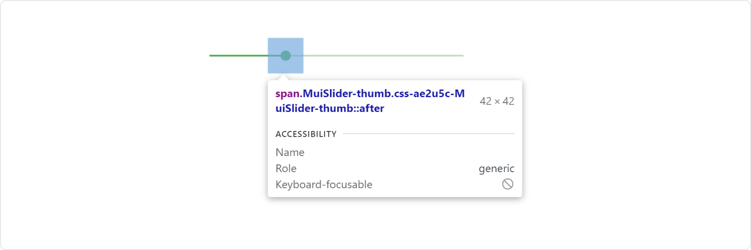
NOTE : In order to get the class names of the nested components use any Browser Dev Tools. In the below example we inspect the thumb of the slider component that comes with MUI.
In above example, the styles are applied with .css-ae2u5c-MuiSlider-thumb so the name of the component is 'Slider' and the name of the slot is 'thumb'. You now know that you need to target the .MuiSlider-thumb class name for overriding the look of the thumb.
import "./App.css"
import * as React from 'react';
import Slider from '@mui/material/Slider';
export default function SxProp() {
return (
<div className="container">
<Slider
defaultValue={30}
sx={{width: 300,color: 'success.main',
'& .MuiSlider-thumb': {
borderRadius: '1px'}}} />
</div>
);
}
Overiding styles with CSS
If you would like to override the styles of the components using classes, you can use the className prop available on each component. For overriding the styles of the different parts inside the component, you can use the global classes available for each as described in the previous section.
NOTE : In the below example we are using the "!important" feature of CSS,if we remove that,those styles will not be applied. Next we'll discuss how to avoid using !important and style MUI components like normal components.
//--------------------App.Css---------------------------
.container{
margin-left: 30%;
margin-top: 20%;
}
.slider {
color: #ff0000 !important;
width: 300px !important;
}
.slider:hover {
color: #2e8b57;
}
.slider > .MuiSlider-thumb {
border-radius: 1px;
}
//------------------App.Js--------------------------------
import "./App.css"
import * as React from 'react';
import Slider from '@mui/material/Slider';
export default function SxProp() {
return (
<div className="container">
<Slider className="slider" defaultValue={30} />
</div>
);
}
You could also use the Global CSS names exposed by MUI as CSS selectors directly.
//-------------------App.Css-----------------------
.container{
margin-left: 30%;
margin-top: 20%;
}
.MuiSlider-root {
color: #20b2aa !important;
width: 300px !important;
}
.MuiSlider-root:hover {
color: #2e8b57;
}
.MuiSlider-root .MuiSlider-thumb {
border-radius: 1px;
}
//--------------------App.Js-------------------------
import "./App.css"
import * as React from 'react';
import Slider from '@mui/material/Slider';
export default function SxProp() {
return (
<div className="container">
<Slider defaultValue={30} />
</div>
);
}
CSS Injection Order (Useful : 1] Click)
NOTE : Most CSS-in-JS solutions inject their styles at the bottom of the HTML <head>, which gives MUI precedence (more importance) over your custom styles. To remove the need for !important, you need to change the CSS injection order. The StylesProvider component from MUI has an injectFirst prop to inject the style tags first in the head.
In the below example,we did'nt use the !important feature and still achieved the same result as previous example.
//-------------App.css---------------------------------
.container{
margin-left: 30%;
margin-top: 20%;
}
.slider {
color: #ff0000;
width: 300px;
}
.slider:hover {
color: #2e8b57;
}
.slider > .MuiSlider-thumb {
border-radius: 1px;
width: 45px;
height:45px
}
//--------------App.js-----------------------------------
import "./App.css"
import * as React from 'react';
import Slider from '@mui/material/Slider';
import { StyledEngineProvider } from '@mui/material/styles';
export default function SxProp() {
return (
<div className="container">
<StyledEngineProvider injectFirst>
<Slider defaultValue={30} className="slider" />
</StyledEngineProvider>
</div>
);
}
3] Reusable Customized Components
If you find that you need the same overrides in multiple places across your application, you can use the styled() utility to create a reusable component.
import "./App.css"
import * as React from 'react';
import Slider from '@mui/material/Slider';
import { alpha, styled } from '@mui/material/styles';
const SuccessSlider = styled(Slider)(({ theme }) => ({
width: 300,
color: theme.palette.success.main,
'& .MuiSlider-thumb': {
'&:hover, &.Mui-focusVisible': {
boxShadow: `0px 0px 0px 8px ${alpha(theme.palette.success.main, 0.16)}`,
},
'&.Mui-active': {
boxShadow: `0px 0px 0px 14px ${alpha(theme.palette.success.main, 0.16)}`,
},
},
}));
export default function App() {
return (
<div className="container">
<SuccessSlider defaultValue={10}/> <br/>
<SuccessSlider defaultValue={20}/> <br/>
<SuccessSlider defaultValue={30}/>
</div>
);
}
---------------------------------------------------------------------------------------------------------------


Comments
Post a Comment