Angular Notes
Angular is a popular open-source web application framework developed by Google. It is used for building modern, scalable, and feature-rich single-page applications (SPAs) and web applications. Angular follows the component-based architecture and leverages TypeScript, a superset of JavaScript, to build applications that are scalable, maintainable, and highly performant.
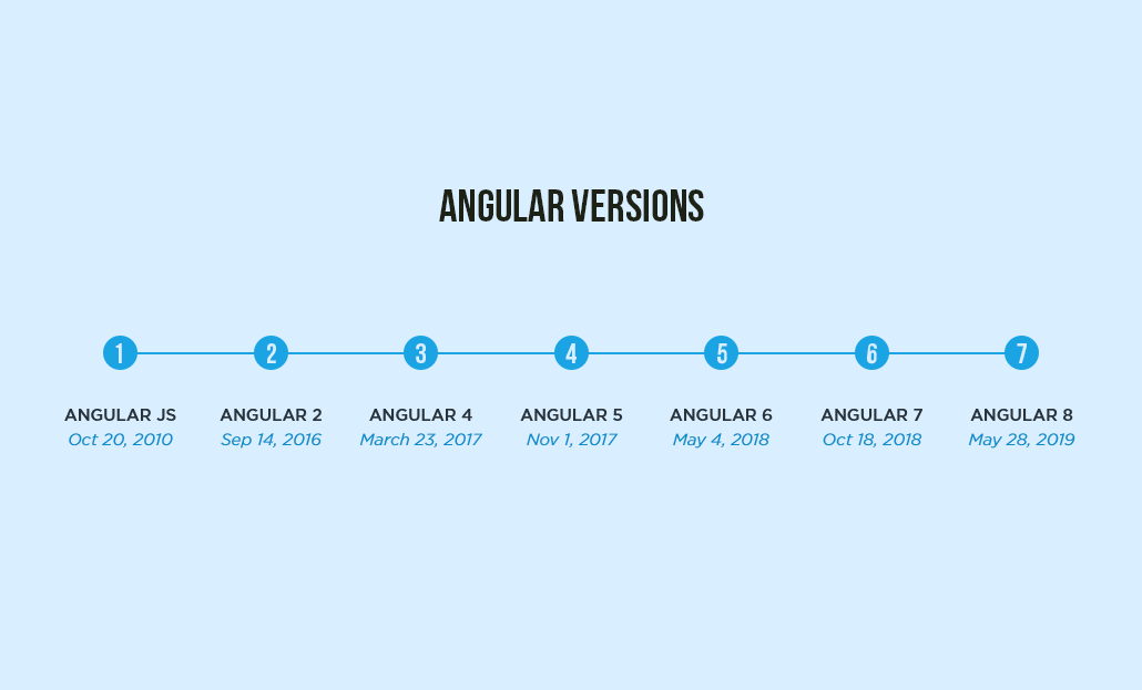
AngularJS (also known as Angular 1.x) and Angular (Angular 2+) are two different versions of the Angular framework. AngularJS was the older version of Angular, whose support officially ended in January 2022. Today when we talk about Angular we usually refer to the new modern Angular.
Angular follows the Model-View-Controller (MVC) architectural pattern. The MVC pattern is a design pattern that helps separate the concerns of an application into three distinct objects: the Model, the View, and the Controller.
In Angular, the MVC pattern is implemented using components, templates and services. In Angular, the view is defined using HTML templates, which are associated with components, whereas the controller role is performed by the component class and the model is typically implemented using services, which are injectable classes responsible for managing and manipulating data.
Angular CLI
Angular CLI (Command Line Interface) is a powerful tool that helps developers create, manage, and scaffold Angular applications efficiently. It provides a set of commands that streamline the development process, automate common tasks, and enhance productivity.
Here are some of the top must-know Angular CLI commands :
ng new: This command is used to create a new Angular project. It sets up the project structure, initializes the necessary configuration files, and installs the required dependencies. For example: ng new my-app.
ng serve: This command serves the Angular application locally for development. It compiles the application, starts a development server, and watches for file changes. The application can be accessed at http://localhost:4200 by default. For example: ng serve.
ng generate or ng g: This command is used to generate various Angular artifacts such as components, services, modules, directives, and more. It automatically generates the necessary files and updates the relevant configuration files.
ng build: This command compiles the Angular application and builds the production-ready bundle. It generates optimized and minified files that can be deployed to a web server. The output is typically stored in the dist folder.
ng test: This command runs the unit tests for the Angular application using a testing framework like Karma or Jest. It executes the test cases and provides test results, including code coverage reports.
ng lint: This command runs the static code analysis tool (linting) on the Angular project. It checks the code against predefined linting rules to identify potential issues and coding standards violations. For example: ng lint.
ng update: This command helps in updating the Angular CLI and the project's dependencies to the latest versions. It automatically analyzes the project's configuration and suggests updates for packages. For example: ng update @angular/core.
NOTE : The shorthand "ng" stands for angular. You can use "ng help" command to get a list of all angular CLI commands.
---------------------------------------------------------------------------------------------------------------
Angular Components
Angular components are the fundamental building blocks of an Angular application. They are responsible for defining and managing the structure, behavior, and appearance of specific parts of the user interface.
Angular's component-based architecture allows you to create reusable and modular components, each responsible for a specific part of the user interface and functionality. These components can be composed together to form the complete application.

Each component created in Angular consists of the following 4 things :
- An HTML template that declares what renders on the page.
- A TypeScript component class that defines the component's logic and behavior.
- A CSS selector that defines how the component is used or acessed in a template as custom HTML element.
- CSS styles applied to the template that can be defined inline within the component's metadata or imported from external style files.
The "app" component in an Angular application is often referred to as the root component because it serves as the starting point or entry point of the application. It acts as the top-level component in the component hierarchy. This is similar to "app.js" component in React apps.
NOTE : In Angular, a component that contains one or more components is referred to as a "parent" component. On the other hand, a component that is nested inside another component is called a "child" component.
---------------------------------------------------------------------------------------------------------------
Component with Inline Style & Template
In Angular, when generating a component using the Angular CLI or creating it manually, it typically generates an HTML template file and a separate CSS style file along with the component class file.
However, for small or simple components that don't require extensive markup or styling, you can utilize inline HTML and inline styles directly within the component's metadata. This approach allows you to define the template and styles within the component file itself, without the need for separate files.
NOTE : Inline style is mostly used when either our component requires very less styling, or if most of our styling is coming from global style.
---------------------------------------------------------------------------------------------------------------
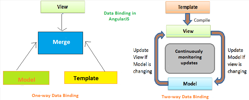
Data Binding in Angular (Useful : 1] Click)
Data binding is a core concept in Angular that allows you to establish a connection between your component's data (properties) and the user interface (template). It enables you to dynamically update and display data in the UI based on changes in the component's properties.
There are various binding techniques in Angular, which are classified into 2 main categories based on the direction of data flow :
- One-Way Data Binding
- Two-Way Data Binding
One-Way Data Binding
One-way binding refers to the flow of data in a single direction, either from the component to the template (component to view) or from the template to the component (view to component).
It is a way to bind data from the component to the view (DOM) or vice versa - from view to the component. It is used to display information to the end-user which automatically stays synchronized ensuring that any changes in the component's data are reflected in the template. It's like a one-sided flow of information, from the component to the UI.
The different types of one-way binding techniques, whic are as followed :
- Interpolation: This technique uses double curly braces
{{ }}in the template to bind a component property's value into the template.
- Property Binding: Property binding uses square brackets
[ ]in the template to bind a component property to a property of a DOM element.
- Event Binding: Event binding utilizes parentheses
( )in the template to bind an event from a DOM element to a method in the component.
- Attribute Binding: Attribute binding involves binding a component property to an attribute of a DOM element using square brackets
[attr.attributeName]in the template.
- Class Binding: Class binding allows binding a component property to a class attribute of a DOM element using square brackets
[class.className]in the template.
- Style Binding: Style binding enables binding a component property to a style attribute of a DOM element using square brackets
[style.styleProperty]in the template.
NOTE : One-way data binding is unidirectional, meaning that it allows data to flow in one direction only. You can bind data either from the component to the view (component to template) or from the view to the component (template to component), but not both simultaneously.
Below is the breakdown of the two directions of one-way data binding :
- Component to View : Here we bind data from the component's properties to the view (template). The data from the component is passed to the template for rendering, and any changes in the component's properties are automatically reflected in the view. Eg - Interpolation, property binding, attribute binding etc.
- View to Component : This direction enables you to capture user interactions or events in the view (template) and trigger corresponding actions in the component. When a specific event occurs, such as a button click or input change, it triggers a method or event handler in the component. Event binding is the primary technique used for this direction of binding.

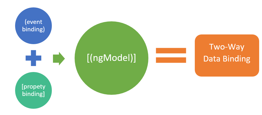
Two-Way Data Binding
Two-way data binding in Angular allows for bidirectional data flow, meaning that changes can be synchronized between the component and the view (template) in both directions. It combines property binding and event binding into a single syntax, providing a convenient way to keep the component and the UI in sync.
The primary technique for achieving two-way data binding in Angular is through the [(ngModel)] directive. This directive is used primarily with form elements such as input fields, checkboxes, and select dropdowns.
The binding punctuation of [ ], (), [( )] specify the direction of data flow :
- Use [ ] to bind from source to view
- Use ( ) to bind from view to source
- Use [( )] to bind in a two-way sequence of view to source to view
This bidirectional synchronization ensures that changes in the component are reflected in the view, and changes in the view are propagated back to the component, keeping them in sync at all times. This allows a simultanious flow of data in both directions.
---------------------------------------------------------------------------------------------------------------
Interpolation
In Angular, interpolation is a mechanism that allows you to dynamically insert values or expressions into your HTML templates. It is denoted by double curly braces {{}} syntax. Interpolation is commonly used to display dynamic data from your component's properties or perform calculations within the template.
Interpolation supports a wide range of expressions and types of data, including simple variables, object properties, method invocations, and conditional expressions.
Inside double curly braces {{}} you can include a variety of things, including :
- Simple variables : You can interpolate the value of a variable defined in your component's code. For example:
{{ title }}.
- Expressions : You can perform calculations or evaluate expressions within the curly braces. For example:
{{ 2 + 2 }}or{{ firstName + ' ' + lastName }}.
- Component properties : You can interpolate the properties of your component, including object properties. For example:
{{ user.name }}.
- Method invocations : You can invoke methods defined in your component and display their return values. For example:
{{ calculateTotal() }}.
- Conditional expressions : You can use conditional operators (
if,else,?,:) to display different values based on conditions. For example:{{ isLoggedIn ? 'Logged In' : 'Logged Out' }}.
NOTE : There are also alot of things we cannot do inside interpolation like changing variable values, incrementing/decrementing values, using TypeOf operator etc.
NOTE : In Interpolation, boolean values are treated as strings and not as their actual boolean representation. When using interpolation in Angular, boolean values are converted to their string representation by implicitly calling the toString() method hence we don't use it for property binding.
---------------------------------------------------------------------------------------------------------------
Property Binding
Property binding in Angular is a one-way data binding technique that allows you to bind a component's property to a property of a DOM element in the template. Using property binding, you can assign the value of a component's property to a property of an HTML element or an Angular directive.
The component's property acts as the source of the data, and the target property of the DOM element or directive is updated based on changes to the component's property. The property binding is denoted by square brackets ([ ])
We can use Interpolation too for binding component properties to HTML tag properties, but sometimes these require boolean values to (Eg- isDisabled attribute), since Interpolation treats booleans as strings we use the property binding technique.
NOTE : Property binding is particularly useful when you need to bind non-string values or when you want to bind to properties that are not directly supported by interpolation.
Attribute Binding
The attribute binding feature is same as property binding. Although property binding can cover most scenarios, but attribute binding is useful for non-standard attributes, boolean attributes, or when you want to be clear about setting attributes rather than properties.
The syntax for attribute binding in Angular is denoted by square brackets [ ], followed by attr.* and the name of the attribute you want to bind. For standard attributes like src, property binding and attribute binding can achieve the same result, but using [attr.*] can make your intent clearer, especially when working with non-standard attributes.
NOTE : If you try to use attribute binding with a non-standard attribute or an attribute that is not supported by the specific HTML element, it won't work as expected, and you might encounter errors.

---------------------------------------------------------------------------------------------------------------
Class Binding
Class binding in Angular allows you to conditionally add or remove classes to HTML elements based on expressions defined in the component. It is a powerful feature that helps you dynamically control the appearance and styling of elements in the template.
In Angular, there are 2 different ways to apply CSS class conditionally, as followed :
- [Class.*] - The
[class.*]syntax for class binding allows you to apply a single class based on an expression directly.
- NgClass - The
[ngClass]directive allows you to apply multiple classes conditionally based on an object expression.
condition is true, the class 'class-name' will be applied to the element, and if condition is false, the class will be removed.[Class.*]
It is a more concise syntax, and it is appropriate when you only need to apply a single class conditionally. It is useful for simple cases where you want to toggle a single class based on a condition. The condition should evaluate to a boolean, determining whether the class should be applied or removed.

Example] Below we add or remove CSS classes from elements on button click.
NgClass Directive
The NgClass directive allows you to apply CSS classes conditionally based on an object expression. Here we provide an object expression where the keys represent the class names, and the values represent the conditions under which the classes should be applied. Each value should evaluate to a boolean, indicating whether the corresponding class should be applied or not.
Example] Below we add or remove CSS classes from elements on button click.
The choice between the two depends on the complexity of your class binding requirements. For simple cases, [class.*] can be sufficient, while [ngClass] is more suitable for handling multiple classes with different conditions.
---------------------------------------------------------------------------------------------------------------
Style Binding
Style binding in Angular allows you to apply INLINE styles to HTML elements dynamically based on expressions or component properties. It provides a way to dynamically control the visual appearance and styling of elements in the template.
In Angular, we can achieve style binding in 2 different ways, as followed :
- [Style.*] - The
[style.*]syntax for style binding allows you to set individual style properties based on expressions or component properties.
- NgStyle - The
[ngStyle]directive allows you to apply multiple styles to an element at once, based on an object expression.
[Style.*]
The syntax for [style.*] is [style.property]="expression", where property represents the CSS style property you want to set, and expression is the value you want to assign to that property. The value of the expression should be a string representing a valid CSS value for the specified property.
You can use [style.*] with any valid CSS property that you want to apply to the element inline. It allows you to conditionally set various style properties based on expressions or component properties.

Example] Below we dynamically change styles applied when button is clicked.
NgStyle Directive
The ngStyle directive in Angular is a powerful feature that allows you to apply multiple inline styles to HTML elements dynamically. Unlike [style.*] syntax, which is used for setting individual style properties, ngStyle enables you to conditionally apply or remove multiple styles to an element based on an object expression.
The syntax for using ngStyle is [ngStyle]="{ 'property': expression, ... }", where each key represents a CSS property, and its associated value is the expression that determines the value of that property. The value should evaluate to a valid CSS value for the specified property.
Example] Below we dynamically change styles applied when button is clicked.
---------------------------------------------------------------------------------------------------------------
Event Binding
Event binding in Angular enables you to execute methods in the component when specific events occur, such as button clicks, mouse movements, keyboard inputs, and more. Event binding allows you to bind events happening in template to methods in component class.
It follows the (event)="method()" syntax, where (event) represents the specific event you want to listen for (e.g., click, input, mouseover, keyup, etc.), and "method()" is the method in the component that you want to execute when the event occurs.
The $event is a special variable in Angular that holds the event object emitted by the event. When using $event in the event binding syntax, you pass the event object to the method you are calling. The method in the component can then access and use the event object as needed.
NOTE : The use of () in event binding indicates that the data flow is from the view (template) to the component class, since the event data flows from view to method in component class.
Example] Below we trigger component class methods on various events.
---------------------------------------------------------------------------------------------------------------
Template Reference Variables
Template Reference variables in Angular are used to get a reference to HTML elements, components, or directives within the template and then use that reference to interact with them from any other element within the same template.
These variables are local to the template in which they are defined, so they provide a controlled and scoped way to access elements or components without affecting other parts of the application.
NOTE : Template reference variables are denoted by '#' symbol followed by a name. Eg - #input.
Example] Below we get a ref of input element and pass its value to method.
@ViewChild
In Angular, @ViewChild is used in conjunction with template reference variables to get a reference to an element or component defined in the template. This combination allows you to access the referenced DOM element directly from component's TypeScript code.
This allows you to manipulate or interact with the referenced element or component programmatically, which can be useful in scenarios where you need to manipulate specific elements, access their properties, or attach event handlers programmatically.
Example] Below we acess DOM elements and modify them in component class.
---------------------------------------------------------------------------------------------------------------
Parent/Child Components
In the context of Angular, the terms "parent," "child," and "sibling" components refer to the relationships between components in the component tree hierarchy.
- A parent component is a higher-level component that contains one or more child components. Parent components often pass data and communicate with their child components.
- A child component is a component that exists within the scope of a parent component. It is nested inside the parent component and can be considered a part of the parent component's template.
- Sibling components are components that share the same parent component. Sibling components cannot directly communicate with each other, as they are independent of one another. If sibling components need to share data or communicate, they must do so through their common parent component.
Parent-to-Child Communication
In Angular, the @Input property decorator is used to define an input property in a component. An input property allows a parent component to pass data into a child component. By using the @Input decorator, you specify that a property in the child component can receive its value from its parent component.
By utilizing the @Input property decorator, Angular enables the parent component to communicate with its child components by passing data and updating the child component's properties dynamically.

Example] Below we pass text message from parent to child component.
NOTE : When an @Input property changes in the parent component, it triggers the change detection mechanism in Angular. The child component will be updated and re-rendered during the change detection cycle if the value of the @Input property has changed.
Child-to-Parent Communication
In Angular, @Output is a decorator that allows a child component to emit events to its parent component. It facilitates communication from the child component to the parent component, enabling the parent component to respond to actions or data changes in the child component.
The @Output marks a property in a child component as a doorway through which data can travel from the child to the parent. It allows the child component to emit events that the parent component can listen to and respond to by executing its own methods.
NOTE : The child component emits events using the EventEmitter class, which is associated with the @Output property. The child component can emit events by calling the emit() method of the EventEmitter, and it can pass data along with the emitted event.
Example] Below we pass data from child to parent component on button click.
NOTE : When the child component emits an event through an @Output property, it sends data or a signal to the parent component. The parent component can listen to these events and execute methods in response, but it doesn't trigger a re-render of the parent component's template.
Sibling-to-Sibling Communication
In Angular, Sibling components cannot directly communicate with each other, as they are independent of one another. Since sibling components do not have direct parent-child relationships, a different approach is required for them to communicate with one another.
There are multiple ways to achieve sibling-to-sibling communication :
Using a Shared Service :
Create a shared service that acts as a mediator between the sibling components. Inject this service into both sibling components. Use the service to share data between the siblings.
Using @Input and @Output :
Pass data from one sibling component to the parent component using@Outputand event emitters. The parent component can then pass this data to the other sibling component using@Inputproperties. In this approach the parent acts as the middle-man for both siblings.
Using Template Reference Variables :
Create a template reference variable in the parent component template that points to one sibling component. Use this template reference variable in the parent component template to pass data to the other sibling component.
NOTE : In general, using a shared service as a mediator between sibling components is often the most efficient approach. While using @Input and @Output can work well for simpler cases, it might become less efficient and less maintainable when dealing with multiple sibling components.
Example] Below we use @Input and @Output together to pass data from Child1 to Child2 component through the Parent component.

Example] Below we use Template Reference variables to pass data from Child1 to Child2 component through the Parent component.

As the application grows and the number of sibling components increases, managing communication through template reference variables becomes more complex. It becomes challenging to track which component is passing data to which component, leading to a tangled and harder-to-maintain codebase.
---------------------------------------------------------------------------------------------------------------
Two-Way Binding
In Angular, two-way binding is a mechanism that enables data synchronization between the component's data (properties) and the template's view (UI elements) in both directions. It combines property binding (from the component to the template) and event binding (from the template to the component) into a single concise syntax.
In Angular's two-way binding, any changes made to the template element will update the corresponding component property, and vice versa, any changes made to the component property will update the value displayed in the template element.
In Angular, there are primarily 2 ways to achieve two-way binding:
NgModelngModelis a built-in directive provided by Angular that simplifies the process of establishing two-way binding between a component property and a template element. It combines property binding and event binding into a single directive.
- Custom Two-Way Binding : If you prefer not to use
ngModelor need more control over the two-way binding mechanism, you can create a custom two-way binding using custom property and event bindings.
NOTE : The Two-way binding syntax is denoted by "[( )]", which is often reffered to as 'Banana in Box', fun way to describe the two-way binding syntax.
NgModel Directive
The NgModel is a built-in directive in Angular designed to enable two-way data binding between a component property and an HTML form element (input, radio, select , textarea etc) in the template. Its primary purpose is to establish a bidirectional data flow, ensuring that changes made in the template element are automatically propagated to the component property, and changes made to the component property are reflected in the template.
NOTE : To use two-way binding with NgModel for form elements, you need to import the FormsModule in the app.module.ts file in your Angular application.
NOTE : The NgModel directive is primarily designed to work with HTML form elements like input, textarea, select, radio buttons, and checkboxes. To apply two-way binding to other elements that are not form-related we need to implement custom two-way binding.
The ngModel directive binds to the value property of the input element. When you use [(ngModel)] with an input element, the value entered by the user in the input field is automatically bound to the associated component property, and vice versa.
In the above case, ngModel binds the value entered by the user in the input field to the username property of the component. If the user types something in the input field, the value will be immediately reflected in the username property. Similarly, if the username property changes programmatically in the component, the new value will be displayed in the input field.
Example] Below we use apply two-way binding using NgModel directive and also change their values programmatically on button click.

---------------------------------------------------------------------------------------------------------------
Directives
Directives are one of the fundamental building blocks of Angular applications. They extend the functionality of HTML elements. These are classes that add additional behavior to elements in your Angular applications. With directives,we can create reusable components, manipulate the DOM, and add behavior to your application's user interface.
There are 2 main types of directives in Angular as followed :
- Attribute Directives : Enhance or customize the behavior and appearance of existing elements or components.
- Structural Directives : Modify the DOM layout by conditionally adding, removing, or manipulating elements in the view.
NOTE : The attribute directives are used to modify existing elements (classes, styles etc), whereas the structural directives are used to add or remove elements from DOM conditionally.
Attribute Directives
Attribute directives are used to modify the behavior or appearance of existing elements or components. They do this by manipulating the element's properties, styles, or classes. Attribute directives are applied as attributes within HTML elements, and they can enhance or customize the behavior of the host element or component.
Below are some commonly used built-in attribute directives in Angular :
NgClass: Conditionally applies CSS classes to elements based on expressions.
NgStyle: Conditionally applies inline styles to elements based on expressions.
NgModel: Enables two-way data binding between form controls (input elements) and component properties.
Structural Directives
Structural directives are used to add or remove elements from the DOM conditionally. They do this by manipulating the DOM layout, such as adding or removing elements based on certain conditions. Structural directives are applied as attributes within HTML elements, and they control the structure of the view.
Below are some commonly used built-in structural directives in Angular :
NgIf : Conditionally renders elements in the DOM based on an expression.
NgFor : Iterates over a collection and generates HTML elements for each item.
NgSwitch : Conditionally renders elements based on multiple expressions.
NOTE : When using structural directives we often add the prefix ' * ' to the directive for indicating that the element or container with the structural directive applied will be modified by the directive to add, remove, or manipulate its children based on certain conditions.
In Angular all structural directives implicitly wrap their host element or container in an <ng-template> element behind the scenes when using the * (asterisk) syntax. The <ng-template> element acts as a placeholder for the generated content created by the structural directive.
The reason for wrapping the host element in an <ng-template> is to enable Angular to handle the rendering and manipulation of the DOM as specified by the structural directive.
NgIf Directive
The NgIf directive in Angular is a structural directive used to conditionally render elements in the DOM based on a given expression. It is used when you want to show or hide elements based on conditions in your application.
The *ngIf directive is applied to an HTML element or a container with the * (asterisk) syntax, which implicitly wraps the element in an <ng-template> behind the scenes.
NOTE : If the expression evaluates to true, the element and its content will be added to the DOM. If the expression evaluates to false, the element will be removed from the DOM.
NgFor Directive
The NgFor directive in Angular is a structural directive used for iterating over a list/collection and generating HTML elements for each item in the collection. It allows you to dynamically render repeating elements based on the contents of an array or an iterable object.
NOTE : The index part is optional, we can only mention "let item of items" if we dont need the index of the element from the corresponding list.
NgSwitch Directive
The NgSwitch directive in Angular is a structural directive used to conditionally render elements based on multiple expressions. It allows you to switch between different cases and display different content based on the evaluated value of each case expression.
The
[ngSwitch]attribute is applied to an HTML element or a container, specifying the expression to evaluate. The*ngSwitchCaseattribute is used to define specific cases along with their corresponding expressions. When a case expression matches the main expression, the content associated with that case will be rendered.- <select [(ngModel)]="selectedOption"><option value="A"> A </option><option value="B"> B </option><option value="C"> C </option></select><!-- Selected Option Text will Appear --><div [ngSwitch]="selectedOption"><h1 *ngSwitchCase="'A'">Option A selected</h1><h1 *ngSwitchCase="'B'">Option B selected</h1><h1 *ngSwitchCase="'C'">Option C selected</h1><h1 *ngSwitchDefault>No option selected</h1></div>//------------------------------------------------------------------------------------import { Component } from '@angular/core';@Component({selector: 'app-root',templateUrl: './app.component.html',styleUrls: ['./app.component.scss']})export class AppComponent {selectedOption: string = '';}
NOTE : The
*ngSwitchDefaultattribute is used to define the default case when none of the cases match the main expression.
---------------------------------------------------------------------------------------------------------------
Component Lifecycle Hooks (Useful: 1] Click)
In Angular, a component's life goes through stages. It starts when Angular creates the component and displays it on the screen. As you use the component and things change, Angular keeps the view and the data in sync. Eventually, when you're done with the component, Angular cleans it up and removes it from the screen.


To control these lifecycle stages, Angular provides "hooks" – like special functions – that you can use to do things at specific points. Here's the list of these hooks in the order they happen :
- Constructor: The constructor is the first method that gets called when an instance of the component is created. It's used to initialize class properties and perform basic setups. It's important to note that this is a standard TypeScript class constructor and is not specific to Angular.
- ngOnChanges: This hook is called whenever an input properties changes. It's called before ngOnInit() and whenever there's a change detected in the input properties. It provides information about the previous and current values of input properties.
- ngOnInit: This hook is called only once immediately after the first time ngOnChanges() is called. It's used for one-time initializations such as setting up variables and making initial API calls. It's a good place to start most of your component setup. Once the ngOnInit() hook is executed during the component's lifecycle, it won't be called again for that instance of the component.
- ngDoCheck: This hook is called during every change detection cycle, which is a mechanism that Angular uses to detect and update changes in data and the DOM. It's used for custom change detection logic but should be used carefully to avoid performance issues.
- ngAfterContentInit: This hook is called after the component's content (projected content from parent components) has been initialized. This includes content projected into the component using
<ng-content>.
- ngAfterContentChecked: This hook is called after every check of the component's content. It's called during each change detection cycle after ngAfterContentInit.
- ngAfterViewInit: This hook is called after the component's view (template) and its child views have been initialized. It's used for tasks that require interaction with the DOM after it has been rendered.
- ngAfterViewChecked: This hook is called after every check of the component's view. It's called during each change detection cycle after ngAfterViewInit.
- ngOnDestroy: This hook is called just before the component is destroyed. It's used for cleanup tasks such as unsubscribing from observables, freeing up resources, or tearing down anything that might cause memory leaks.
NOTE: If the component has no inputs or you use it without providing any inputs, the framework will not call ngOnChanges().
NOTE : The constructor() and ngOnInit() are only executed once in entire lifecycle of an component, whereas other methods like ngOnChanges(), ngDoCheck(), ngAfterContentChecked() & ngAfterViewChecked() are executed everytime any input property changes.
---------------------------------------------------------------------------------------------------------------
Change Detection
In Angular "Change detection" refers to the mechanism that Angular uses to monitor and detect changes in the application's data and update UI accordingly. It ensures that the UI remains up-to-date and reflects the current state of the application's data.
An Angular application is composed of many parent and child components. Whenever a data change occurs in the parent component it must be reflected accordingly in all its child components too, this task of updating or propagating data updates is done through the "Change Detection" mechanism.

This task of keeping the data in sync with the component view is done through a process termed as "Change Detection Cycle". In a single change detection cycle, Angular traverses through the entire component hierarchy, moving from the topmost root component to the lowest. During this, it finds any changes in properties, compares previous values with the latest values, and updates the UI if needed while at the same time propagating changes to all child components.
In Angular, Change detection can be triggered by a range of events including user interactions (clicks, inputs), asynchronous actions (HTTP requests, timers), observables, changes in input properties from parent to child components, and custom events through output properties. These events trigger Angular to assess the component tree, identify data modifications, and synchronize the user interface to reflect these changes, ensuring coherence between the data and the UI.
A change detection cycle is the sequence of steps that Angular goes through to determine if there are changes in your components' data and update the UI accordingly. It involves the following series of steps :
- Event Trigger: A change detection cycle starts when an event, such as a button click or an HTTP response, triggers Angular's change detection mechanism.
- Component Tree Traversal: Angular starts traversing the component tree, beginning from the root component, and moving down through child components. It examines each component to see if any changes have occurred.
Change Detection Strategies: Angular uses the change detection strategies defined for each component to decide how thoroughly to check for changes.
Default Strategy: In the default strategy, Angular checks all components in the tree for changes. It performs a deep comparison of all properties to determine if they've changed since the last cycle.
"OnPush" Strategy: Components using the "OnPush" strategy are only checked if their input properties have changed or if they're explicitly marked for change detection. This strategy reduces the number of components checked and can significantly improve performance.
Change Detection Process:
Input Property Comparison: If a component's change detection strategy requires it (such as the "OnPush" strategy), Angular compares the component's input properties' current values with their previous values to determine if they've changed.
Component Update: If changes are detected in a component, Angular updates its properties. This can lead to changes in the component's view and its child components' views.
Child Components: The process cascades down to child components, where the same steps are repeated recursively.
- View Update: If any changes are identified during the change detection cycle, Angular updates the corresponding parts of the UI to reflect the new values. This involves updating the DOM elements and applying any necessary rendering changes.
- Completion: Once the entire component tree has been traversed, and all changes have been applied to the UI, the change detection cycle is complete.
Change Detection Strategies
Regarding the number of change detection cycles an application can have, there is no strict limit. Angular's change detection is event-driven, meaning cycles are triggered by events such as user interactions or asynchronous operations.
The number of cycles can vary greatly based on the frequency of these events and the complexity of your application. It's important to note that excessive and unnecessary change detection cycles can impact performance.
Angular provides 2 different change detection strategies, as followed :
- Default Change Detection Strategy
- OnPush Change Detection Strategy
Default Change Detection
The default change detection strategy in Angular involves automatically checking all components for changes during each change detection cycle. Whenever an event triggers a change detection cycle Angular starts traversing the entire component tree from top to bottom.
It checks all components and every property for changes by comparing the current property values with their previous values. If changes are detected in a component's properties, Angular updates the corresponding parts of the UI to reflect the new data.Components using the default strategy don't require additional configuration for change detection. Developers can focus on building components and don't need to manually manage when to trigger change detection. Angular takes care of checking and updating components as needed.
The default strategy can be less efficient in large or complex applications. Since all components are checked for changes in every cycle. It checks all components regardless of whether they require updates. Not all components may need frequent updates. The default strategy can lead to excessive checks and updates for components with relatively stable data, resulting in unnecessary processing.
OnPush Change Detection
The "OnPush" change detection strategy is an optimization over the default change detection strategy. In this strategy, the aim is to reduce the number of components to be checked during a single change detection cycle.
Unlike the default strategy, where all components are automatically checked for changes, the "OnPush" strategy employs a more selective approach, focusing on components that are likely to have undergone modifications.
With the OnPush strategy, we can explicitly mark only a few components for change detection rather than all components. By manually marking only certain components for change detection, we gain more control over the performance and responsiveness of our Angular application.
By choosing to update only the components that are relevant to a particular change, we significantly reduce the number of unnecessary checks. This leads to improved rendering speed and a more efficient application overall.
The "OnPush" change detection strategy in Angular, while enhancing performance by selectively triggering updates, presents challenges such as manual management complexity. Developers should carefully weigh these downsides against the performance benefits when deciding whether to adopt the strategy.
---------------------------------------------------------------------------------------------------------------
Pipes
In Angular, pipes are a feature that allows you to transform data in templates before displaying it to the user. Pipes take in a value as input and output a transformed value. They are used to format, filter, and manipulate data in a declarative way within the template.
Angular comes with several built-in pipes, and you can also create custom pipes to suit your specific needs. Pipes are denoted by the '|' symbol in Angular templates.

Below are some common built-in pipes in Angular as followed :
- DatePipe: Used for formatting dates and displaying them in different formats.
- UpperCasePipe / LowerCasePipe: Used to convert text to uppercase or lowercase.
- CurrencyPipe: Used for formatting currencies.
- DecimalPipe: Used for formatting numbers with decimal points.
- PercentPipe: Used for formatting numbers as percentages.
- JsonPipe: Used for displaying JSON objects in a formatted way.
- SlicePipe: Used to get a subset of an array or string.
- TitleCasePipe: Used to convert text to title case (the first letter of each word capitalized).
- KeyValuePipe: Used to iterate over an object and retrieve its keys or values.
- OrderByPipe: Used for sorting an array based on a specified property.
- FilterPipe: Used for filtering an array based on a specific condition.
DatePipe, UpperCasePipe, LowerCasePipe, etc., you can directly use them in the templates by referencing their names with the pipe (|) symbol.
---------------------------------------------------------------------------------------------------------------
Routing
In Angular, even though it's a single-page application (SPA), routing is used to provide the illusion of multiple pages and navigation within the application without actually performing full-page reloads.
Angular's routing mechanism allows you to create distinct "views" within your single HTML page, enabling users to navigate between different sections of your application without triggering a full page reload.
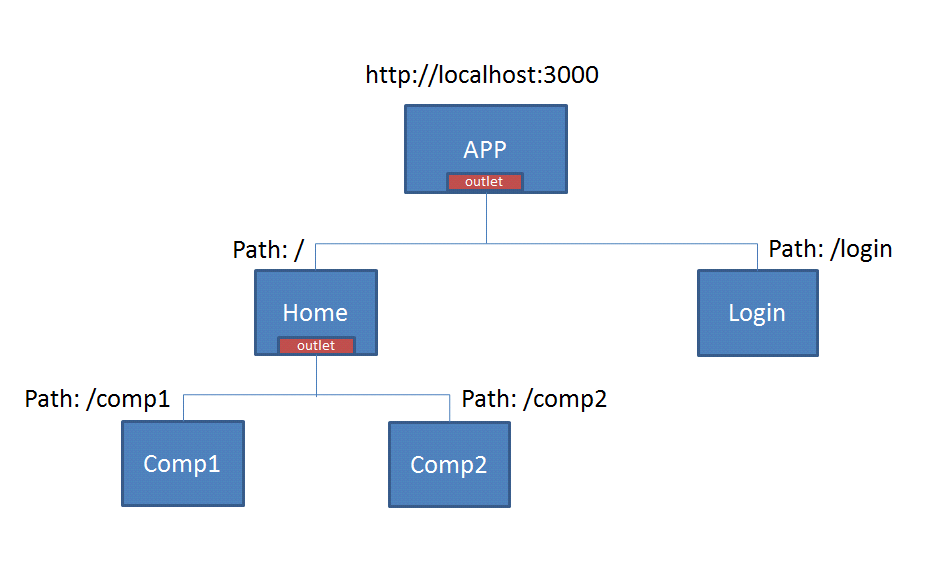
Angular's RouterModule provides the infrastructure for handling routing. To start using routing in your Angular application, you need to import RouterModule and configure your routes using the RouterModule.forRoot() method in your main application module.
In the route configuration, you define an array of route objects. Each route object consists of a path (the URL segment that triggers the route) and a component (the Angular component to display when the route is activated). You can also add more advanced configurations, like guards, resolvers, and child routes.
In your main HTML template (usually app.component.html), you place a <router-outlet></router-outlet> element. This is where the components corresponding to the active route will be rendered. When you navigate to different paths in your application, Angular's router will activate the corresponding components and render them within the <router-outlet></router-outlet> element in respective template.
NOTE: Although routes can be defined directly in the "app.module.ts" file, Angular provides a dedicated file "app-routing.module.ts" for defining routes.
Example] Below we define multiple routes and links through which a user can navigate to different components.
In the Angular routing configuration, the "children" property can be used to define child routes within a parent route. Child routes are routes that are nested under a parent route and are typically used when you want to create complex layouts or nested component structures within your application.
Example] Below we define the child routes using the "children" property to define "user/setting" and "user/setting/logout" paths.
NOTE: The order of routes is important because the Router uses a first-match wins strategy when matching routes, so more specific routes should be placed above less specific routes. The wildcard routes come last because it matches every URL and Router selects it only if no other routes match first.
Route Navigation
In Angular, there are several ways to navigate between routes in your application. Each method serves a specific purpose. Below are the different ways to navigate routes in an Angular application :
1] RouterLink Directive
The routerLink directive is the most common and straightforward way to navigate between routes. It's used in template files and generates anchor tags (<a>) with the appropriate href attributes based on the provided route paths.
2] Router.Navigate()
The router.navigate the method allows you to programmatically navigate to a specific route using imperative code. It takes an array and allows one to navigate to a specific route by providing the route path and optional route parameters.
3] Router.NavigateByURL()
Similar to router.navigate, the router.navigateByUrl method navigates to a specific route. However, it allows you to navigate using a complete URL, including query parameters.
Wildcard Routes
Wildcard routes, also known as catch-all routes, are a type of route configuration in Angular that matches any URL that doesn't match any of the previously defined routes. Wildcard routes can be useful for displaying a "not found" page or redirecting to a default route.
NOTE: To define a wildcard route, you use an empty path and the "**" route parameter. The "**" parameter matches any URL segment that hasn't matched any previous route.
NOTE: The wildcard route should be placed at the end of your route configuration. This ensures that the Router checks the wildcard route only after all other routes have been evaluated.
Router Outlet
A route outlet is an HTML directive that acts as a placeholder for routed components, and the Angular Router takes care of loading and displaying the appropriate component content based on the active route.
When a user navigates to a specific route, the Angular Router matches the requested URL to the route configuration and loads the associated component. The content of this component is then rendered within the router outlet.
In a template routerLink and router-outlet are often used together. The routerLink directive is used in templates to create navigation links whereas the router-outlet directive is a placeholder in the template where the content of routed components will be rendered.
When a user navigates to a route using routerLink, the component associated with that route is loaded and its content is displayed within the router-outlet.
Named Router Outlet
In Angular, we can have multiple router outlets in a single template, and each router outlet can display content independently based on the active route. The content of components associated with different routes will be displayed in their respective router outlets, and they won't be displayed multiple times.
---------------------------------------------------------------------------------------------------------------
Routes with Dynamic Params (Useful : 1] Click)
Dynamic route parameters in Angular allow you to capture and extract values from the URL path. These values can then be used within your components to provide dynamic content or functionality based on the URL segment values.
Dynamic route parameters are placeholders within the route path that are denoted by a colon (:) followed by a parameter name. When a URL is matched against a route configuration with dynamic parameters, Angular extracts the values from the corresponding segments in the URL and makes them available in your component through the 'ActivatedRoute' service.
Example] Below we create a Dynamic route that accepts multiple URL parameters.
We can also pass these params to RouterLink directive or the Navigate() method to navigate the user to the respective URL route.
Routes with Query Params
Query parameters allow you to pass data as key-value pairs in the URL query string. They are commonly used to provide additional information to a route or component. Query parameters are appended to the URL after a question mark (?) and are separated by ampersands (&).
When dealing with query parameters in Angular, you don't need to explicitly define them in the route configuration. They are not part of the route path and are appended to the URL separately.
Example] Below we create a route that accepts Query Params and displays values
We can also pass query parameters to RouterLink directive or the Navigate() method to navigate the user to the respective URL route.
RouterLinkActive
The routerLinkActive is a directive in Angular that allows you to add or remove CSS classes from an HTML element based on the active state of a router link. This is particularly useful for highlighting or styling the active navigation link in your application.
We can use the routerLinkActive directive on an HTML element and provide it with one or more CSS class names that you want to add when the associated router link is active.
In the above example, when a link is active, it will have bold text due to the .active CSS rule.
Router Events
In Angular, Router Events are a set of events emitted by the Angular Router that allow you to observe and react to navigation events and changes in the application's route state. These events provide hooks for executing code at various points during the navigation lifecycle.
Here are some important router events provided by the Angular Router :
- NavigationStart: This event is triggered when navigation starts. It is emitted at the beginning of the navigation process.
- RouteConfigLoadStart: This event is emitted when the router begins loading a route configuration that has not been loaded yet.
- RouteConfigLoadEnd: This event is emitted when the router finishes loading a route configuration.
- RoutesRecognized: This event is triggered when the router has successfully recognized the URL and matched it to a route.
- GuardsCheckStart: This event is emitted before any of the route guards start executing.
- ChildActivationStart: This event is emitted when the router is about to start activating a child route.
- ActivationStart: This event is emitted when the router is about to start activating a route.
- GuardsCheckEnd: This event is emitted after all route guards have passed.
- ResolveStart: This event is emitted when the router begins the process of fetching route data through route resolvers.
- ResolveEnd: This event is emitted when the router completes the process of fetching route data through route resolvers.
- ActivationEnd: This event is emitted when the router completes the activation process for a route.
- ChildActivationEnd: This event is emitted when the router completes the activation process for a child route.
- NavigationEnd: This event is emitted when navigation ends successfully, after all the hooks have been executed.
- NavigationCancel: This event is emitted if navigation is canceled, for example, due to a redirect.
- NavigationError: This event is emitted when navigation fails due to an unexpected error.
You can subscribe to these events using the router.events observable in your component or service to perform tasks such as logging, analytics, or handling loading indicators during navigation.
---------------------------------------------------------------------------------------------------------------
Route Guards
In Angular, route guards are used to control access to specific routes within your application. They provide a way to implement security and control user navigation based on certain conditions.
They are used to protect routes, allowing you to decide whether a user should be allowed to access a specific route or not. Route guards provide an extra layer of security and control by executing certain logic before allowing navigation to proceed. Below are some commonly used Route Guards in Angular :
- CanActivate: This guard decides whether a user is allowed to navigate to a particular route. If the guard returns
true, the navigation is allowed; if it returnsfalse, the navigation is blocked. This guard is typically used to enforce authentication and authorization.
- CanActivateChild: Similar to
CanActivate, but it applies to child routes of a parent route. It's used to control access to child routes of a parent route.
- CanDeactivate: This guard decides whether a user is allowed to navigate away from a route. It is used to prevent users from accidentally leaving a route/page in your application. It's often used to prevent users from leaving a form with unsaved changes without confirmation.
Example] Below we Implement canActivate() guard to prevent unauthorized users from acessing "/user" route path. We also Implement canActivateChild() guard to prevent acess to child routes if the condition does meet.
---------------------------------------------------------------------------------------------------------------
Dependency Injection (DI)
A dependency is an object or service that another class or component relies on to perform its tasks. When an class is dependent on another class, a common practice is to simply create the instances/objects of the class in the required class, but this is a bad practice.
Relying on creating instances or objects of a class directly within another class is known as "tight coupling", which can lead to various issues and challenges in the long run. In a tightly coupled system, changes made to one part of the system may have a significant impact on other parts, making it difficult to maintain, extend, or modify the application without affecting other components.
Dependency Injection (DI) is a design pattern that addresses the problem of tight coupling by providing a way to obtain class instances, or dependencies, without creating them inside the dependent class directly. Instead of a class creating its dependencies, the required dependencies are provided or "injected" into the class from an external source.

Dependency Injection (DI) is a mechanism that allows you to create objects or instances of required classes outside of the class that needs them. By using Dependency Injection, the dependent class declares its dependencies through constructor parameters or property setters.
The actual creation and provision of these dependencies are delegated to the DI system, which takes care of instantiating the required classes and injecting them into the dependent class when it is created.
@Injectable Decorator
Dependency Injection (DI) is a fundamental concept in Angular that allows you to manage and provide dependencies to classes or components without directly creating their instances. It promotes loose coupling and modular design, making Angular applications more maintainable, testable, and scalable.
In Angular, when a class requires dependencies (objects of another class), we declares them as constructor parameters. This is known as "constructor injection". The class specifies the dependencies it needs by listing them as parameters in its constructor signature.
Before we can define dependencies inside constructor we need to perform 2 main tasks so that Angular's DI system recognizes them :
1] Declare Dependency Classes with @Injectable Decorator : When a class needs to be injected as a dependency into other classes, it must be marked with the @Injectable() decorator. This decorator tells Angular that the class is eligible for dependency injection, and it provides metadata required by the DI system.
@Injectable(), it needs to be registered as a provider. A provider is a configuration that tells Angular's DI system how to create and provide instances of the dependency. There are 3 levels at which you can provide a dependency :- Module-level Providers: You can register providers at the module level by adding them to the
providersarray of an NgModule.
- Component-level Providers: You can register providers at the component level by adding them to the
providersarray of a component's metadata.
- Service-level Providers (using @Injectable providedIn): Starting from Angular 6, you can also use the
providedInproperty of@Injectable()to declare that a service should be provided at the root level, without explicitly adding it to any module or component.
In Summary, Dependency Injection in Angular is basically, making classes injectable with @Injectable decorator and asking Angular to create their instances and inject them into constructors when asked for.
NOTE : The Services in Angular are prime example for Dependency Injection in Angular, as we don't create their instance in component classes and only mention them in our component class constructor and use it directly inside class.
Services
In Angular, the MVC pattern is implemented using components, templates and services. The view is defined using HTML templates, which are associated with components, whereas the controller role is performed by the component class and the model is implemented using services, which are injectable classes responsible for managing and manipulating data.
In Angular, the role of components is primarily to present data and handle the user interface (UI) interactions. Components should not be responsible for fetching or saving data directly from data sources, such as APIs or databases. Instead, components should delegate these data access tasks to services.
Services are singleton instances by default. This means that there is only one instance of a service throughout the application, allowing components to share data and state efficiently. When a component updates data through a service, other components that depend on the same service will see the updated data, ensuring data consistency and coherence.
NOTE : The 'ng generate service' command generates a new service file named <service-name>.service.ts in the src/app folder by default. It also automatically adds the service to the 'providers' array in the root module (app.module.ts) with the providedIn: 'root' configuration, making it available as a root-level service for the entire application.
Example] Below we create and access data provided by service and also modify it.
To use the service, you simply declare it as a parameter in constructor of the component or service that needs to use it, since a service is an injectable class (i.e decorated with @injectable) it becomes eligible for dependency injection.
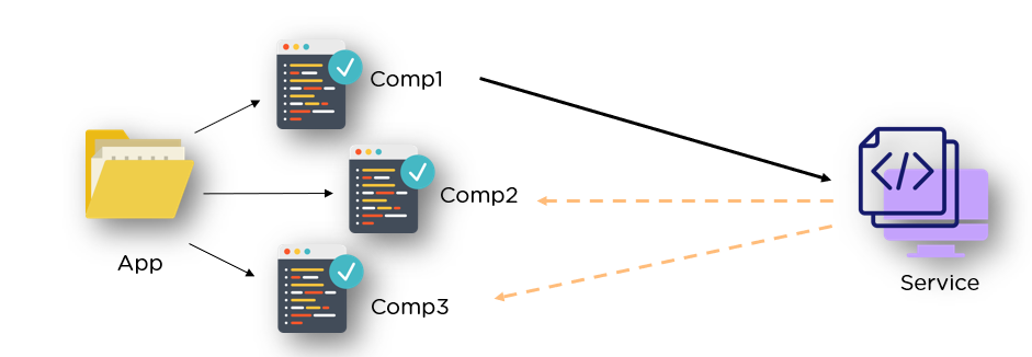
Remote Data & Services
In Angular, we almost never make network requests directly from components, we define the logic inside a service and then acess the service when required to acess remote data. Components should not directly perform tasks like fetching data from APIs or handling business logic. Instead, they should delegate such tasks to services.
To access remote data using services in Angular, you typically use the HttpClient module provided by Angular. The HttpClient module allows you to make HTTP requests to remote servers and APIs to fetch, send, and manipulate data.
Example] Below we define GET request logic to service and use it on button click.
NOTE : Make sure to import the necessary modules (HttpClientModule) in the app module to enable the HttpClient service.
Example] Below we define POST request logic to service and use it on button click.
---------------------------------------------------------------------------------------------------------------
Angular Forms
A form in web development is a user interface element that allows users to input data and submit it to a server for processing. Forms are used for various purposes like user login, registration, data submission, and more. In Angular, there are 2 main types of forms :
- Template-Driven Forms
- Reactive Forms
The template-driven forms are simpler and suitable for basic use cases, while reactive forms offer more control and flexibility, making them a better choice for complex forms and larger applications.
Template Driven Forms
A template-driven form is the most basic technique to create an Angular form. Template-driven forms use two-way data binding to update the data model in the component as changes are made in the template and vice versa. In template-driven forms the logic and validation is handled directly inside the template.
Template-driven forms perform validation mainly on the template side using directives like required, minlength, maxlength, etc. Template-driven forms are generally easier and faster to set up, making them a good choice for simple forms with basic validation requirements.
The 'ngForm' is an Angular directive used to create and manage forms in template-driven forms approach. It is responsible for creating a formGroup instance and linking it to the form element in the template. ---------------------------------------------------------------------------------------------------------------
Reactive Forms
Reactive forms are constructed using 4 fundamental components :
- Form Control: A form control represents an single input element in the form, such as text input, checkboxes, radio buttons, and dropdowns.
- Form Group: A form group is a way to group related form controls together, serving as a container for form controls.
- FormArray: is used to group together multiple
FormControlinstances orFormGroupinstances. It is commonly used to manage an array of form groups.
- Form Builder: A form builder allows you to programmatically define and configure your form controls, form groups, and form arrays.
These elements are dynamically generated within the component, granting you complete autonomy over the form elements and their behavior.
FormControl
FormControl represents a single input field within a form. It encapsulates the value of the field, its validation state, and various other properties. You can create a FormControl instance by passing an initial value and an optional array of validation rules. 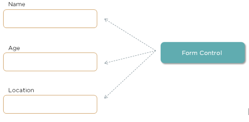
FormControl instance in Reactive form :- value: The current value of the form control.
- status: The validation status of the control. Possible values are
'VALID','INVALID','PENDING','DISABLED'. - valid: A boolean property that indicates whether the form control's value is valid according to all the applied validation rules.
- invalid: The opposite of
valid. It istrueif the form control's value is invalid - errors: An object containing any validation errors. It's
nullif the control is valid. - pristine: A boolean indicating if the control is unchanged (not dirty).
- dirty: A boolean indicating if the control's value has changed (is dirty).
- touched: A boolean indicating if the control has lost focus (been touched).
- untouched: A boolean indicating if the control is untouched (not touched).
- pending: A boolean indicating if the control is waiting for an asynchronous validation to complete.
- disabled: A boolean indicating if the control is disabled.
- enabled: A boolean indicating if the control is enabled.
FormGroup in Angular Reactive Forms also has similar properties to FormControl, and they serve similar purposes in managing form validation and user interactions. FormGroup
FormGroup in Angular Reactive Forms is a class that represents a collection of form controls organized into a group. It's used to manage and validate multiple form controls collectively. A FormGroup can contain one or more FormControl instances, other FormGroup instances, or FormArray instances, allowing you to structure complex forms with nested controls.FormArray
FormArray in Reactive Forms is a class used to manage an array of FormControl, FormGroup, or FormArray instances. It's particularly useful when dealing with dynamic forms where the number of form controls or groups can vary. FormArray allows you to create and manage an array of form controls or groups dynamically.[formGroupName]="i" inside the loop, Angular understands that i represents the index of the current FormGroup within the FormArray. This allows Angular to bind the form controls correctly within each FormGroup because i points to the specific FormGroup in the FormArray at that index.controls: An array of theAbstractControlinstances that belong to theFormArray.
value: An array that represents the current values of the form controls within theFormArray.
valid: A boolean property that indicates whether all the form controls within theFormArrayare valid.
invalid: A boolean property that indicates whether any of the form controls within theFormArrayare invalid.
errors: An object containing any errors that are present in theFormArray.
at(index: number): Returns theAbstractControlat the specified index in theFormArray.
push(control: AbstractControl): Adds a new control to the end of theFormArray.
insert(index: number, control: AbstractControl): Inserts a new control at the specified index in theFormArray.
removeAt(index: number): Removes the control at the specified index from theFormArray.
clear(): Removes all controls from theFormArray.
setControl(index: number, control: AbstractControl): Replaces the control at the specified index with a new control.
setValue(value: any[], options?: Object): Sets the value of theFormArray.
patchValue(value: any[], options?: Object): Updates the value of the `FormArray without changing its structure.
reset(value?: any, options?: Object): Resets theFormArrayand its controls to an initial state.
- valueChanges: Observable<any[]>: An observable that emits the current value of the
FormArraywhenever the value changes.
setValue() will throw an error. This method is typically used when you have a complete set of values for all controls in your form.NOTE: The patchValue() method is used to update the values of an existing formGroup/Array. It updates only the controls that are included in the provided object and leaves the rest unchanged. It does not require all controls to be present in the provided object.
valueChanges()
FormGroup class provides a method called valueChanges that returns an observable representing the form's current value. We can subscribe to this observable to react to changes in the value of a specific formcontrol.FormBuilder
FormBuilder is a service provided by the @angular/forms module. It's a helper class that simplifies the process of creating and managing instances of FormGroup and FormControl in reactive forms.FormGroup and FormControl classes. Using FormBuilder is optional, but it offers a more concise and readable way to create form controls and groups, especially when dealing with complex forms with multiple controls and nested groups.Behaviour Subject
BehaviorSubject provides a way to manage and share the state across different parts of the application. Components can subscribe to a BehaviorSubject and react to changes in the state, ensuring that they always have access to the most recent data.BehaviorSubject is a type of subject, which is a part of the RxJS (Reactive Extensions for JavaScript) library. The BehaviorSubject acts as the subject. It holds the current state (the "behavior" part) and notifies its subscribers (observers) when the state changes.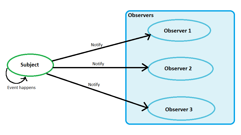
BehaviorSubject, subscribers are the observers. They subscribe to the BehaviorSubject to receive notifications whenever the state (value) of the BehaviorSubject changes.BehaviorSubject, you are essentially registering an observer on the subject. Whenever you call the next() method on the BehaviorSubject to emit a new value, all the subscribed observers (components, services, or any other part of your application) are notified of this change.BehaviorSubject instances are often created in Angular services so that any component across the application can subscribe to the subject and react to changes in value.---------------------------------------------------------------------------------------------------------------
Modules
---------------------------------------------------------------------------------------------------------------
Angular Material
---------------------------------------------------------------------------------------------------------------


Comments
Post a Comment