Flutter Notes (Part 1)
Flutter is an open-source UI framework developed by Google that enables developers to build beautiful, natively compiled applications for multiple platforms, including mobile (iOS & Android), web, desktop (Windows, macOS, Linux), and embedded devices, all using a single codebase. Flutter is designed to facilitate the creation of high-performance apps with visually stunning user interfaces and a streamlined development experience.
Single Codebase: Write once, deploy across platforms.
Hot Reload: Instantly see changes in the code without restarting the app, enabling faster development and debugging.
Rich Widget Library: Pre-designed widgets follow platform-specific guidelines (Material for Android, Cupertino for iOS), ensuring a native look and feel. Custom widgets can also be created for unique app designs.
High Performance: Flutter's architecture ensures smooth animations and fast performance.
Broad Platform Support: Build for mobile, web, desktop, and embedded systems seamlessly.
Rendering in Flutter
In frameworks like React Native, a communication layer connects/maps the JavaScript code to native platform APIs. This bridge translates UI components from JavaScript into their corresponding native components. React Native relies on the native components of each platform, so apps can inherit platform-specific behaviors (e.g., differences in button styles or navigation). When a UI element (like a button or text) is created, React Native uses the native component equivalent to render it on the screen.
React Native relies on the platform's native UI components, so the app's behavior and appearance may vary slightly between iOS and Android. The bridge can become a bottleneck, especially when handling complex animations or frequent UI updates. Each interaction requires a roundtrip between the JavaScript thread and native rendering.

Unlike many other frameworks, Flutter does not rely on native platform components (like UIButton for iOS or Button for Android). Instead, it uses its own rendering engine called "Skia", a high-performance 2D graphics engine. This approach allows Flutter to deliver consistent, high-quality user interfaces across all supported platforms.
TextView or ListView.Performance: By avoiding the bridge and native components, Flutter minimizes latency and ensures smooth animations (even at 60fps or higher).
Customization: Developers have full control over the UI, enabling detailed customizations, including shapes, gradients, shadows, and animations.
Cross-Platform Consistency: Skia ensures the UI behaves identically on all platforms.
Native platform components can be restrictive. Flutter’s approach allows developers to fully customize UI elements, from buttons to animations, without being limited by the platform’s design guidelines. Since Skia draws every pixel, Flutter offers fine-grained control over the UI. Developers can customize everything, including shapes, gradients, shadows, and animations.
Impeller: Flutter’s Modern Rendering Engine
While Flutter’s Skia engine has long been recognized for its ability to deliver smooth, consistent, and visually stunning interfaces across platforms, it wasn’t without its limitations—particularly with shader compilation jank. This issue could occasionally cause stuttering during animations or transitions, especially on the first render of complex scenes. To address this and further optimize performance, Flutter introduced Impeller, its next-generation rendering engine.
Key advantages of Impeller include:
- Smoother Animations: By eliminating runtime shader compilation, Impeller ensures consistent frame rates, even in graphics-heavy scenarios or during rapid transitions.
- Platform-Specific Optimization: Unlike Skia, which uses generic APIs like OpenGL, Impeller takes advantage of platform-native APIs, resulting in more efficient rendering.
- Future-Proofing Graphics: With its modern architecture, Impeller is better equipped to handle emerging demands in visual effects and complex UI designs.
It takes full advantage of modern GPU hardware capabilities using APIs like Metal (iOS/macOS) and Vulkan (Android/Linux). As of recent updates, Impeller is enabled by default on iOS and Android. To run flutter without Impeller renderer, use the below command:
---------------------------------------------------------------------------------------------------------------
Flutter file structure
When you create a new Flutter project, you’ll notice a specific directory structure designed to keep your code organized, scalable, and maintainable. Below is an overview of the typical file structure in a Flutter project and the purpose of each directory and file.
Here’s a concise one-liner for each file and folder in a Flutter app:
android/: Contains Android-specific code and resources for building the Android version of the app.build/: Holds the output of the build process, including compiled code and assets.ios/: Contains iOS-specific code and resources for building the iOS version of the app.lib/: Contains the main Dart code for your app’s logic and user interface.test/: Holds unit and widget tests to ensure the app works as expected.pubspec.yaml: Defines the app’s metadata, dependencies, and assets.pubspec.lock: Locks the exact versions of dependencies to ensure consistency across environments.
lib/ folder in a Flutter project is the heart of your application. It contains all the Dart files where you define the main logic, UI, and functionality of your app. This is where you’ll write most of your Flutter code, such as UI elements, business logic, and state management. Widgets
In Flutter, widgets are the building blocks of any application. They define the structure, design, and interaction of the user interface (UI). Everything you see on the screen, from buttons and text (even padding or margins) to entire layouts, is a widget. Flutter uses a widget tree to manage the hierarchy and composition of these widgets.
Widgets are immutable by design, meaning their properties cannot be changed after they are created. To update the UI dynamically, you rebuild widgets with new data or state. Each widget has a lifecycle that defines the stages a widget goes through from creation to destruction.
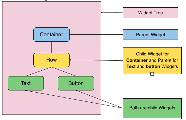
The widget tree in Flutter is the hierarchical structure that organizes and represents all the widgets in an app's user interface. Every Flutter app starts with a root widget (typically MaterialApp or CupertinoApp), and this widget branches out into child widgets, which further branch into their own children, forming a tree-like structure.
Each widget in the tree is a node, and its parent-child relationships define how the widgets are displayed and interact with each other. The parent widget controls the layout and positioning of its child widgets. For example, a Column widget (parent) can have multiple Text and Button widgets (children) arranged vertically.
The widget tree is recreated whenever the app state changes, which ensures that the UI remains in sync with the underlying data. Flutter's efficiency in rebuilding only the parts of the tree that have changed is a key reason for its smooth performance.
NOTE : Deeply nested widget trees can become hard to manage. Use helper methods, custom widgets, or composition to simplify and modularize your tree. The Flutter Inspector helps visualize the widget tree and understand the relationships between widgets. It’s invaluable for identifying layout issues and optimizing the structure.
Based on how the state is managed, Flutter provides two main types of widgets:
Stateless Widget - A Stateless Widget is used when the widget’s appearance remains constant throughout its lifecycle. It doesn’t depend on any mutable state and is immutable, meaning that once it is built, it doesn’t change unless its parent requests a rebuild. These widgets are ideal for static UI elements that don’t need to update dynamically.
Stateful Widget - A Stateful Widget is used when the widget’s appearance can change over time. It has mutable state, which means it can rebuild itself when its internal data or state changes. This type of widget is ideal for dynamic content, like counters, forms, or interactive elements, that require updates based on user interactions or changing data.
These two widget types allow Flutter to efficiently handle both static and dynamic user interfaces by managing their state differently.
The main() function is the entry point of any Flutter app, and inside it, we use the runApp() function to start the app. Inside main(), runApp() is called with the root widget of the app, MyApp. The runApp() function is responsible for launching the app and displaying the UI on the screen.
Stateless Widget
In Flutter, a StatelessWidget is a type of widget that is immutable—once it is created, it does not change. A StatelessWidget represents a UI element whose properties and content remain the same throughout its lifecycle, making it ideal for displaying static content.
When you use a StatelessWidget, the widget does not maintain any mutable state. Its properties are provided when it is created, and it rebuilds only when its parent widget triggers a rebuild. This makes StatelessWidgets extremely efficient for simple UI elements that don't need to respond to user actions or other dynamic data.
Immutable: The content of a StatelessWidget cannot be changed after it is created. Once built, it stays the same unless it is explicitly rebuilt.
No internal state: Unlike StatefulWidgets, StatelessWidgets do not have any internal state to track or modify. They rely solely on the properties passed to them at the time of their creation.
Rebuild triggered by parent: StatelessWidgets only rebuild when the parent widget requests a rebuild. They are not affected by any internal state changes, as there is none to track.
Efficiency: Because they don’t need to handle mutable state, StatelessWidgets are generally more lightweight and have better performance compared to StatefulWidgets.
The StatelessWidget is a class provided by Flutter to create immutable widgets. A StatelessWidget requires you to override its build() method to describe how the widget looks on the screen.
If you attempt to call setState() inside a StatelessWidget, you'll encounter a compile-time error because setState() is not defined in the StatelessWidget class.
NOTE : The data is passed to a StatelessWidget using its constructor. This allows the parent widget to provide information (called properties) that the child StatelessWidget can use to build its UI. Flutter allows passing data through named parameters (preferred for readability) or positional parameters.
Stateless Widgets & role of const
Stateless Widgets do not maintain any internal state. They are designed to display static content that does not change after the widget is built. Whenever a StatelessWidget is rebuilt, its appearance is determined solely by the parameters passed to it.
Flutter introduces a powerful optimization technique using the const keyword. Declaring a widget as const makes it immutable and ensures it is not recreated unnecessarily during the widget tree updates.
- Compile-Time Creation: Widgets marked with
constare created at compile-time rather than runtime. This reduces the overhead of recreating widgets during runtime. - Reuse of Widget Instances: Once a
constwidget is created, Flutter reuses the same widget instance across rebuilds, saving memory and CPU resources. This optimization is especially useful in widget-heavy applications.
When to Use const in Stateless Widgets
- Static Properties: All the properties of the widget are fixed and known at compile time.
- No Dynamic Data: The widget does not rely on dynamic or runtime data (e.g., user inputs, API responses, or state changes).
- Improving Performance: For widgets that do not change, using
const helps improve performance by minimizing rebuilds.
const helps improve performance by minimizing rebuilds.When NOT to Use const
- If the widget depends on dynamic data, such as user input or changing state,
const is not applicable. - Avoid using
const when properties of the widget might change during the app's lifecycle.
const is not applicable.const when properties of the widget might change during the app's lifecycle.StatelessWidgets only rebuild when their parent widget triggers a rebuild. This makes them highly efficient compared to StatefulWidgets. StatelessWidgets themselves are already efficient even without const. const simply makes them more efficient by ensuring they are only created once during compile-time when their properties are fixed.
To optimize a StatelessWidget using the const keyword, it's essential to know which parts of the widget you should mark as const. This helps Flutter to avoid unnecessary rebuilds and improve performance by reducing the number of new object creations.
- Mark the constructor as
constif all properties of the widget are immutable (i.e., they do not change). - Use
constfor child widgets if they are static (i.e., their properties do not change). - Use
constfor fixed properties like styles, padding, or decorations that don't change. - Parent widget instantiation: Use
constwhen passing immutable data to a widget.
---------------------------------------------------------------------------------------------------------------
Stateful Widget
In Flutter, a StatefulWidget is a widget that can change over time, typically in response to user interaction or dynamic data updates. Unlike a StatelessWidget, a StatefulWidget maintains a mutable state, meaning its properties can be modified and updated during its lifecycle.
A StatefulWidget consists of 2 main components :
The Widget : This part defines what the widget looks like. It's similar to the widget in a StatelessWidget, where the appearance of the widget is described. However, it doesn't handle any changes over time. The Widget is immutable.
The State : This is where the mutable state lives. The State holds the dynamic data that can change, such as the current user input or data fetched from an API. When the state changes (using
setState()), the widget rebuilds to reflect these updates.

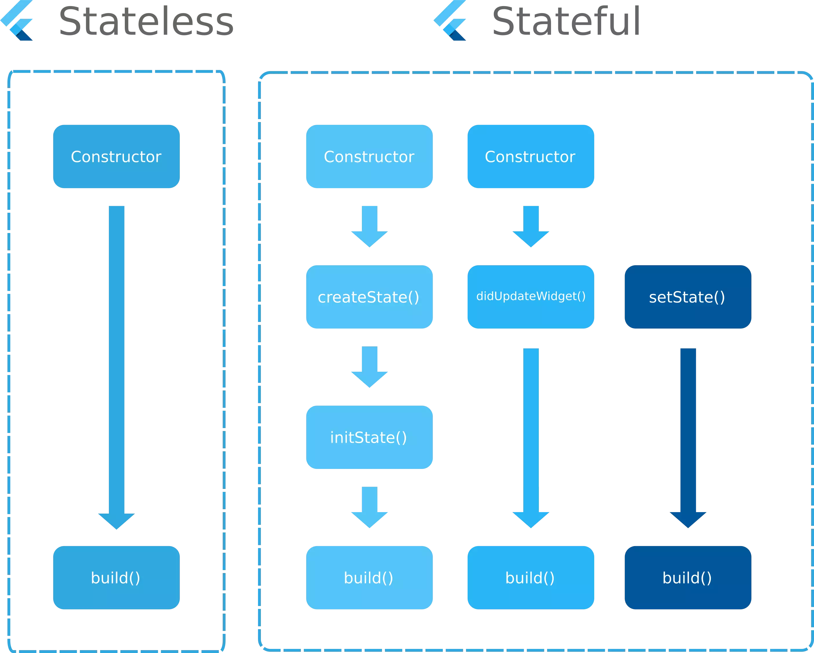
The lifecycle of a StatefulWidget in Flutter refers to the sequence of events that happen from the time the widget is created until it's disposed of. This lifecycle is divided into several stages, which involve the creation, updating, and destruction of the widget and its associated State object.
Lifecycle Stages of a StatefulWidget:
Creation of the StatefulWidget:
- When a StatefulWidget is created, the framework calls its
createState()method, which returns an instance of the State class. The State class holds the mutable state of the widget. - This is the initial phase where the widget is inserted into the widget tree.
- When a StatefulWidget is created, the framework calls its
Mounting:
- Mounting occurs when the widget and its state are inserted into the widget tree for the first time. This happens in the
initState()method. - The
initState()method is called only once during the widget's lifecycle, and it is a good place to initialize any data or resources needed for the widget.
- Mounting occurs when the widget and its state are inserted into the widget tree for the first time. This happens in the
Building the Widget:
- After the widget is mounted, the framework calls the
build()method of the State class. Thebuild()method describes the widget's UI by returning a widget tree that represents the current state of the widget. - This method is called whenever the state changes (by calling
setState()), and the widget tree is rebuilt to reflect the new state.
- After the widget is mounted, the framework calls the
State Changes:
- Whenever the state of the widget changes (e.g., due to user interaction or data updates), the
setState()method is called. This triggers a rebuild of the widget. - The
build()method is called again to rebuild the widget with the updated state.
- Whenever the state of the widget changes (e.g., due to user interaction or data updates), the
Rebuilding the Widget:
- If there are any changes to the state that require the widget to update,
setState()triggers the rebuild. Thebuild()method will be called again to update the widget's UI based on the new state. - This process can happen many times during the widget's lifecycle (e.g., for animations, user interactions, or data changes).
- If there are any changes to the state that require the widget to update,
Deactivation:
- The deactivate() method is called when the widget is temporarily removed from the widget tree.
- This might happen when a widget is moved to a different part of the widget tree during a rebuild or if its parent widget is changing.
- The deactivate() method can be used for any cleanup or temporary resource release, but the State object is still retained and can be reactivated.
Disposal:
- When the widget is no longer needed (for example, when it is permanently removed from the widget tree), the framework calls the dispose() method of the State class.
- The dispose() method is a good place to release any resources or listeners that were set up in the initState() method to avoid memory leaks (such as cancelling timers, closing streams, or disposing of controllers).
TabBarView or navigating to another screen using Navigator.push, allowing it to be reinserted later. In contrast, a widget is disposed when it is permanently removed from the widget tree, such as when a screen is popped with Navigator.pop or a dynamically added widget is deleted.
The primary reason State is kept separate from the widget itself is to efficiently handle the widget tree rebuilds. The State is preserved between rebuilds, so it can hold the mutable data that persists over the lifecycle of the widget. Since the State class holds the mutable data, it can be updated without recreating the widget, which is key for performance.
Widgets are immutable, which means once they are built, their properties can't be changed. Keeping the mutable state separate from the widget ensures that only the state is changed, and the widget itself can be rebuilt when necessary without creating new instances of it.
NOTE : The underscore (_) in Dart is optional, but it is a convention in Dart used to indicate that a class or variable is private to the file in which it is declared. When you prefix a class or variable name with an underscore, it signifies that it is private to the file. This means that it cannot be accessed from outside that file.
setState()
In Flutter, setState() is a method provided by the State class to update the state of a StatefulWidget. When called, it marks the widget as "dirty," prompting the framework to schedule a rebuild of the widget. The build() method is called again, and the UI is updated to reflect the new state.
- Triggers a Rebuild: It informs the Flutter framework that the internal state of the widget has changed and needs to be redrawn.
- Partial Updates: Only the widget that calls
setState()and its descendants are rebuilt, not the entire widget tree. - Efficient Updates: Avoid heavy computations inside
setState()to ensure smooth UI performance. - Should Be Called in the Widget Lifecycle: It should only be used after the widget is initialized (
initState) and before it's disposed (dispose).
setState() will not trigger a UI update.Heavy computations inside setState() can make the UI sluggish. Instead, perform calculations outside and pass the result to setState(). Since setState() should execute synchronously, using async/await can cause unintended issues. Minimize the area of the widget tree that is rebuilt. Ideally, encapsulate UI sections in smaller widgets and call setState() only where necessary to avoid performance issues.
---------------------------------------------------------------------------------------------------------------
BuildContext
In Flutter, BuildContext is a fundamental concept that represents the location of a widget within the widget tree. It acts as a handle to access various properties and methods of the widget's environment, such as its parent widgets, the surrounding UI state, and more. A BuildContext is required for various actions like accessing theme data, navigating between screens, or interacting with inherited widgets.
BuildContext is a class in Flutter that provides information about the location of a widget in the widget tree. It is passed as an argument to the build method of every widget and allows you to interact with the widget tree in various ways.
Every widget has its own BuildContext, which corresponds to its position in the widget tree. This allows Flutter to locate and interact with widgets above and below it, to make decisions about layout, theming, or other configurations.
Flutter’s declarative UI model relies on the context to resolve the relationship between widgets and access global or inherited information. For example:
- Theme Information: Widgets use
contextto access inherited theme data (like color schemes, typography, etc.). - MediaQuery: It allows you to get device information (screen size, orientation, etc.).
- Navigator: Context is used to navigate between screens or pages.
- Inherited Widgets: You can use
contextto access data provided byInheritedWidgetor state management solutions likeProvider.
When dealing with routing and navigation, BuildContext is essential. It's required to interact with Navigator, like pushing, popping routes, or replacing screens. It provides a way to reference the widget tree and allows you to retrieve information from the ancestor widgets.
---------------------------------------------------------------------------------------------------------------
Widget Themes
In Flutter, widget themes refer to the styling principles associated with the 2 primary design systems:
- Material Design (by Google)
- Cupertino (by Apple)
These themes provide built-in support for creating applications that look native on Android and iOS platforms, respectively. Material Design is a design language developed by Google.
Flutter provides a robust implementation of Material Design widgets through the MaterialApp widget. Cupertino is Apple's design system for iOS applications. Flutter provides Cupertino widgets to create UIs that look native on iOS.

If you choose to use MaterialApp for your Flutter app, it will still work and look consistent across both Android and iOS platforms. However, the UI elements will follow Google's Material Design guidelines, which are better suited for Android. This means your app will have a distinctly Material Design look on iOS, which might not align perfectly with iOS's native aesthetics.

The app won't have the native iOS look and feel unless you explicitly use Cupertino widgets. Mimicking iOS design requires manual adjustments, such as integrating CupertinoApp or conditionally using Cupertino widgets.
You can mix and match Material and Cupertino widgets within the same app. For example:
- Use MaterialApp for the core structure.
- Add CupertinoNavigationBar for iOS-like navigation elements.
You can use third-party packages like flutter_platform_widgets to simplify creating a UI that adapts to both Material and Cupertino designs automatically. If your app targets both platforms equally, use Material Design with occasional Cupertino widgets to ensure platform familiarity. For apps with a global design language (e.g., a brand-specific look), focus on customizing Material or Cupertino themes to align with your brand.
NOTE : When you use Material Design on iOS devices, certain widgets like the Material AppBar might look out of place because they follow Android’s Material Design principles, which don’t perfectly align with iOS’s native aesthetics. The Material Design AppBar doesn't automatically adjust to account for the notch or safe areas on devices like the iPhone 15. This can make your AppBar look misaligned or improperly positioned.
In Flutter some widgets are exclusive to Material while some to Cupertino, but there are also some widgets that are Generic to both. Flutter has widgets that are specifically designed for each design system:
Material Widgets: These widgets are exclusive to Material Design, such as
Scaffold,AppBar,FloatingActionButton, etc. They follow Google's Material Design guidelines, primarily used in Android apps.Cupertino Widgets: These widgets are exclusive to the Cupertino design, such as
CupertinoPageScaffold,CupertinoNavigationBar,CupertinoTextField, etc. They follow Apple's Human Interface Guidelines, primarily used in iOS apps.
Some widgets are neutral and can work across both Material and Cupertino contexts without enforcing a specific design system:
- Examples:
Container,SafeArea,Center,Padding,Row,Column,Stack, etc. - Purpose: These widgets focus on layout, positioning, and non-design-specific functionality, making them versatile for both Material and Cupertino applications.
Example] Below we use Material Design as root widget. The app adheres to Google's Material Design guidelines, ensuring consistency across the UI. It includes built-in support for Material widgets like Scaffold, AppBar, FloatingActionButton, ElevatedButton, and SnackBar.
Even on iOS devices, MaterialApp ensures a consistent look and feel by following Material Design principles. However, it may not perfectly align with iOS's native aesthetics.
Example] Below we use Cupertino Design as root widget. When you use CupertinoApp as the root widget in your Flutter app, the app adopts Apple's Cupertino Design principles.
On Android, CupertinoApp will still render correctly, but the app will have an iOS-style UI. This can make the app appear out of place compared to other native Android apps.
NOTE : If you want the best of both worlds, you can use a hybrid approach: Use MaterialApp for the overall app structure to maintain cross-platform consistency. Use Cupertino widgets selectively where you need specific iOS-like features (like CupertinoNavigationBar, CupertinoPicker, etc.).
---------------------------------------------------------------------------------------------------------------
MaterialApp Widget
The MaterialApp widget is a high-level widget that acts as the foundation for Material Design apps in Flutter. It serves as a container for app-wide configurations like theming, routing, and localization. Most Flutter apps use MaterialApp as their root widget to ensure a consistent and cohesive Material Design experience across the app.
The MaterialApp widget enables Material Design principles by providing built-in support for Material-specific widgets such as Scaffold, AppBar, FloatingActionButton, and more. MaterialApp simplifies navigation by supporting named routes and dynamic route generation.
It provides tools like routes, onGenerateRoute, and navigatorKey to manage screen transitions effectively. Below are some commonly used properties of MaterialApp widget :

The MaterialApp widget is typically the root widget, and it initializes configurations for the app. It's the entry point where the app begins setting its theme, navigation, and more, ensuring a consistent experience across the app.
NOTE : The MaterialApp widget is not strictly required to build a Flutter app.
However, it is highly recommended if you're building a Material Design app because it provides essential configurations and functionality for Material Design, such as theming, navigation, and localization which you would have to handle manually if not used. Widgets like Scaffold, AppBar, FloatingActionButton, and others may still work but won't have consistent Material Design theming or behavior.
---------------------------------------------------------------------------------------------------------------
Structural Widgets (Material)
Structural widgets in Flutter play a crucial role in defining and organizing the layout and hierarchy of your app's UI. They act as the framework or scaffolding, determining how other widgets are arranged and how key features like navigation, screen layout, and positioning are handled. These widgets are fundamental in ensuring a consistent and functional UI structure.
- Scaffold: Provides the basic structure for an app, including areas for the app bar, body, navigation, and floating action button.
- SafeArea: Ensures that widgets are displayed within the visible safe area of the screen, avoiding system UI elements.
- AppBar: A material design app bar used at the top of the screen for titles, actions, and navigation.
- Drawer: A slide-in menu often used for app navigation and typically positioned on the left side.
- BottomNavigationBar: A bar at the bottom of the screen for switching between different sections of the app.
- TabBar: Displays a set of tabs for navigation, typically placed at the top of the screen.
Scaffold
The Scaffold widget is a fundamental layout component in Flutter that provides a high-level structure for your app's UI. It acts as the base framework for organizing and placing other widgets within the app. The Scaffold widget allows you to define several key areas of your app's screen, such as the app bar, body, floating action button, and drawer.
It is part of the Material Design package, so it is primarily used in apps targeting Android and other platforms that follow Material Design guidelines. Below are the most commonly used properties of Scaffold widget :
- AppBar: Displays at the top of the screen, used for navigation, titles, and actions.
- Body: The main content area where most of your app's content resides.
- Drawer: A slide-in menu, typically used for app navigation.
- FloatingActionButton: A circular button that "floats" over the body content, used for primary actions.
- BottomNavigationBar: A bar at the bottom of the screen for switching between different app sections.
- PersistentFooterButtons: A fixed row of buttons at the bottom of the screen.
- BottomSheet: Displays a persistent or modal bottom sheet for additional content or actions.
- BackgroundColor: Sets the background color of the entire screen.
Example] Below we use the Scaffold widget and its properties to build home page.
It is not required to use a Scaffold in a Flutter app, but it is highly recommended when building Material Design apps. The Scaffold widget provides a structured layout and functionality that adheres to Material Design principles. Without it, you lose access to several features that make building Material apps easier.
AppBar, Drawer, BottomNavigationBar, FloatingActionButton, and SnackBar won't work as expected because they rely on the Scaffold widget. Scaffold automatically handles (e.g., handling safe areas or padding for different screen sizes). You'll have full control of the screen layout, but you need to implement common UI patterns (e.g., a persistent bottom bar or a top bar) yourself.AppBar and BottomNavigationBar without using a Scaffold widget. The layout is manually managed using Column and other widgets.Creating custom layouts without Scaffold can lead to challenges in ensuring consistent behavior across devices and screen sizes, especially with adaptive layouts. For apps with multiple pages, drawers, or navigation mechanisms, managing layout without Scaffold can become cumbersome and error-prone.
SafeArea
Modern devices often have unique screen designs (e.g., notches, punch-hole cameras, or rounded edges). Content placed too close to the edges may get obstructed by these areas or interact poorly with system UI elements. SafeArea solves this problem by automatically applying padding to avoid unsafe areas. Below are some commonly found system UI elements that can overlap with widgets :
Status Bar
A slim strip at the top of the screen showing time, battery, and notifications. It can overlap with your app's content if not handled properly.Navigation Bar
Found at the bottom of the screen with system controls like Back, Home, or multitasking gestures. Can obscure UI elements if not accounted for.Keyboard (Soft Input)
Appears when interacting with text fields, pushing up or covering UI near the bottom. Needs proper handling to avoid overlapping crucial elements.Notches and Cutouts
Hardware intrusions like camera notches or sensors on edge-to-edge displays. Can clip content placed too close to the edges.Rounded Corners
Screen corners that are curved instead of square may clip or distort UI placed near them. Common in modern smartphones with bezel-less designs.System Gestures Area
The edges reserved for gestures like swiping to go back or home. Interfering with this area can conflict with navigation gestures.
The SafeArea widget in Flutter is used to prevent UI elements from overlapping with system-defined areas like the status bar, navigation bar, notches, rounded corners, and other screen cutouts. It ensures that your content stays within a "safe" visible region on all devices.

The system defines "unsafe" areas on the screen. These areas are typically occupied by the status bar, navigation bar, or cutouts. SafeArea applies padding to the child widget based on these unsafe areas, ensuring the content is fully visible.
NOTE : By default, SafeArea applies padding to all edges, but you can customize it to exclude specific edges. You can specify which edges (top, bottom, left, right) should avoid system UI elements. For apps with Scaffold, many of its features already handle safe areas (e.g., AppBar and BottomNavigationBar).
Points to Consider :
- When Not to Use SafeArea
- SafeArea is unnecessary if you're using widgets like
Scaffold, as many of its child elements (e.g.,AppBar,BottomNavigationBar) already account for safe areas. Avoid using it unnecessarily, as it can lead to redundant padding.
Alternative to SafeArea
For more granular control, consider using thePaddingwidget to manually handle content placement in specific areas. This can be useful for custom layouts where you don't need automatic safe area calculations.Handling Dynamic Content
On devices with changing system UI configurations (e.g., fullscreen apps, immersive mode),SafeAreaautomatically adapts, making it superior to static padding.Impact on Accessibility
Properly using SafeArea ensures your app is accessible across different screen designs, improving user experience and compatibility.SafeArea in Nested Widgets
You can use SafeArea within parts of the UI if only specific sections need to avoid system UI elements, rather than wrapping the entire app.Customizing SafeArea
Mention thatSafeAreaprovides parameters likeminimum(to set additional padding) andmaintainBottomViewPadding(to adjust behavior for the keyboard). These options make SafeArea flexible for various layouts.
---------------------------------------------------------------------------------------------------------------
Flutter Debug Modes
In Flutter, there are 3 main modes for running your app: Debug mode, Profile mode, and Release mode. These modes help you manage your app's development, testing, and final deployment. Each mode serves a different purpose, offering a balance between performance and debugging features based on the stage of the development process.
Debug Mode: Used during the active development phase for debugging and testing. This mode allows developers to test the app, find bugs, and quickly apply changes with the help of debugging tools like hot reload, detailed logging, and assertions.
Profile Mode: Used for performance profiling and benchmarking. This mode helps developers test how their app behaves under conditions closer to release mode but still includes some debugging tools. It is useful for fine-tuning performance before the final release.
Release Mode: The final, production-ready mode used when you’re ready to deploy your app to users. In this mode, Flutter optimizes the app’s performance and size for production use, removing debugging tools and enabling efficient, fast execution.

To run your Flutter app in each mode—Debug, Profile, and Release—you can use specific commands in the terminal. Below are the commands for running your app in each mode:
NOTE : Flutter by default runs the app in Debug mode when you use the flutter run command without any additional flags. In Debug mode, the app provides debugging features such as hot reload and detailed logs.
Debug Mode
Debug mode is designed for use during development. It allows you to write, test, and debug your Flutter app with minimal hassle. This mode prioritizes developer productivity over performance optimization. Below are key features of debug mode :
Hot Reload: The standout feature of debug mode. Hot reload enables you to see the effects of code changes instantly without restarting the entire app or losing the current state. This is incredibly helpful when fine-tuning your app's UI or logic.
Assertions: Assertions are active in this mode, allowing you to check for conditions that should hold true during development. If an assertion fails, it triggers an exception and halts the program to highlight the issue.
Verbose Logging: Debug mode provides detailed logs, making it easier to trace bugs or analyze the flow of the application. You can use
print()statements or view extensive error stack traces.Dart DevTools Integration: This includes tools like the Widget Inspector, Performance Profiler, and Memory Profiler to track the app’s performance and debug widgets or rendering issues. These tools are invaluable when you're working on complex UI layouts or performance-related issues.
Slower Performance: Debug mode isn't optimized for performance. The app will run slower because it includes debugging information, stack traces, and extra checks. The priority is on helping you find bugs, not on speed.
Debug Banner: A "DEBUG" banner is displayed on the top-right corner of the app. This banner reminds you that the app is in debug mode and isn’t intended for end-users.
Profile Mode
Profile mode is designed for performance analysis and optimization while running your Flutter app on a real device or emulator. It strikes a balance between debug and release modes, enabling you to analyze your app's performance without the overhead of debugging features. Below are the key characteristics of profile mode:
Performance Optimization: Unlike debug mode, profile mode includes optimizations such as Ahead-of-Time (AOT) compilation, making the app closer to its release state. These optimizations ensure the app runs efficiently, allowing you to focus on analyzing real-world performance.
Limited Debugging: Features like
Hot Reloadare not available, butHot Restartstill works. Assertions are disabled in profile mode to simulate release performance conditions.Dart DevTools for Profiling: Profiling tools like the Performance Timeline, Memory Profiler, and CPU Profiler are fully enabled. These tools help you analyze frame rendering, CPU usage, and memory allocation to identify bottlenecks and optimize the app’s performance.
Verbose Logging for Performance Metrics: Logs are more performance-focused, showing detailed insights such as frame rendering times, build times, and layout updates. Use
debugPrint()and performance markers to monitor critical sections of your app.Realistic Performance Testing: Profile mode mimics the behavior of your app in a production environment, making it suitable for testing how the app will perform for end users. Animations, transitions, and interactions will run at production-level speed.
No Debug Banner: The debug banner is removed, offering a cleaner experience for performance profiling.
Release Mode
Release mode is tailored for deploying your Flutter app to end users. It prioritizes performance and app size optimization, ensuring that the app runs as smoothly as possible on production devices. This mode removes all debugging and profiling features, making it the final stage of your app's lifecycle.
Maximum Performance: The app is fully compiled to machine code using Ahead-of-Time (AOT) compilation, resulting in a highly optimized binary. It runs at its fastest, ensuring minimal startup time and smooth user interactions.
Small App Size: Debugging symbols, logs, and other development tools are stripped away to minimize the app size. Code is tree-shaken to remove unused classes, methods, and libraries.
No Debugging Tools: Debugging features, including
Hot Reload,Hot Restart, assertions, and detailed logs, are completely disabled. This ensures that the app is free of development artifacts and ready for end users.No Dart DevTools: Profiling tools are unavailable, as the app is running in its final, optimized form.
Optimized Build Configurations: Network requests, database queries, animations, and other operations are executed as they would be in a real-world scenario. Debug-specific tools like
debugPrintare removed to avoid performance degradation.Clean UI: The debug banner is absent, providing a polished and professional user interface ready for deployment.
Flutter Devtools
Flutter DevTools is a suite of debugging and performance analysis tools for Flutter applications. It is a web-based interface that provides deep insights into your app's behavior, helping you debug and optimize your Flutter applications effectively. DevTools is integrated into popular IDEs like Visual Studio Code and Android Studio, but you can also access it independently.
Key Features :
- Widget Inspector: Visualizes the widget hierarchy and helps debug layout issues.
- Performance Profiling: Analyzes frame rendering, CPU activity, and memory usage.
- Logging and Debugging: Displays logs, tracks errors, and supports breakpoints.
- Network Profiling: Tracks network requests and response details.
- Accessibility Checker: Ensures the app meets accessibility standards.
- State Management Debugging: Monitors state changes and rebuilds for better optimization.
- App Size Analysis: Breaks down app size to identify optimization opportunities.
NOTE : DevTools is accessible via a web-based interface or directly through IDEs like Visual Studio Code and Android Studio.
Flutter DevTools is installed by default as part of Flutter SDK. You do not need to install it separately unless you are working on a Dart-only project or need a standalone version. For most Flutter developers, no extra setup is required. DevTools works out-of-the-box with your Flutter installation.
---------------------------------------------------------------------------------------------------------------


Comments
Post a Comment