Flutter Notes (Part 2) - Layout Widgets
Layout Widgets (Material)
In Flutter, layout widgets are responsible for arranging other widgets on the screen. They don’t necessarily display any content themselves but instead manage the positioning, alignment, and spacing of child widgets. They help in creating complex UIs by composing multiple widgets together.
- Container: A versatile widget used for decoration, padding, margin, and aligning a single child.
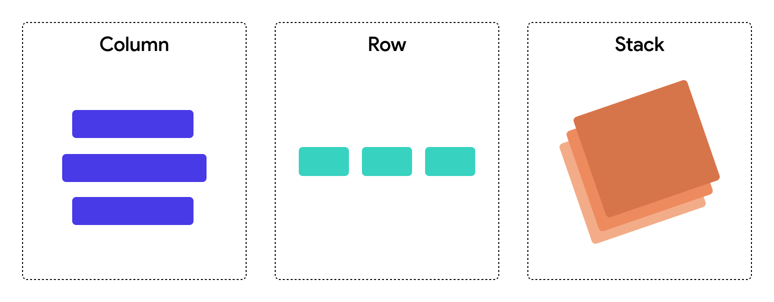
- Column: Arranges its children vertically in a column.
- Row: Arranges its children horizontally in a row.
- Stack: Layers its children on top of each other, with control over their positioning.
- Align: Aligns a child widget within its parent using various alignment options.
- Expanded: Expands a child widget to fill available space within a
Column,Row, orFlex. - Flexible: Provides flexible space for children based on the
flexfactor insideColumn,Row, orFlex. - Padding: Adds padding around a child widget.
- Center: Centers a widget inside its parent.
- Wrap: Automatically wraps its children into multiple horizontal or vertical runs as needed.
- Listview: Display a list of widgets in scrollable manner.
- Gridview: Display a list of widgets in Grid format in scrollable manner.

Column Widget
The Column widget in Flutter is a fundamental layout widget used to arrange widgets vertically. It's perfect for creating vertical UI elements like lists, forms, or stacked widgets. A Column takes a list of widgets (its children) and stacks them one below the other. The vertical alignment, spacing, and behavior can be customized using various properties.
Below are some important properties of the Column widget as follows :
1] Children - A list of widgets to be displayed vertically in the column.2] mainAxisAlignment - Controls how children are aligned vertically and how space is distributed along the column’s main axis.
MainAxisAlignment.start: Aligns children at the top (default).MainAxisAlignment.center: Aligns children at the center.MainAxisAlignment.end: Aligns children at the bottom.MainAxisAlignment.spaceBetween: Spaces children equally with no padding at ends.MainAxisAlignment.spaceAround: Spaces children equally with some padding around each.MainAxisAlignment.spaceEvenly: Spaces children equally with even padding between and around.
3] crossAxisAlignment - Controls how children are aligned horizontally along the cross axis.
CrossAxisAlignment.start: Aligns children to the left.CrossAxisAlignment.center: Aligns children to the center (default).CrossAxisAlignment.end: Aligns children to the right.CrossAxisAlignment.stretch: Stretches children to fill the available width.
4] mainAxisSize - Decides whether the column takes up all available vertical space or just enough to fit its children.
MainAxisSize.max: Takes all available vertical space (default).MainAxisSize.min: Shrinks to fit its children
5] verticalDirection - Defines the vertical order of children (top-to-bottom or bottom-to-top).
VerticalDirection.down: Children are laid out top to bottom (default).VerticalDirection.up: Children are laid out bottom to top.
6] clipBehaviour - Decides how content is clipped when it overflows the column boundaries.
Clip.none: No clipping (default).Clip.hardEdge: Clips without antialiasing.Clip.antiAlias: Clips with antialiasing.Clip.antiAliasWithSaveLayer: Clips with an additional save layer for complex operations.
Row Widget
The Row widget in Flutter is a fundamental layout widget used to arrange widgets horizontally. It's ideal for creating horizontal UI elements like navigation bars, buttons, or any layout where you need to arrange widgets side by side. A Row takes a list of widgets (its children) and places them one next to the other. The horizontal alignment, spacing, and behavior can be customized using various properties.
Below are some important properties of the Column widget as follows :
1] children - A list of widgets to be displayed horizontally in the row.
2] mainAxisAlignment - Controls how children are aligned horizontally and how space is distributed along the row’s main axis.
- MainAxisAlignment.start: Aligns children to the left (default).
- MainAxisAlignment.center: Aligns children to the center.
- MainAxisAlignment.end: Aligns children to the right.
- MainAxisAlignment.spaceBetween: Spaces children equally with no padding at ends.
- MainAxisAlignment.spaceAround: Spaces children equally with some padding around each.
- MainAxisAlignment.spaceEvenly: Spaces children equally with even padding between and around.
3] crossAxisAlignment - Controls how children are aligned vertically along the cross axis.
- CrossAxisAlignment.start: Aligns children to the top.
- CrossAxisAlignment.center: Aligns children to the center (default).
- CrossAxisAlignment.end: Aligns children to the bottom.
- CrossAxisAlignment.stretch: Stretches children to fill the available height.
4] mainAxisSize - Decides whether the row takes up all available horizontal space or just enough to fit its children.
- MainAxisSize.max: Takes all available horizontal space (default).
- MainAxisSize.min: Shrinks to fit its children.
5] textDirection - Defines the direction in which the row's children are laid out (left-to-right or right-to-left).
- TextDirection.ltr: Children are laid out from left to right (default).
- TextDirection.rtl: Children are laid out from right to left.
6] verticalDirection - Defines the vertical order of children (top-to-bottom or bottom-to-top).
- VerticalDirection.down: Children are laid out top to bottom (default).
- VerticalDirection.up: Children are laid out bottom to top.
Container Widget
The Container widget in Flutter is one of the most commonly used and flexible layout widgets. It allows you to customize the appearance and behavior of a box that can hold a single child widget. The Container can be used to add padding, margins, background colors, borders, and much more. It is like a box that can contain any other widget and provide additional styling or layout features.
Below are some important properties of the Container widget as follows:
1] alignment - Controls the alignment of the child widget inside the container.
- Alignment.topLeft: Aligns the child at the top-left corner.
- Alignment.center: Aligns the child at the center (default).
- Alignment.bottomRight: Aligns the child at the bottom-right corner.
- Alignment.topCenter: Aligns the child at the top-center.
- Alignment.bottomCenter: Aligns the child at the bottom-center.
2] padding - Provides inner spacing between the container's border and its child widget.
- EdgeInsets.all(double value): Applies uniform padding on all sides.
- EdgeInsets.symmetric(horizontal: value, vertical: value): Applies padding symmetrically along the horizontal and vertical axes.
- EdgeInsets.only(left: value, top: value, right: value, bottom: value): Provides specific padding for each side.
3] decoration - Used to apply styling and decoration to the container.
- BoxDecoration: A popular way to add decoration such as color, border, border-radius, gradient, and shadows to the container.
- color: Sets a background color.
- borderRadius: Rounds the corners of the container.
- border: Defines a border with specific color and width.
- boxShadow: Adds shadow to the container for a 3D effect.
4] constraints - Defines size limits for the container.
- BoxConstraints: Used to impose limits on width and height.
- maxHeight: Sets the maximum height of the container.
- minWidth: Sets the minimum width of the container.
- maxWidth: Sets the maximum width of the container.
5] width - Defines the width of the container.
- A fixed value (e.g.,
width: 100). - Can be combined with other properties (like
mainAxisSize) to adjust its behavior.
6] height - Defines the height of the container.
- A fixed value (e.g.,
height: 100). - Useful for defining the vertical size of the container.
7] margin - Controls the external spacing (outside) between the container and other widgets.
- EdgeInsets.all(double value): Adds uniform margin on all sides.
- EdgeInsets.only(left: value, top: value, right: value, bottom: value): Adds a custom margin for each side.
8] transform - Applies a transformation matrix to the container.
- Matrix4.rotationX(value): Rotates the container along the X-axis.
- Matrix4.translationValues(x, y, z): Moves the container along the X, Y, and Z axes.
NOTE : A Container widget in Flutter is designed to hold only one child widget at a time. However, this child widget can be any other widget, including a Column, Row, Stack, or even another Container. So, although the Container widget itself can only contain one child, you can place multiple widgets inside the container by wrapping them in a Column or Row.
Stack Widget
The Stack widget in Flutter is used to arrange widgets on top of each other in a layered manner. It's ideal for building complex layouts where widgets need to overlap, such as image overlays, card designs, or custom layered arrangements. A Stack allows widgets to be positioned relative to each other using a coordinate system, making it powerful for creating non-linear layouts.
Below are some important properties of the Stack widget as follows:
1] children - A list of widgets that will be arranged on top of each other. You can stack multiple widgets in a Stack.
2] alignment - Controls how the children widgets are aligned within the Stack. This is similar to the alignment property in other layout widgets but specifically works within the Stack.
Alignment.topLeft: Aligns the children to the top-left of the stack.Alignment.topCenter: Aligns the children to the top-center of the stack.Alignment.topRight: Aligns the children to the top-right of the stack.Alignment.center: Aligns the children to the center of the stack (default).Alignment.bottomLeft: Aligns the children to the bottom-left of the stack.Alignment.bottomCenter: Aligns the children to the bottom-center of the stack.Alignment.bottomRight: Aligns the children to the bottom-right of the stack.
3] fit - Defines how the stack’s size will be determined.
StackFit.loose: Allows the stack to take only as much space as required by its children (default).StackFit.expand: Makes the stack expand to fill the available space.StackFit.passthrough: Uses the size of the first child (rarely used).
4] clipBehavior - Determines how the content should be clipped when it overflows the stack's boundary.
Clip.none: No clipping (default).Clip.hardEdge: Clips without anti-aliasing.Clip.antiAlias: Clips with anti-aliasing.Clip.antiAliasWithSaveLayer: Clips with additional layer for complex clipping operations.
NOTE : You can use the Positioned widget to precisely control where each widget should be placed within the Stack. It allows for flexible placement based on the top, bottom, left, and right offsets. A Positioned widget can only be used inside Stack.
Center Widget
The Center widget in Flutter is a simple but useful layout widget that centers its child widget within its parent. It is commonly used when you want to place a widget exactly in the center of its parent, both horizontally and vertically. The Center widget automatically. Below are some important properties of the Center widget:
The Center widget always centers the child within its parent both horizontally and vertically. However, if you need more control over horizontal or vertical alignment, you may want to use other widgets like Align or Row/Column with specific MainAxisAlignment or CrossAxisAlignment.
Padding Widget
The Padding widget in Flutter is a simple but essential widget used to add space around a child widget. It allows you to provide padding (empty space) on all or specific sides of the child widget. The Padding widget helps create visually appealing layouts by ensuring that widgets do not touch the edges of their parent containers or other widgets.
Padding :
This is the main property of the Padding widget. It defines the amount of space to add around the child widget. It takes an EdgeInsets object that can specify padding on all four sides: top, right, bottom, and left. You can specify padding for each side individually or use a uniform padding for all sides.EdgeInsets provides several ways to define padding:
- EdgeInsets.all(double value): Adds the same padding value to all sides (top, right, bottom, and left).
- EdgeInsets.symmetric({double vertical, double horizontal}): Adds vertical and horizontal padding. You can define different values for vertical (top and bottom) and horizontal (left and right) sides.
- EdgeInsets.only({double left, double top, double right, double bottom}): Adds padding to specific sides, and you can specify different values for each side.
NOTE : Use Padding when your goal is just to add space around a widget. It's simpler, more efficient, and semantically correct. Use Container when you need more than just padding, such as applying decoration, constraints, or other layout customizations.
Wrap Widget
The Wrap widget in Flutter is a layout widget that automatically arranges its children in a horizontal or vertical sequence, wrapping to the next line when there is no more available space. It’s particularly useful when you have a dynamic list of children that might overflow and need to flow to the next line, such as tags, chips, or buttons.
Row and Column widgets are limited to a single line or column of widgets, which can result in overflow when there is insufficient space. Wrap solves this issue by automatically moving widgets to the next line or column when there is no more space, making it a great choice when working with a dynamic number of widgets.Below are some important properties of the Wrap widget as follows:
1] direction - Defines the direction in which the children are arranged.
Axis.horizontal: Children are arranged in a horizontal line (side by side).Axis.vertical: Children are arranged in a vertical line (top to bottom).
2] alignment - Controls how the children are aligned along the main axis (the direction of the wrap).
WrapAlignment.start: Aligns children at the beginning (default).WrapAlignment.center: Aligns children in the center.WrapAlignment.end: Aligns children at the end.WrapAlignment.spaceBetween: Spaces children equally with no padding at the ends.WrapAlignment.spaceAround: Spaces children with equal padding around each child.WrapAlignment.spaceEvenly: Spaces children equally with padding between and around.
3] spacing - Specifies the horizontal space between the children when direction is horizontal, or vertical space when direction is vertical. This is the gap between each widget in the wrap.
4] runAlignment - Aligns the rows or columns of the wrap along the cross axis (perpendicular to the main axis). This property affects how the rows or columns are positioned if the children wrap into multiple lines or columns.
WrapAlignment.start,WrapAlignment.center,WrapAlignment.end: Similar alignment options as inalignment, but applied to the cross axis.
5] runSpacing - Defines the vertical space between runs (rows or columns of children) when direction is horizontal, or horizontal space when direction is vertical. This controls the spacing between lines when children overflow to the next line.
6] crossAxisAlignment - Aligns the children along the cross axis (perpendicular to the main axis). This determines how children are aligned within each row or column.
WrapCrossAlignment.start: Aligns children to the top or left (default).WrapCrossAlignment.center: Aligns children to the center.WrapCrossAlignment.end: Aligns children to the bottom or right.WrapCrossAlignment.stretch: Stretches children to fill the cross axis.
7] textDirection - Determines the text direction, which can impact layout direction, particularly when using localized languages.
TextDirection.ltr: Left-to-right text direction (default).TextDirection.rtl: Right-to-left text direction.
8] verticalDirection - Defines the vertical order of the children.
VerticalDirection.down: Children are arranged top to bottom (default).VerticalDirection.up: Children are arranged bottom to top.
9] clipBehavior - Defines how content is clipped when it overflows the wrap boundaries.
Clip.none: No clipping (default).Clip.hardEdge: Clips without anti-aliasing.Clip.antiAlias: Clips with anti-aliasing.Clip.antiAliasWithSaveLayer: Clips with additional layer for complex clipping operations.
10] children - A list of widgets to be arranged by the Wrap widget. These are the individual widgets that will be wrapped according to the properties defined in the Wrap widget.
NOTE : The main axis is determined by the direction property: if direction: Axis.horizontal, the children are arranged horizontally, and the cross axis is vertical; if direction: Axis.vertical, the children are arranged vertically, and the cross axis is horizontal.
Align Widget
The Align widget is used to align a single child widget within its parent container, offering various alignment options. It allows you to precisely control where a widget is positioned within its allocated space. The Align widget is particularly useful when you need to position a widget within a specific area of a larger layout.
Below are some important properties of the widget as follows:
1] alignment - Defines how the child widget should be aligned within the parent.
Alignment.topLeft: Aligns the child to the top-left of the parent.Alignment.topCenter: Aligns the child to the top-center of the parent.Alignment.topRight: Aligns the child to the top-right of the parent.Alignment.centerLeft: Aligns the child to the center-left of the parent.Alignment.center: Aligns the child to the center of the parent (default).Alignment.centerRight: Aligns the child to the center-right of the parent.Alignment.bottomLeft: Aligns the child to the bottom-left of the parent.Alignment.bottomCenter: Aligns the child to the bottom-center of the parent.Alignment.bottomRight: Aligns the child to the bottom-right of the parent.
2] widthFactor - Allows you to adjust the width of the Align widget relative to its child. If this property is provided, the widget's width will be scaled accordingly based on the factor. A value of 1.0 means no scaling, while values greater than 1.0 will stretch it, and values less than 1.0 will shrink it.
3] heightFactor - Similar to widthFactor, this property adjusts the height of the Align widget relative to its child. A value of 1.0 indicates no scaling, and values greater or less than 1.0 can stretch or shrink the widget’s height accordingly.
NOTE : If no alignment is specified, the child is placed at the center of the parent by default (Alignment.center). The Align widget is more flexible than the Center widget, as it allows alignment in all directions, while Center always aligns the child to the center.
Expanded Widget
The Expanded widget in Flutter is a key layout tool that enables child widgets to take up available space within a flex-based parent widget, such as a Column, Row, or Flex. Its main function is to allow a child widget to expand and fill the remaining space along the main axis (vertically in a Column, horizontally in a Row). By wrapping a child widget in an Expanded widget, we specify how much space the child can occupy along the main axis.
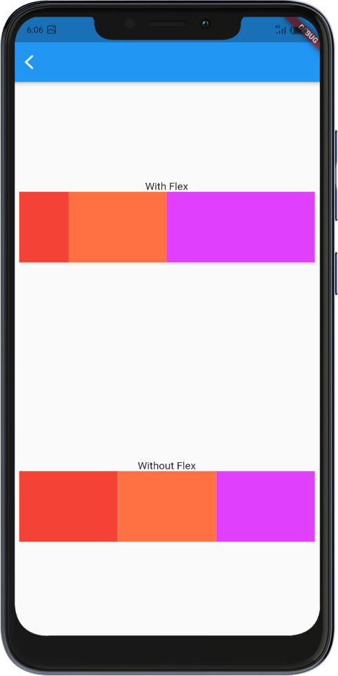
The flex property allows you to define how much space each child widget should take relative to the other widgets inside the parent. A widget with a higher flex value will occupy more space. Once wrapped in an Expanded widget, a child’s size is controlled by available space and cannot have a fixed height or width.
Flexible Widget
The Flexible widget allows you to control how much space a child widget should take inside a flex-based parent widget (like Row, Column, or Flex). It is used to give children proportional space in the parent widget based on the flex factor. Unlike the Expanded widget, which forces the child to occupy all the available space, the Flexible widget only takes up a portion of it.
The flex property of the Flexible widget determines how much space the child should take relative to other children. When you use Flexible, each child can be assigned a flex value, which defines how much space it should get compared to other widgets inside the parent widget.
- Expanded takes up all available space inside the parent widget, pushing other widgets aside. It’s like using flex: 1 for one child.
- Flexible gives the child proportional space based on its flex value, but the child does not fill the entire available space unless its flex value dictates it.
It’s particularly useful in cases where you want some widgets to take more space than others, but still allow some flexibility in their sizes, without forcing one widget to take all the space (like Expanded does).
Listview Widget
The ListView widget in Flutter is one of the most commonly used widgets for displaying a scrollable list of items. It is an essential widget when working with long or dynamic content, as it allows the user to scroll through a collection of widgets that may not fit entirely on the screen at once.
Column widget is not scrollable by default , great for small, static collections of widgets that are not expected to overflow the screen. ListView is the better choice for handling larger, dynamic, or scrollable content with more complex interactions. It provides built-in support for lazy loading and scrollability, making it ideal for performance and scalability.
The
ListView widget in Flutter offers several types of constructors to accommodate various use cases for displaying lists of data :ListView(): A basic constructor that creates a simple scrollable list where you manually provide the children. Useful when the list of items is static or predefined.
ListView.builder(): This constructor is used for lists that are dynamically generated or when you have a large number of items. It builds the items on demand as the user scrolls, making it more memory efficient.
ListView.separated(): This constructor is similar toListView.builder(), but it allows you to add separators between items, which can be useful for providing spacing or dividers between list elements.
ListView.custom(): This constructor allows for greater flexibility when building the list. You can customize how the list is built using a customSliverChildDelegate.
For lists that contain a large number of items, it’s better to use ListView.builder() instead of ListView(), as it avoids rendering the entire list at once, thus reducing memory consumption.
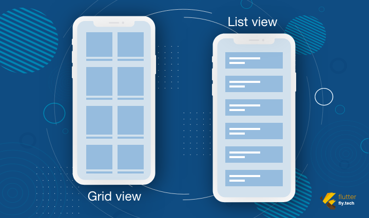
Gridview Widget
The GridView widget in Flutter is a scrollable grid of widgets, where you can display items in a two-dimensional arrangement (rows and columns). It is a highly flexible and powerful widget used for displaying collections of items, such as images, cards, or other types of content in a grid layout. You can customize the grid's number of columns, the spacing between items, and how items are laid out.
- Main-Axis (Vertical): Determines the layout of items in columns.
- Cross-Axis (Horizontal): Determines how items are aligned horizontally within the grid.
The GridView widget in Flutter offers several types of constructors to accommodate various use cases for displaying lists of data :
GridView(): A simple constructor that takes a list of children widgets to display them in a grid layout. Typically, used for a static list of items.GridView.builder():
Ideal for dynamic lists or lists with large numbers of items. This constructor builds grid items on demand as they are scrolled into view. This is memory-efficient for large grids.GridView.count():
This constructor arranges the items into a fixed number of columns. It is a simple way to create a grid layout where the number of columns is predefined.GridView.extent():
Allows the grid items to have a fixed maximum cross-axis extent (such as a maximum width). It is useful when you want to specify the maximum width of each item, and the number of columns is determined automatically based on the available space.GridView.custom():
Provides the most flexibility in creating a grid layout. This allows the customization of how the grid is built using a customSliverChildDelegate.
Below are some must know important properties of GridView Widget :
crossAxisCount(GridView.count) : Defines how many items you want in each row. It is useful when you want a fixed number of columns for the grid.crossAxisSpacing: Defines the horizontal space between grid items. You can adjust this to provide some spacing between the columns.mainAxisSpacing: Defines the vertical space between grid items. Use this to control the space between the rows.childAspectRatio: Defines the aspect ratio of each item in the grid. It determines the width-to-height ratio of the grid item. For example, achildAspectRatioof 1.0 means each grid item is a square.scrollDirection: By default, theGridViewscrolls vertically, but you can change this to horizontal scrolling by setting thescrollDirectionproperty toAxis.horizontal.shrinkWrap: If set totrue, the grid will take only as much space as it needs for the items, rather than occupying all available space. This is useful when the grid's size is not predefined.primary: Controls whether theGridViewshould use the primary scroll controller, usually used in cases where the grid is part of a scrollable widget like aSingleChildScrollView.padding: You can provide padding around the grid items to space the grid from its parent widget.reverse: If set totrue, the grid will start from the last item and scroll backward. This is useful for certain user interface requirements.
NOTE : GridView.count() is a more straightforward and simple choice when you know the exact number of columns your grid will have and when the list of items is small or predefined. It doesn't require you to define an itemBuilder or manually handle indexing, making it easier to set up in cases where the grid layout is simple and static.
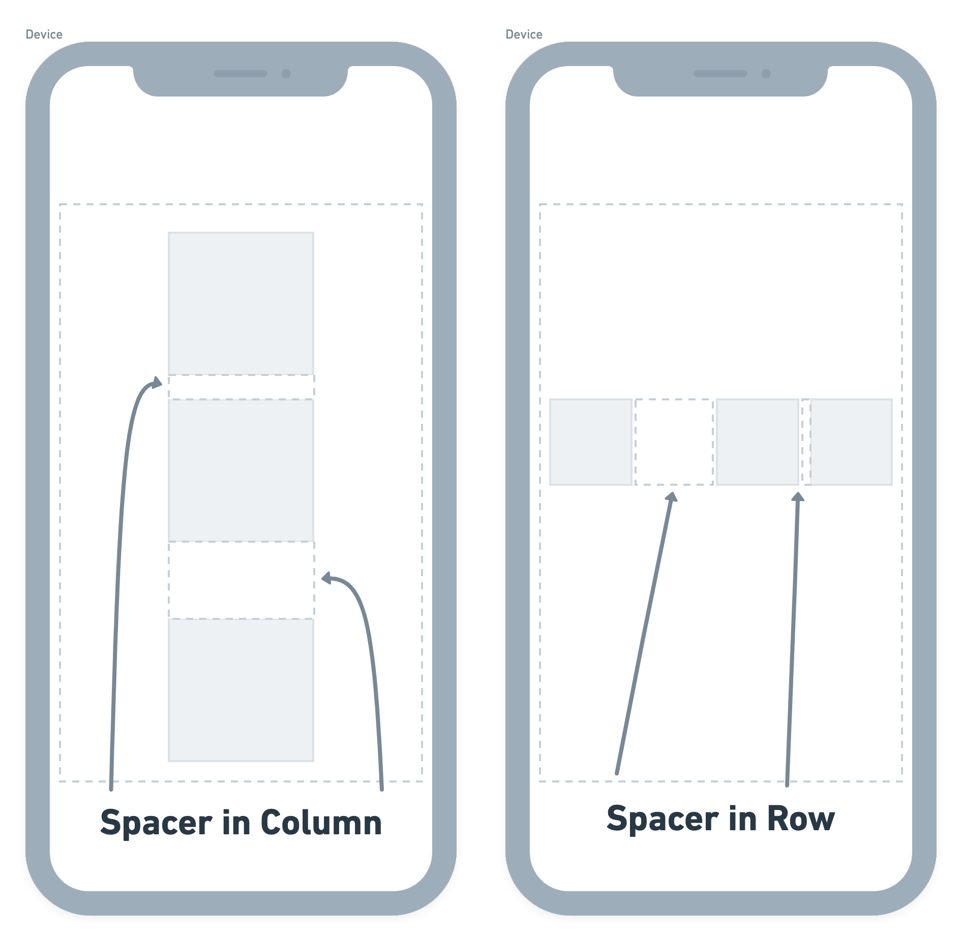
Spacer Widget
The Spacer widget in Flutter is a specialized widget designed to create flexible and proportional empty spaces between widgets in layouts like Row, Column, or Flex. It helps distribute the available space dynamically without needing to hard-code dimensions, making your layouts more adaptive and responsive.
The Spacer widget uses the flex property to define how much space it should occupy relative to other Spacers in the same parent. It acts as a shorthand for creating an empty Flexible widget with no child.
NOTE : While both Spacer and Padding can create space, Spacer is dynamic and adjusts based on available space, whereas Padding creates fixed-size gaps. Also spcer only works inside flex-based widgets.
The Spacer must be a child of Row, Column, or Flex, as these widgets manage their children's flex properties.
SizedBox Widget
The SizedBox widget in Flutter is a layout tool used to impose specific size constraints on its child widget or create empty space in your UI. It’s a highly flexible and precise widget that allows developers to set fixed width, height, or both for a widget. We use SizedBox for following cases :
To Fix the Size of a Widget : Use SizedBox to explicitly define a widget's width and height, ensuring consistent UI dimensions.
To Add Precise Spacing : SizedBox is ideal for adding empty space between widgets in any layout. For example, you can use
SizedBox(height: 20)for vertical spacing.Placeholder Widget : SizedBox can act as a placeholder when
widthandheightare set but no child is provided.
NOTE : SizedBox is used for precise spacing and dimensions, whereas Spacer is used to fill available space dynamically in Row, Column, or Flex.
Key Points to Remember
SizedBox vs. Spacer:
SizedBox is used for precise spacing and dimensions, whereas Spacer is used to fill available space dynamically inRow,Column, orFlex.Null Dimensions:
If bothwidthandheightare null, the SizedBox adjusts its size to fit the child. If there's no child, it shrinks to zero size.Performance:
SizedBox is lightweight and does not add unnecessary overhead, making it ideal for layout management.


Comments
Post a Comment